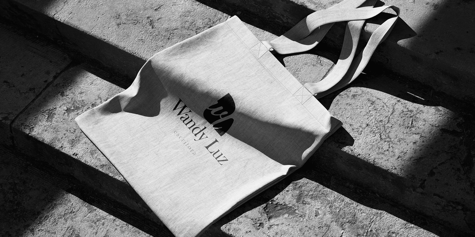
About the Project
Visual Identity development for writer Wandy Luz. The project aimed to create a brand that didn’t just sign her works but translated the essence of her writing: deep, feminine, and timeless. The brand needed the elasticity to work across book covers, social media, and an exclusive product line.
The Strategy (The “Unfolding” Concept)
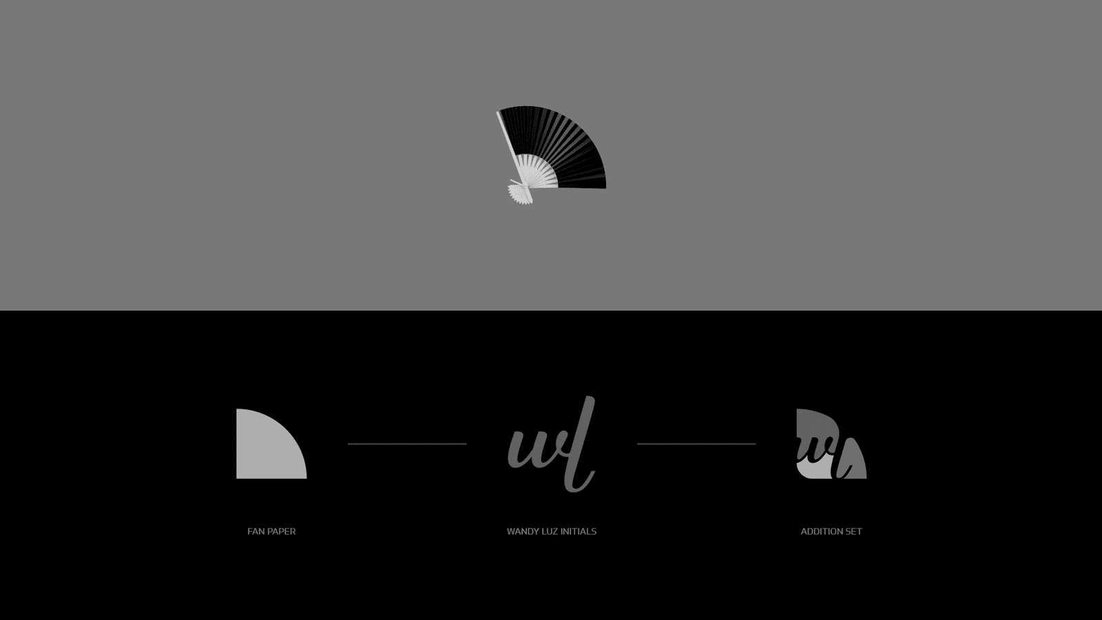
The brand construction was based on the metaphor of “opening up” to the world, much like a book or a fan:
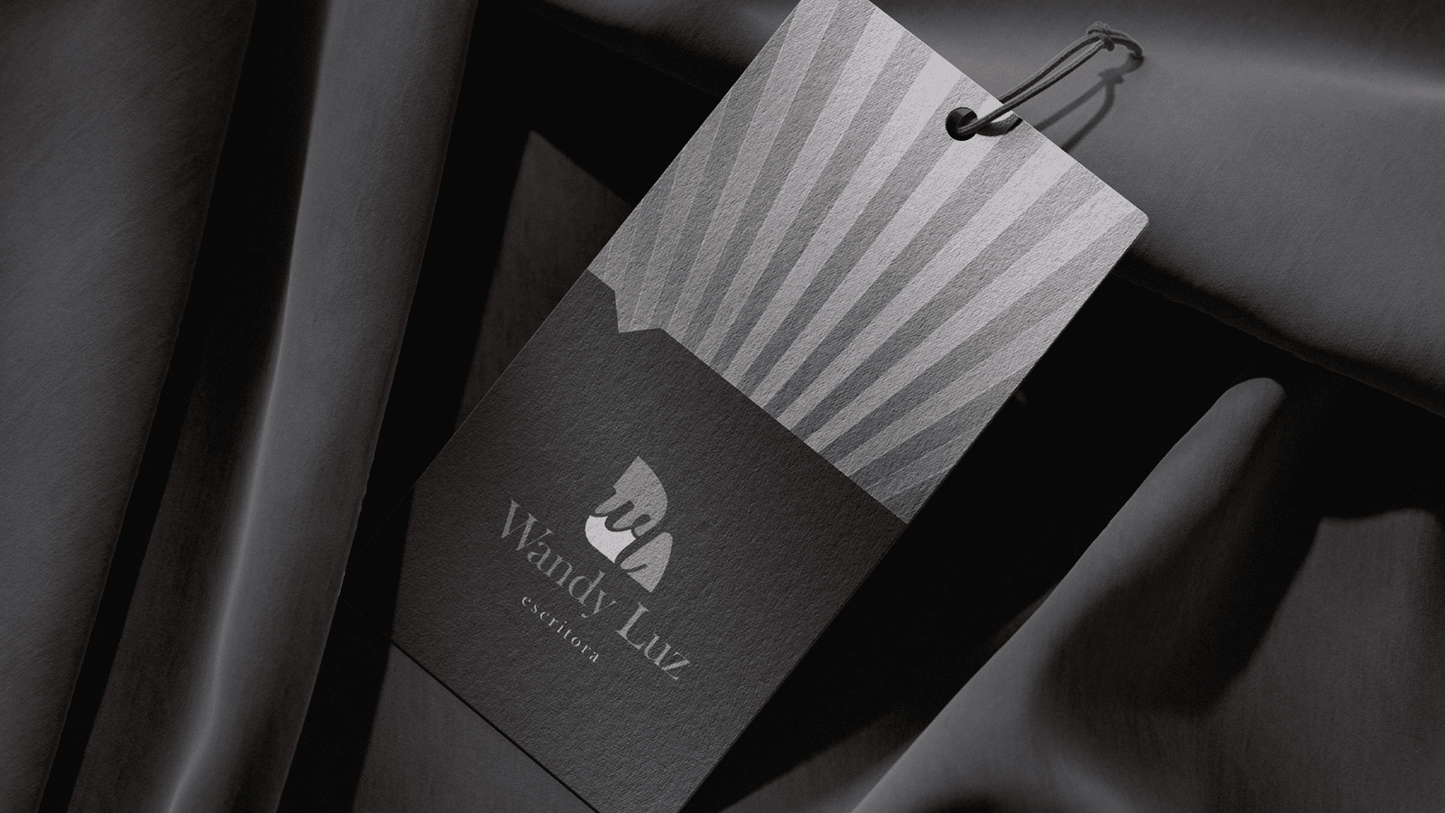
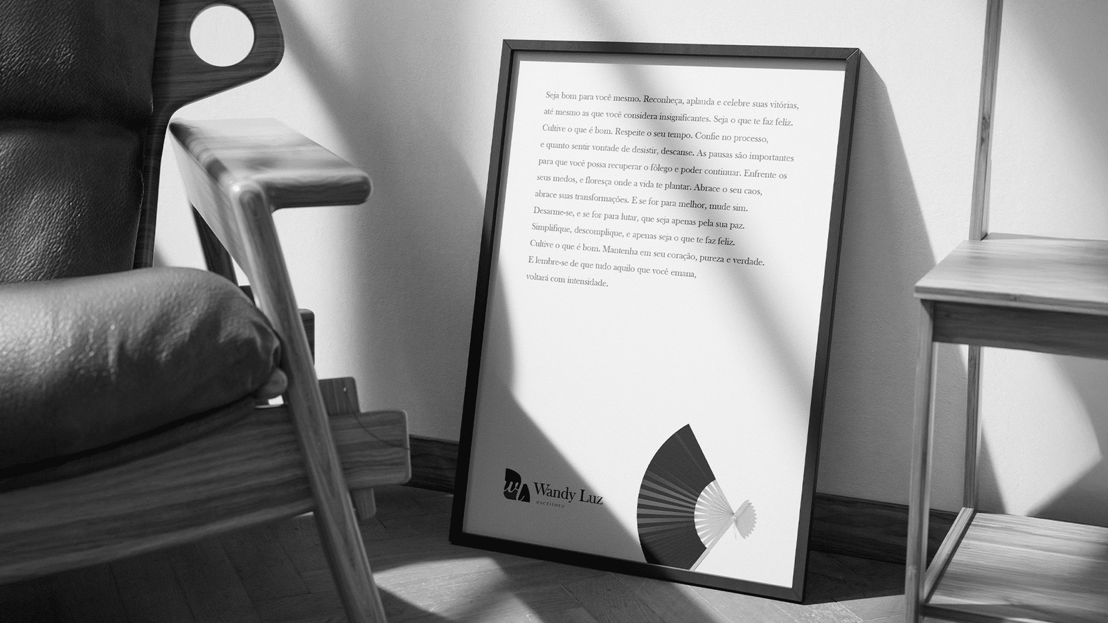
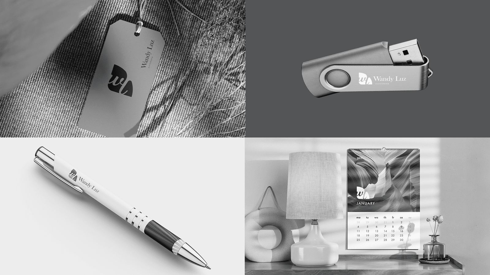
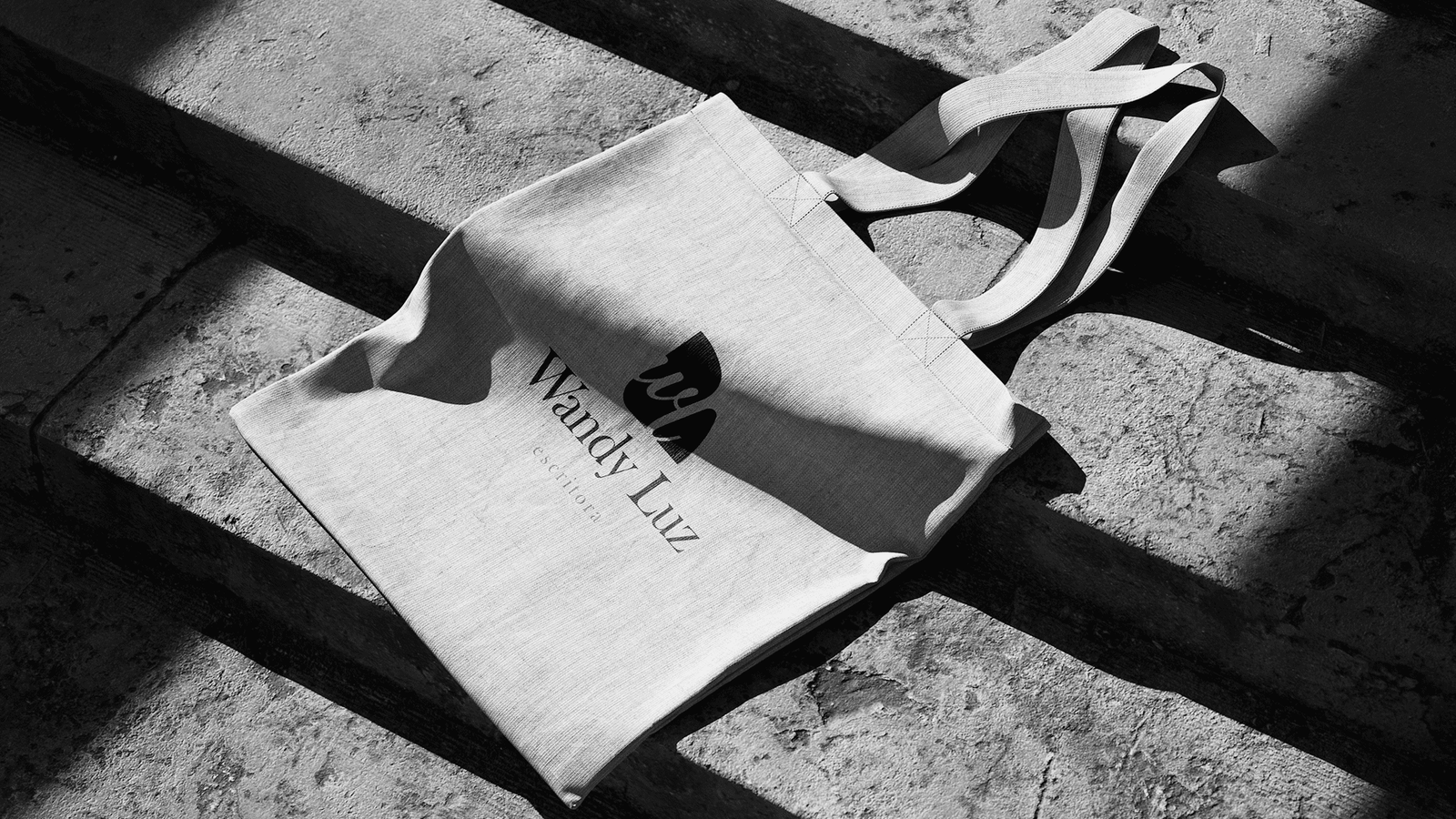
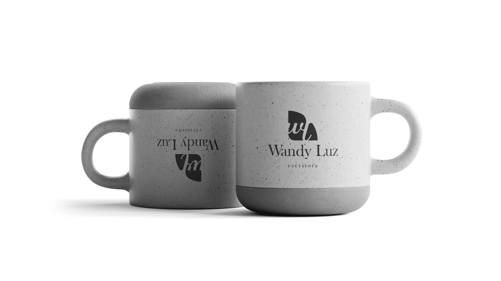
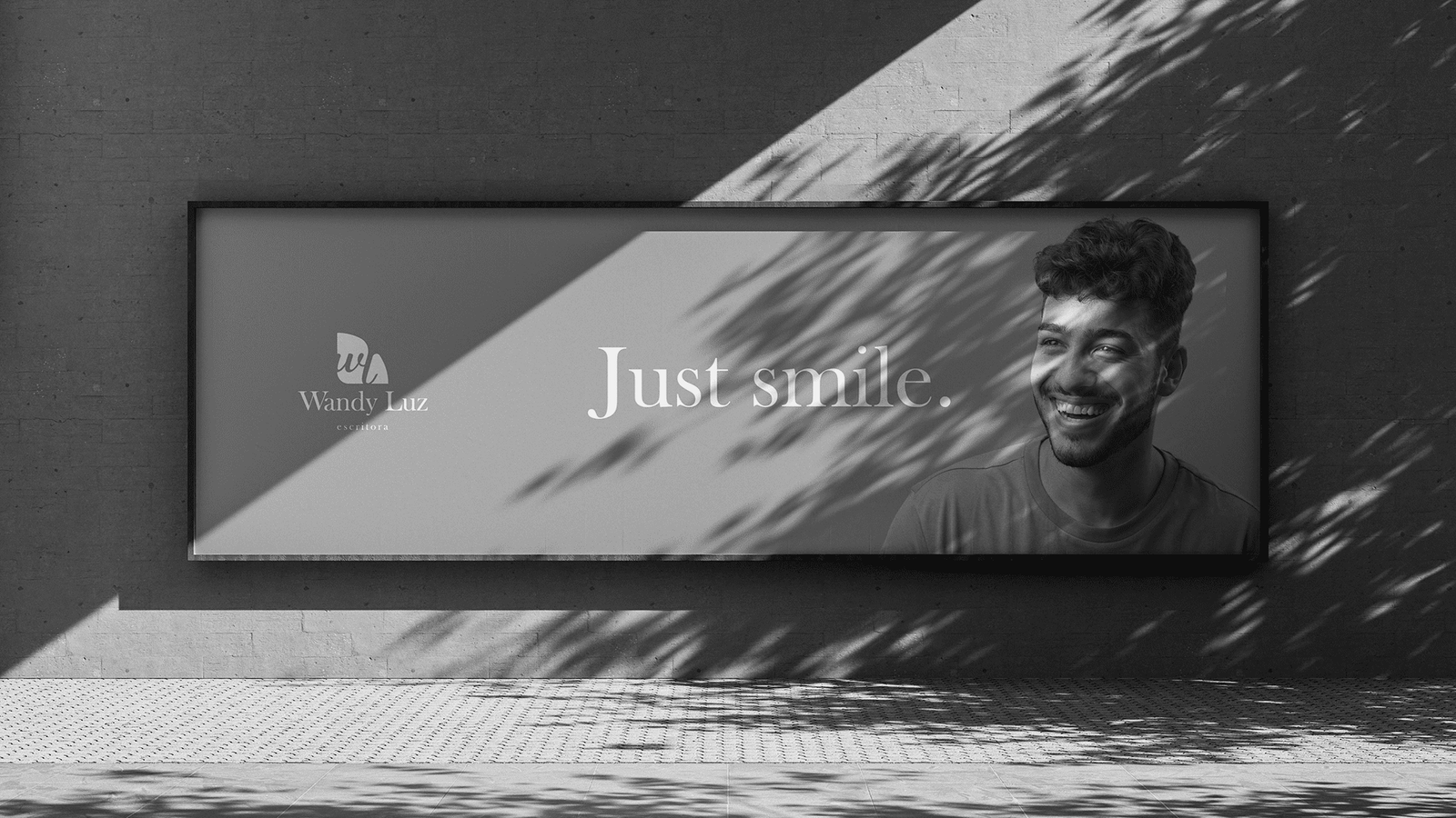
Fan Symbology: The main icon is a stylized fan (leque). It represents movement, classic femininity, and the act of gradually “revealing” stories. The fan’s ribs also allude to the pages of an open book.
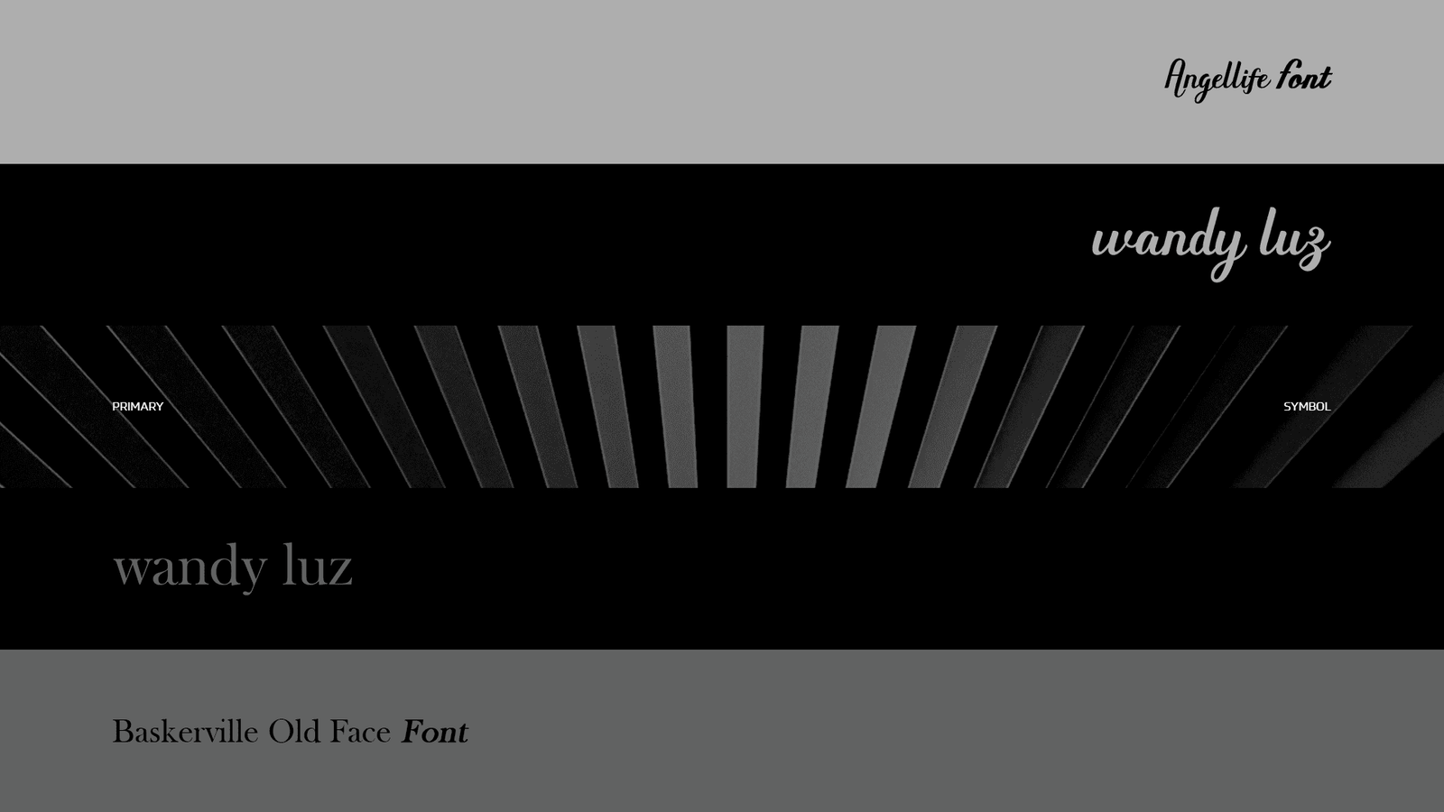
Contrast Typography
Signature (Script): The Angellife font brings the gestural quality of handwriting, representing the human touch and authorship.
Authority (Serif): The Baskerville Old Face font anchors the brand with the seriousness and literary tradition required for an author.
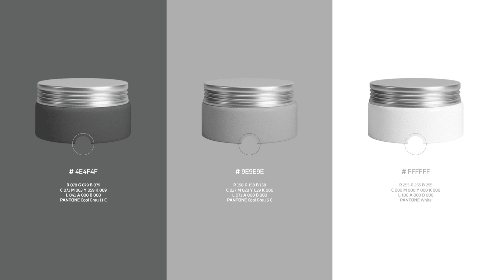
“Ink & Paper” Palette: The choice of a monochromatic palette (Black, White, and Cool Gray tones) pays homage to the foundation of literature: ink on paper. Besides being sophisticated, this palette allows the brand to be applied over any background color or photography without losing readability.
Result
A poetic and versatile visual identity. The brand extended into a universe of products (tote bags, mugs, stationery), turning the author’s name into a desirable and elegant lifestyle brand.