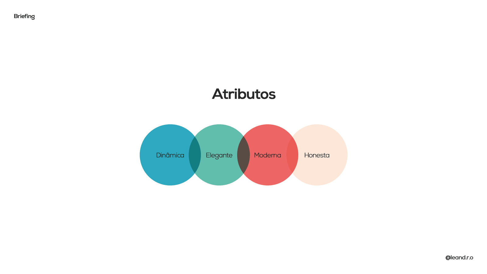
About the Project
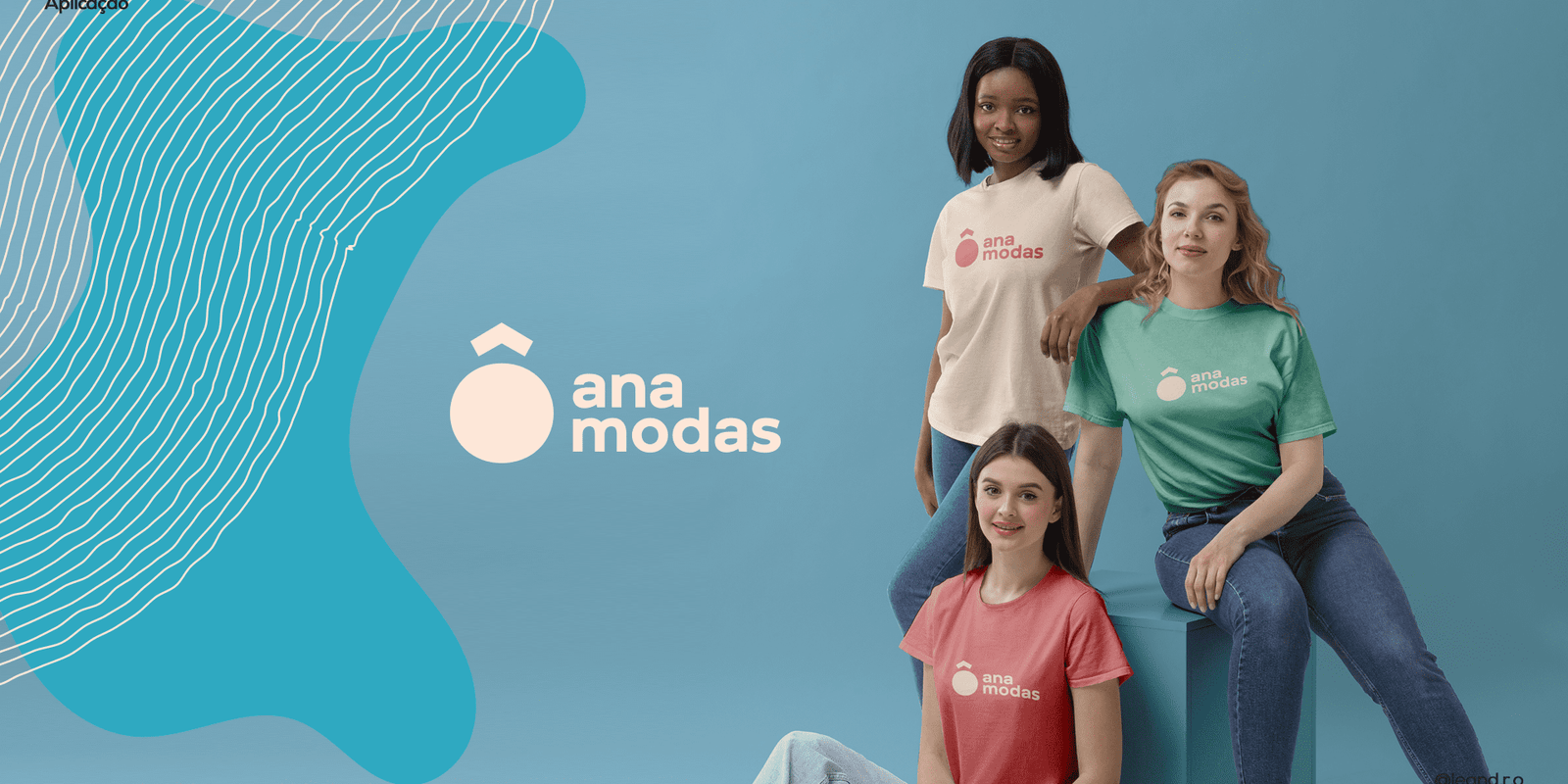
Visual Identity creation for Ô, Ana Modas, a women’s clothing brand focused on a young and dynamic audience. The briefing challenge was to develop an authentic brand that escaped segment clichés, conveying high product quality with an accessible and friendly language.
The Strategy (The “Direct Call”)
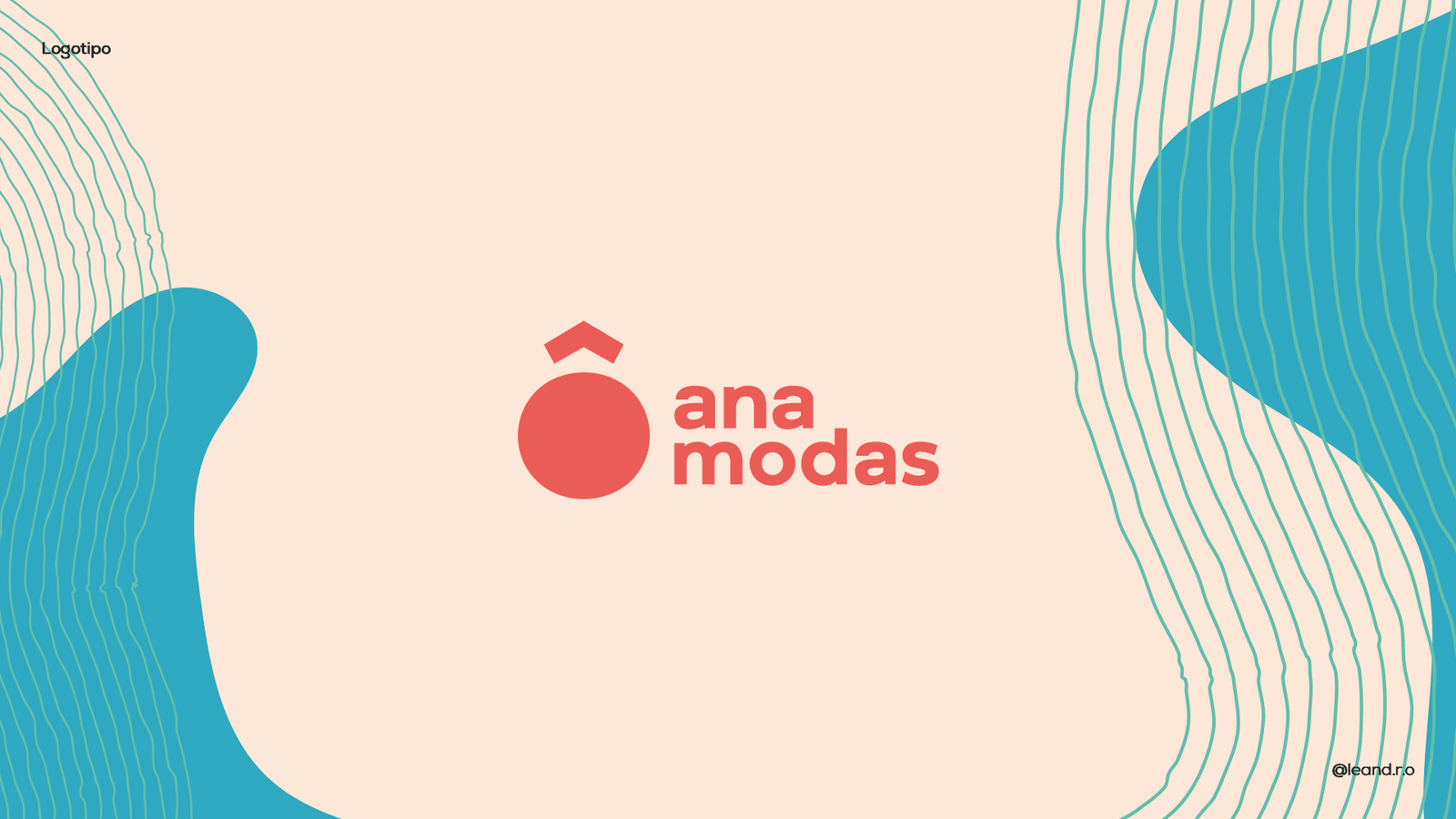
The visual concept was born from the name itself. In Portuguese, “Ô, Ana” is an interjection used to call someone, suggesting intimacy and conversation. The visual identity needed to reflect this proximity:
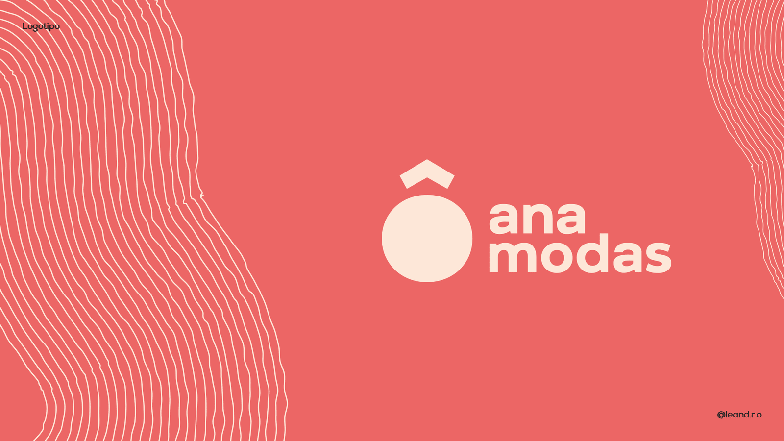
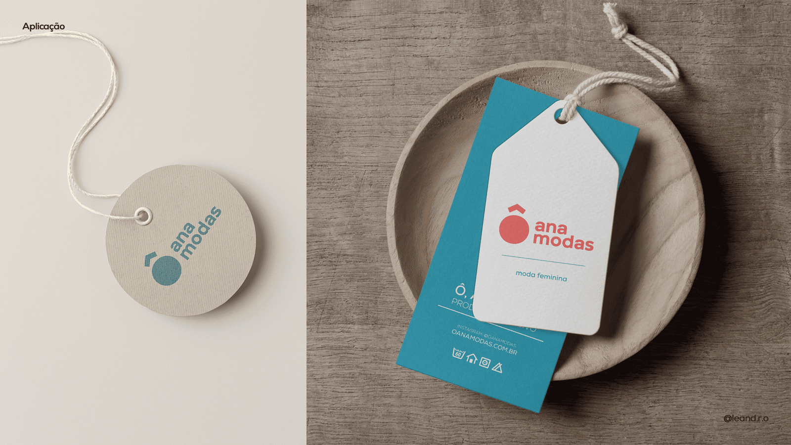
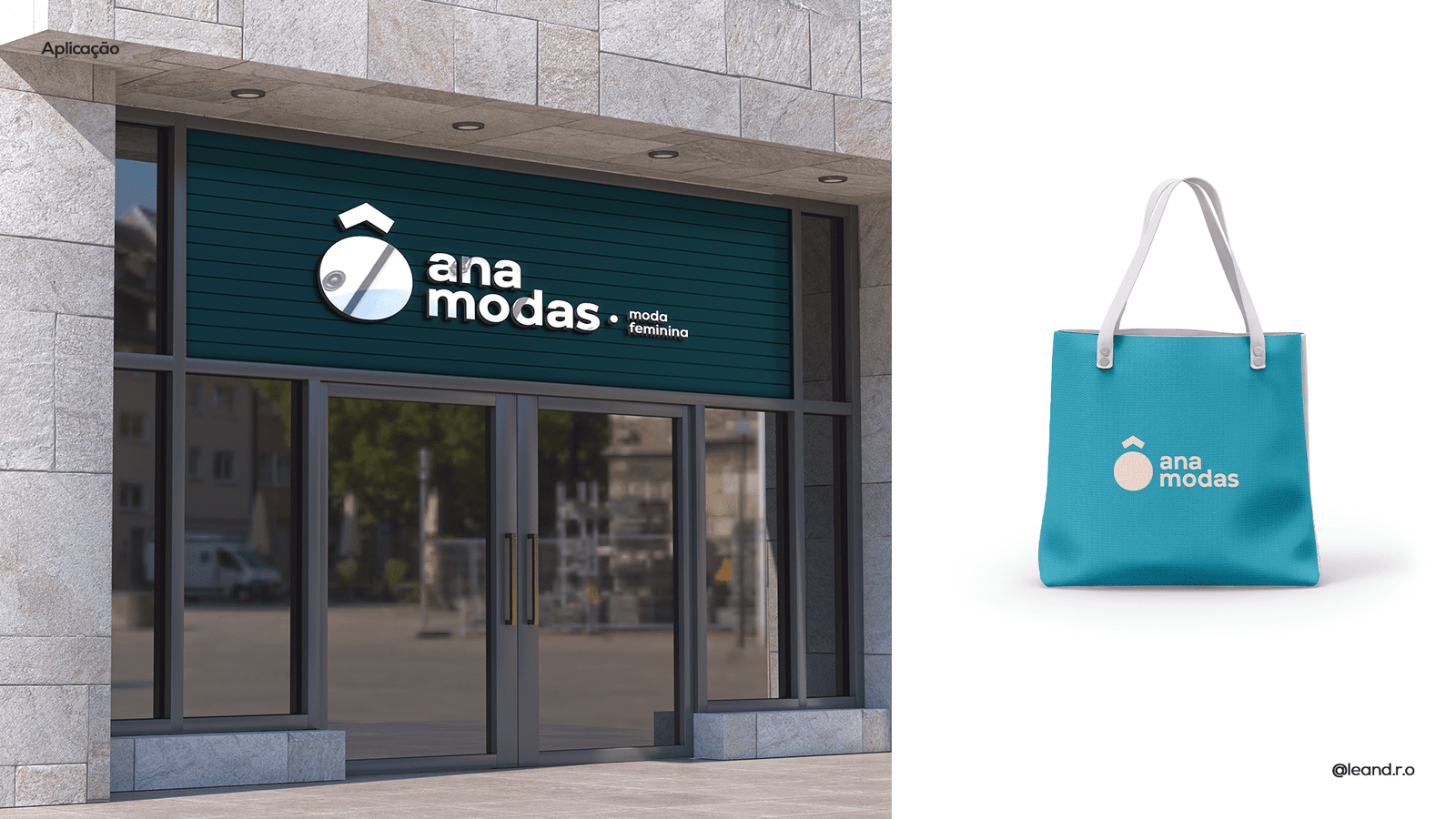
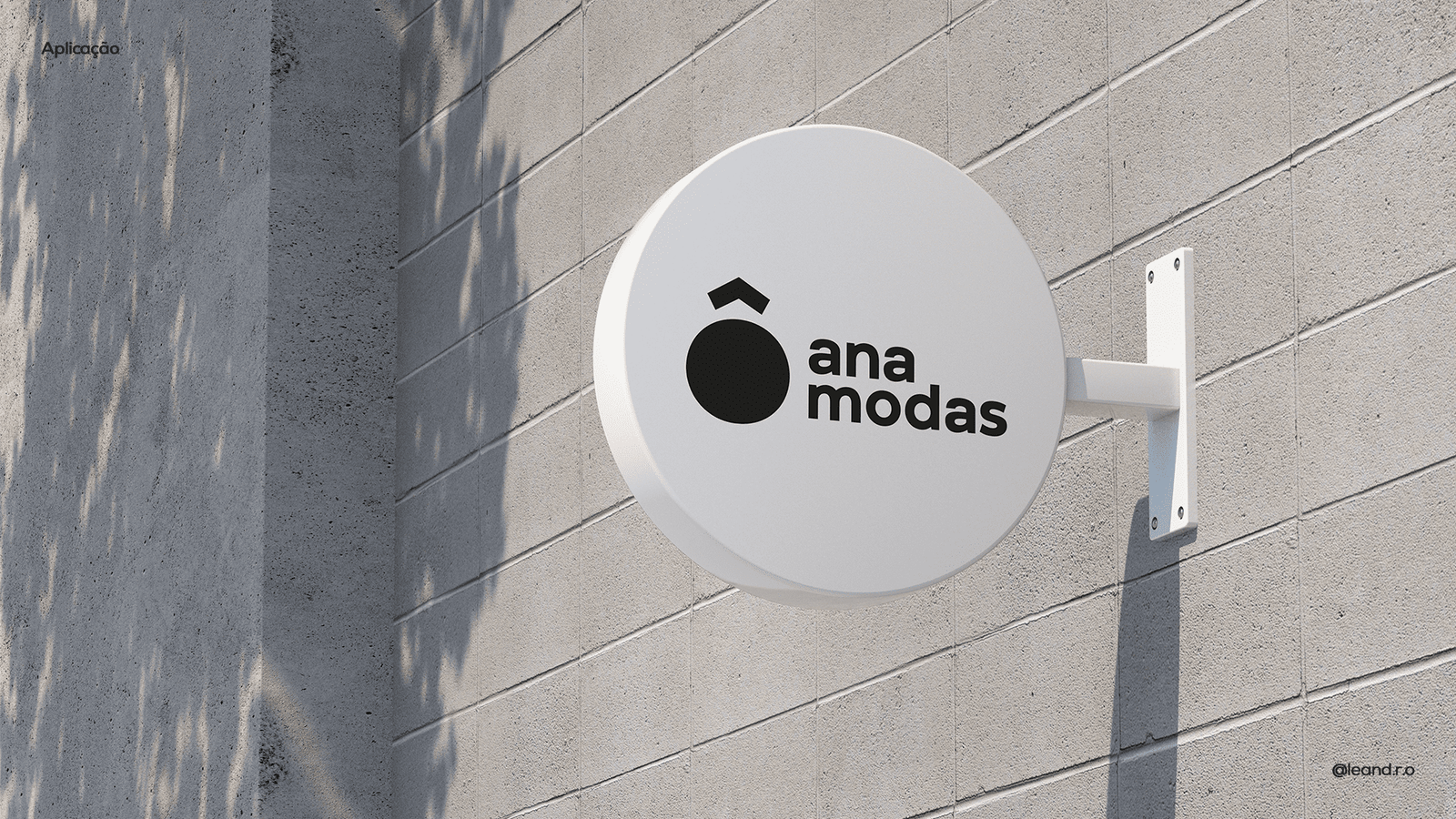
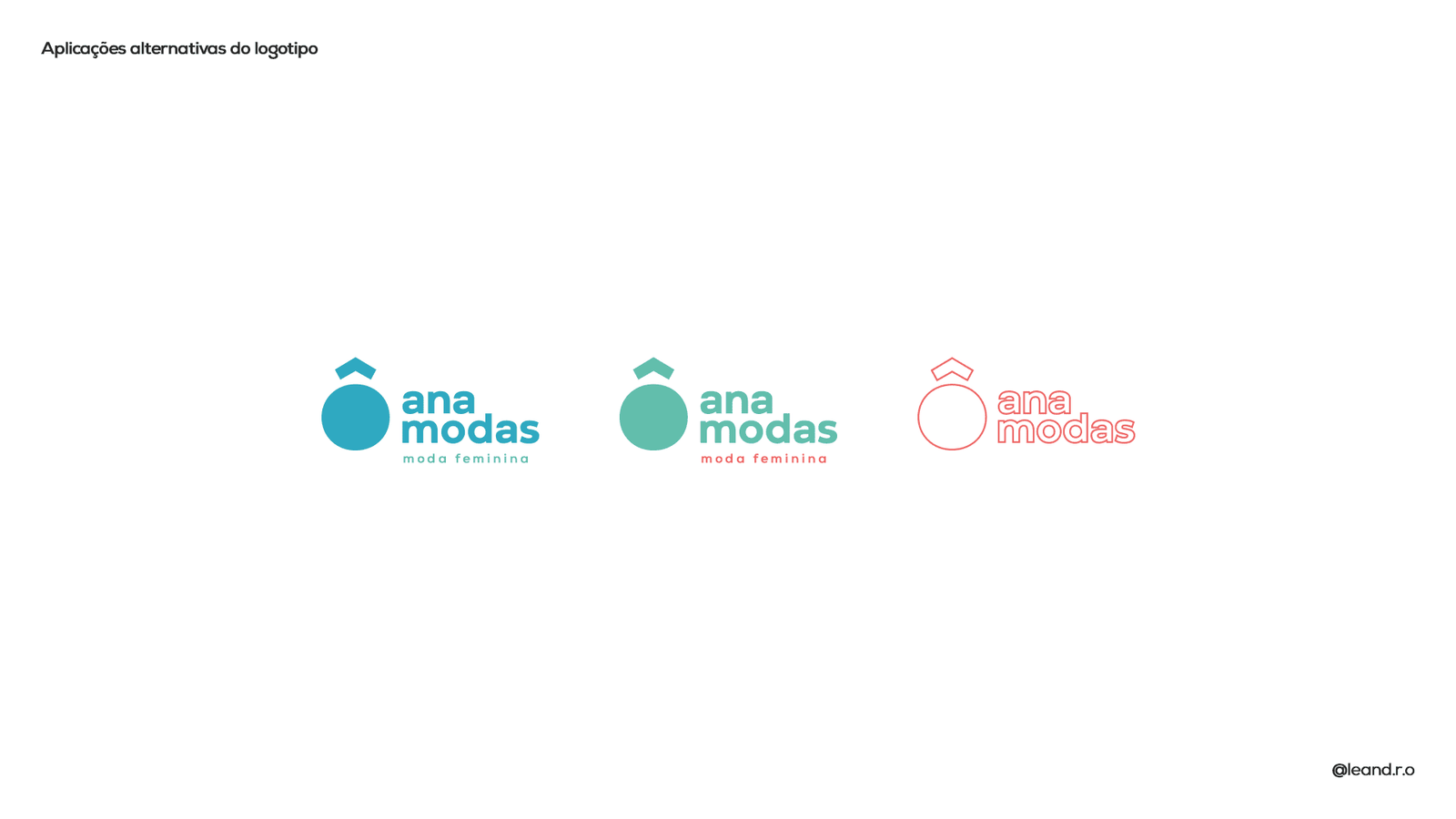
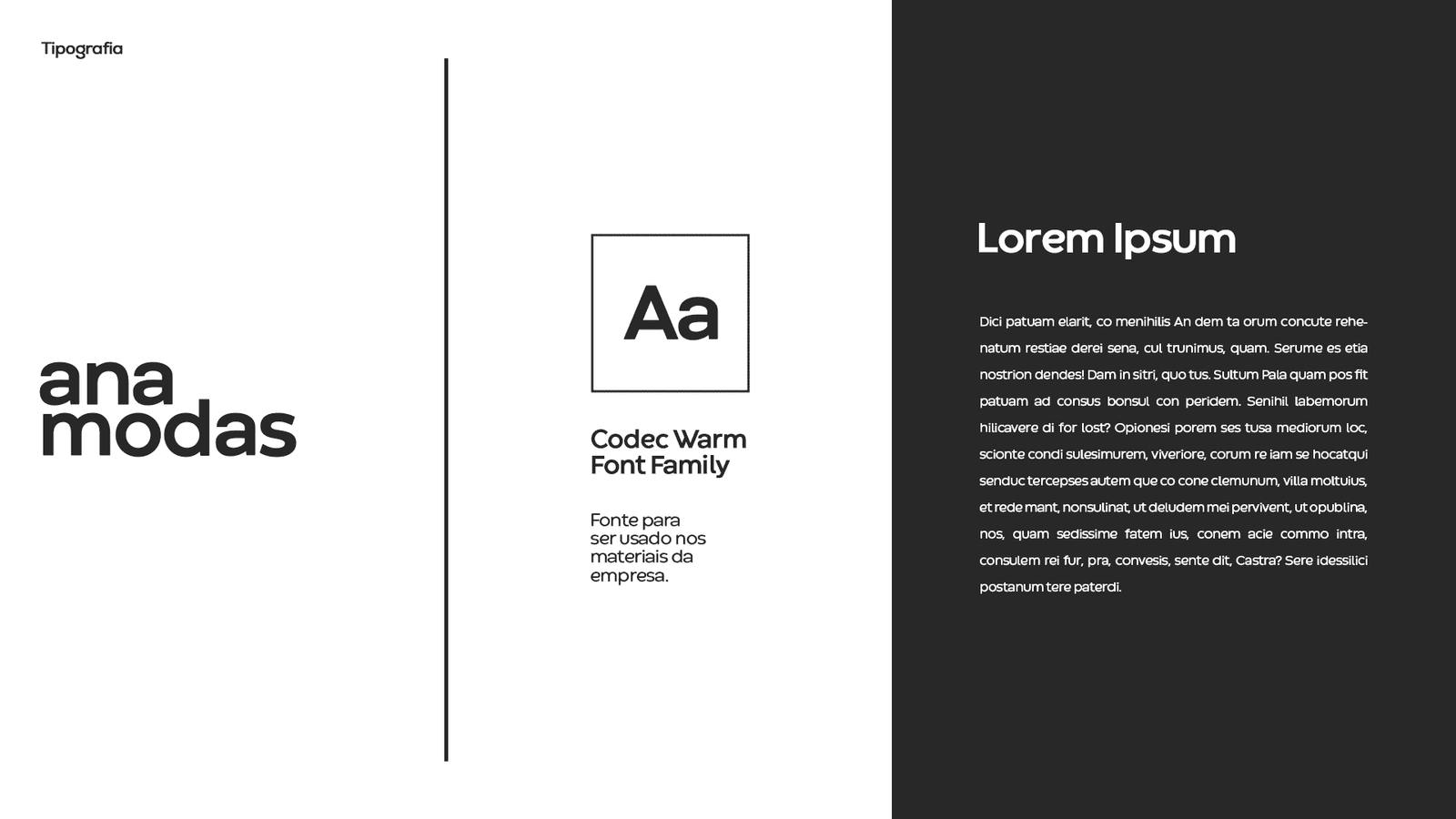
Typography & Symbol: We used a bold, rounded sans-serif typography (lowercase) to convey modernity and approachability. The geometric symbol, resembling a ring or stylized jewel, crowns the brand, adding value and femininity without being too literal.
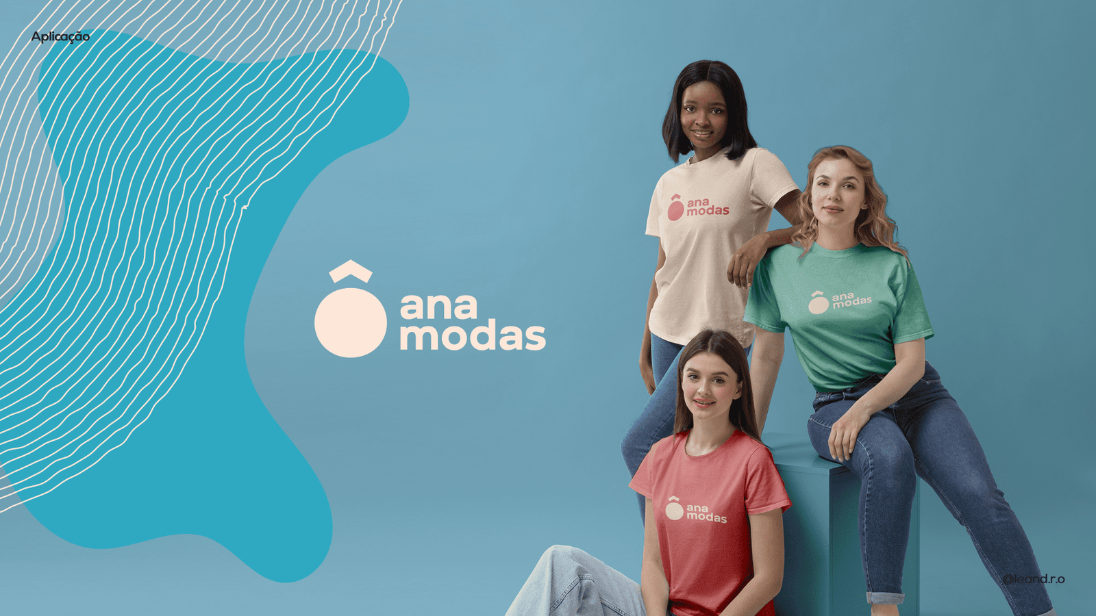
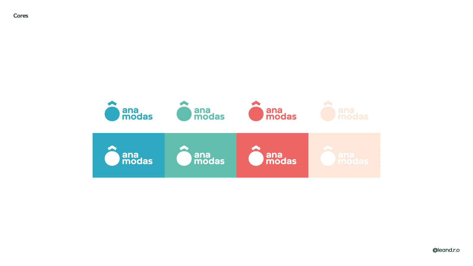
“Fresh Pop” Palette: To stand out in retail, we created a vibrant and unusual palette. The combination of Coral (Energy) with Turquoise (Modernity) and Nude/Beige tones creates a cheerful and instantly recognizable color code on bags and tags.
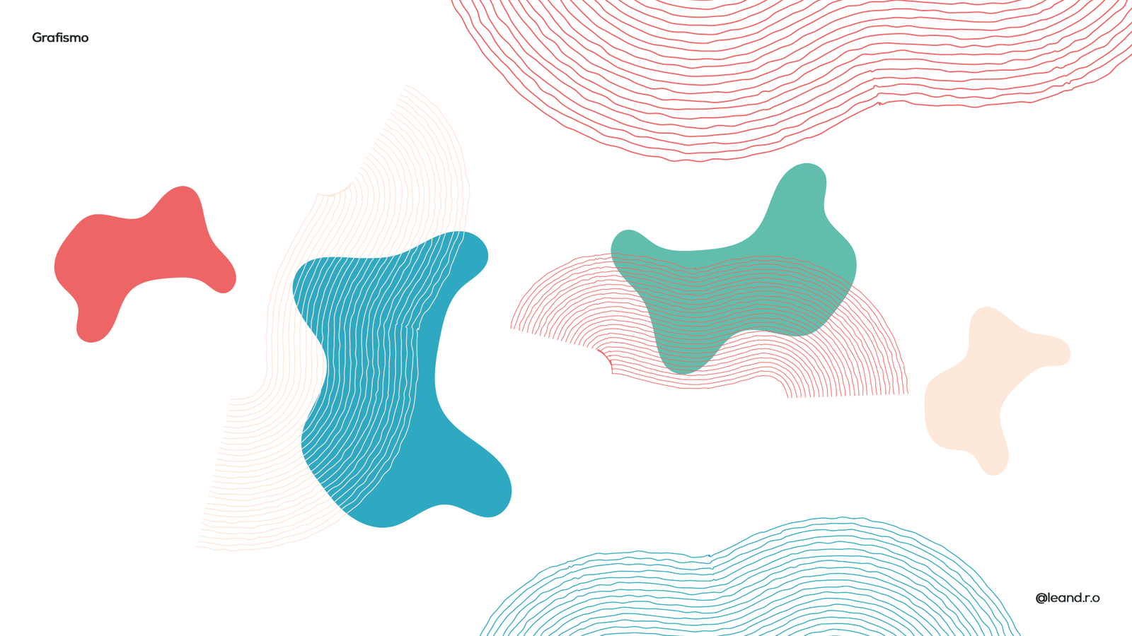
Fluid Graphics: We developed a pattern of organic lines and liquid shapes representing the movement of fabrics and the versatility of fashion. This graphic dresses the corporate communication, bringing dynamism to the asset backgrounds.
Result
A brand with a magnetic personality. The visual identity translated the “excellent service” mentioned in the brief into a warm visual experience, making the customer feel “called” and welcomed by the brand.