The Business Challenge
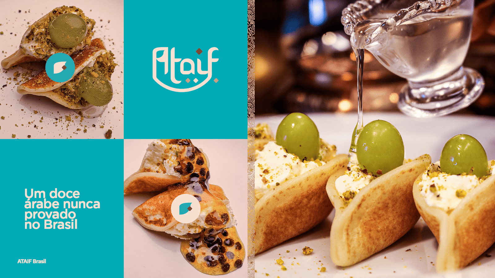
To introduce a millennia-old Middle Eastern delicacy to the Brazilian market, where it was virtually unknown: the Qatayef. The mission was to transform an exotic product into an object of desire and prepare the ground for a robust operation, scalable to different retail formats and product mixes.
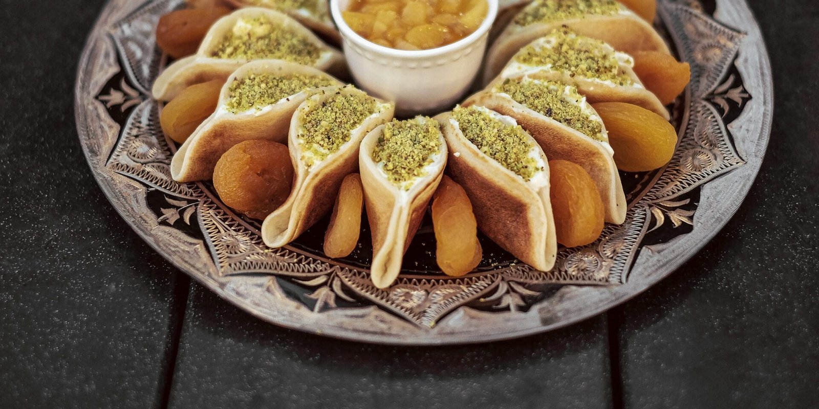
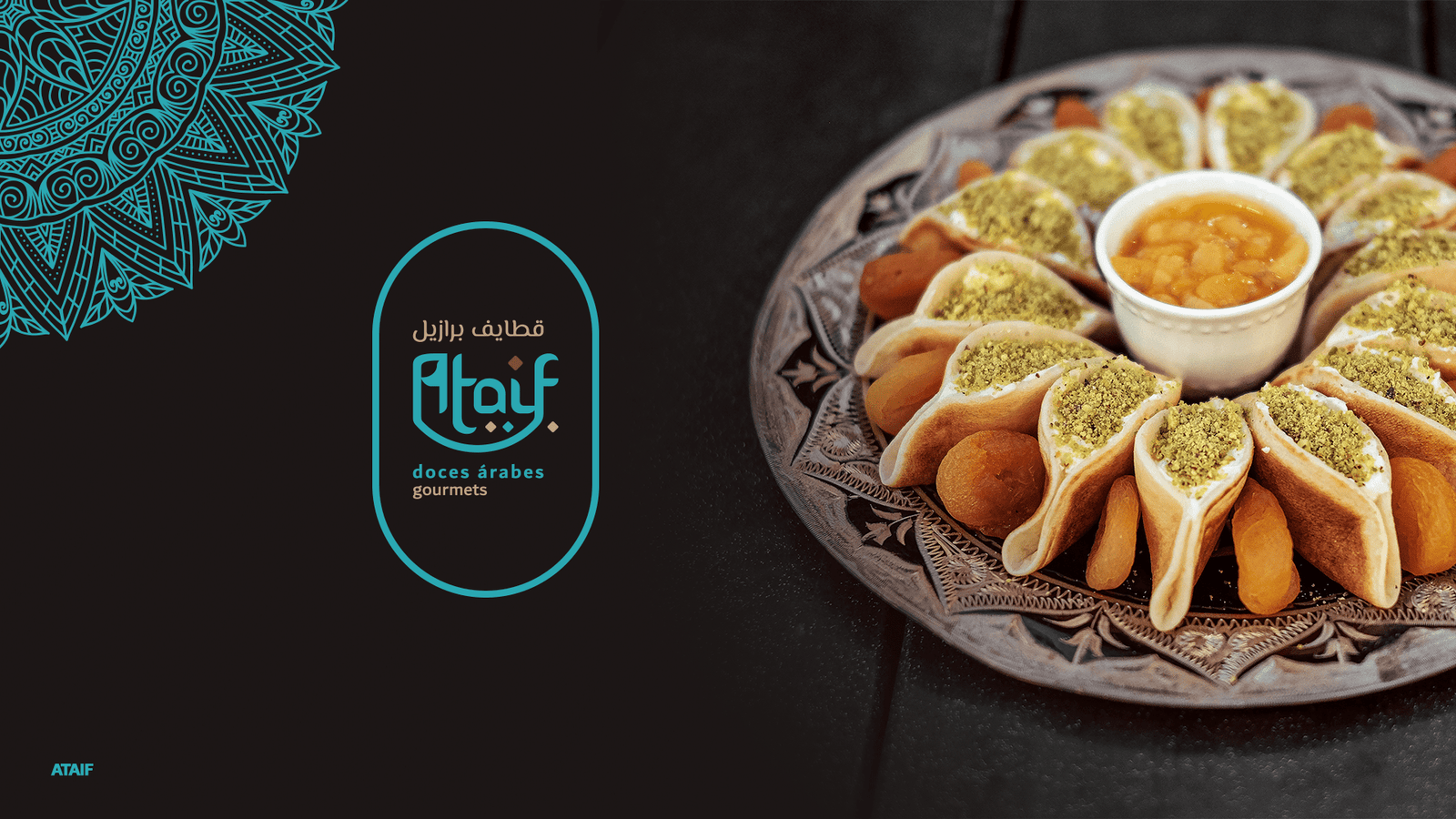
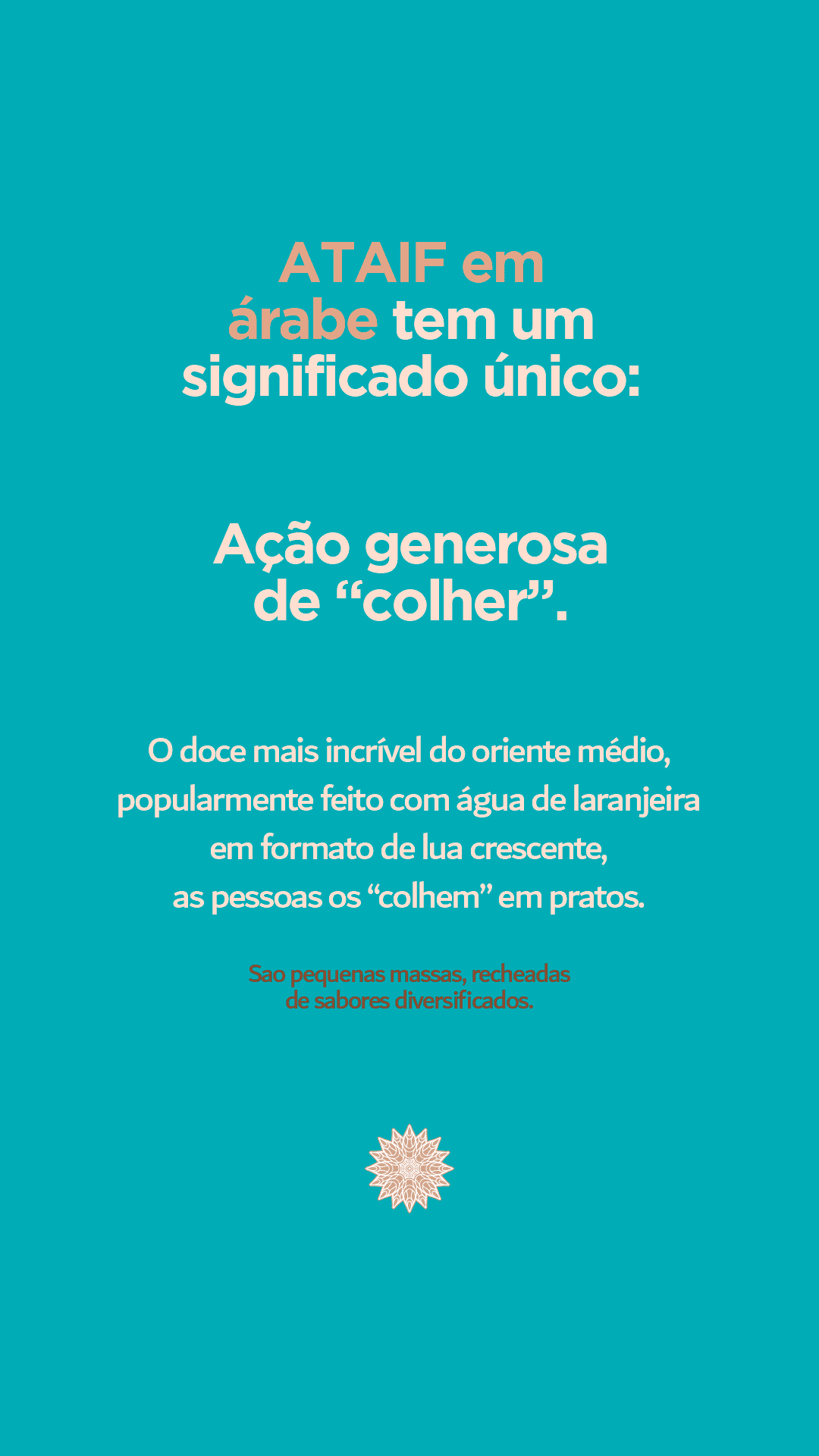
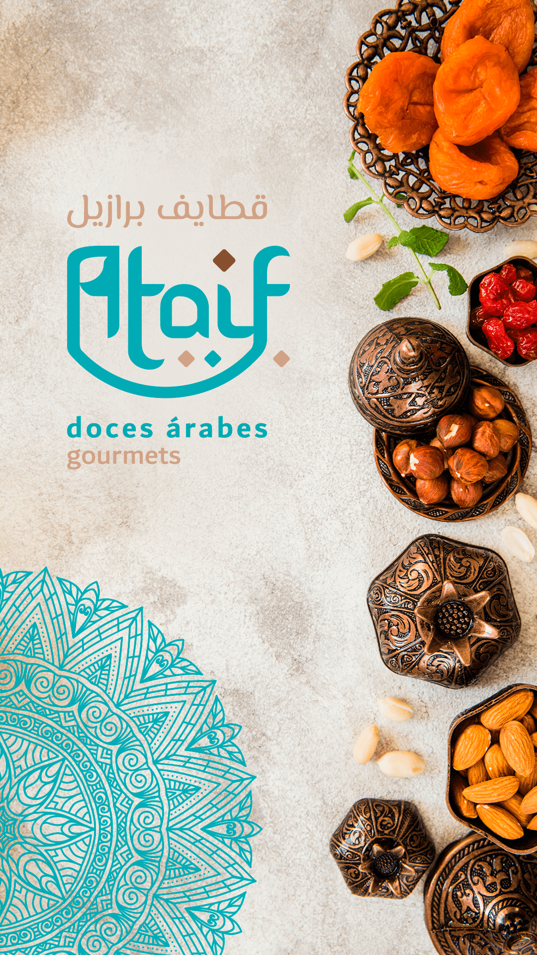
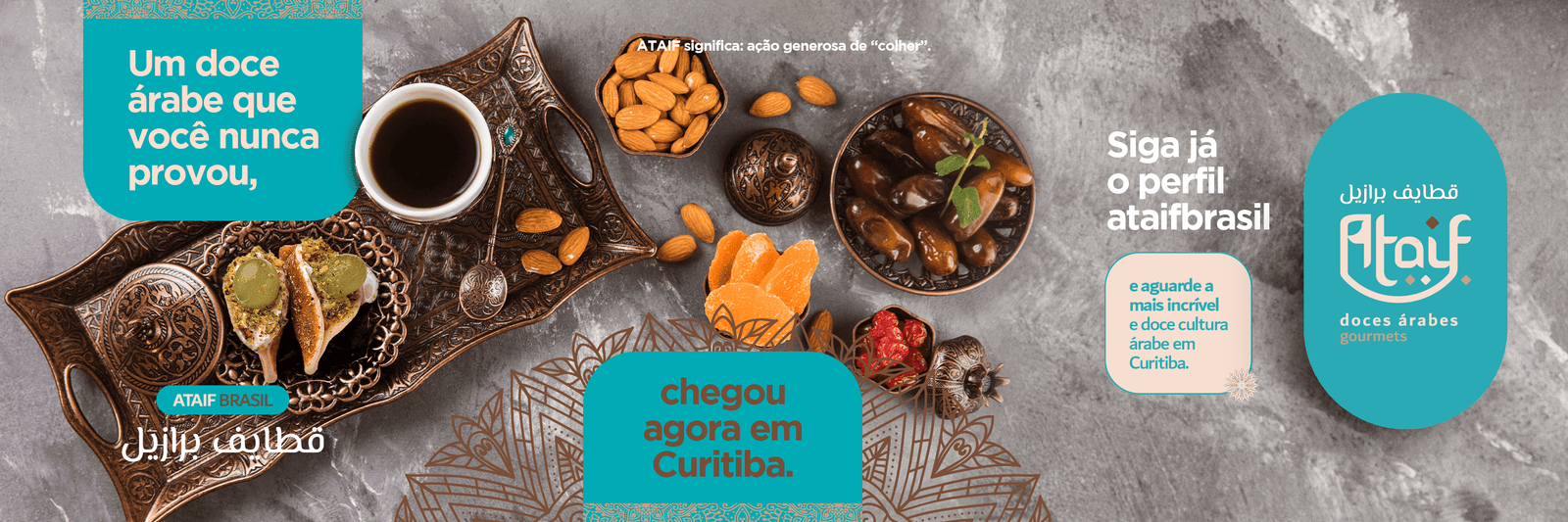
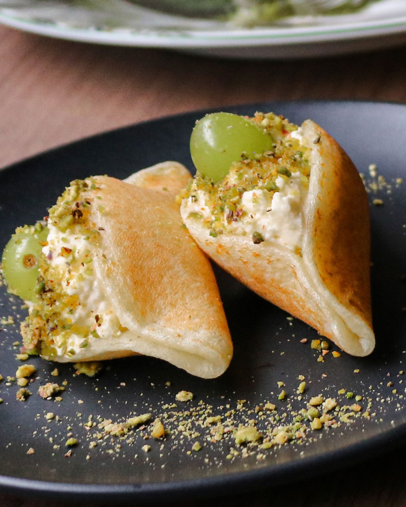
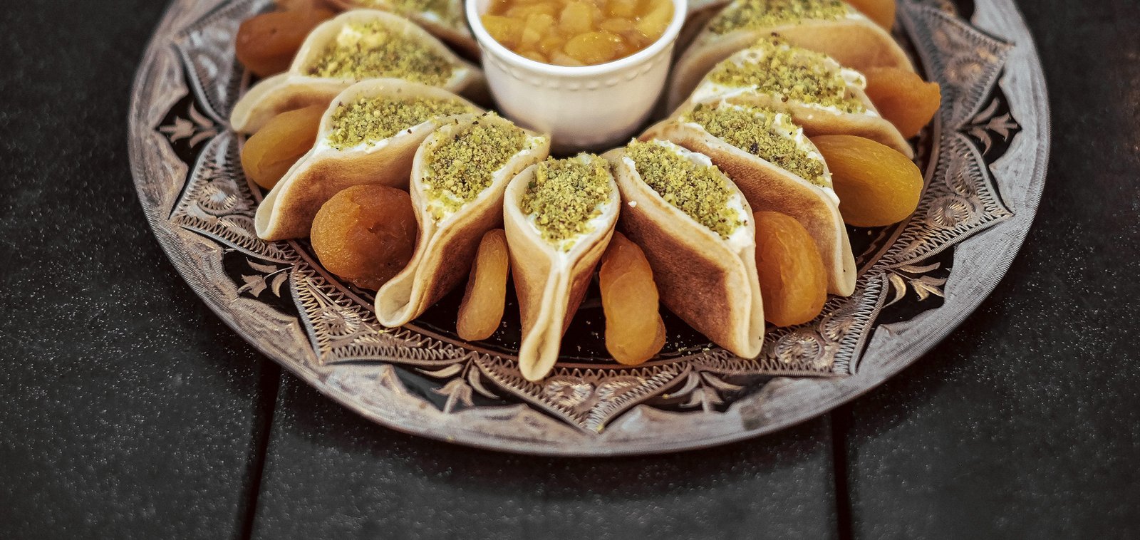
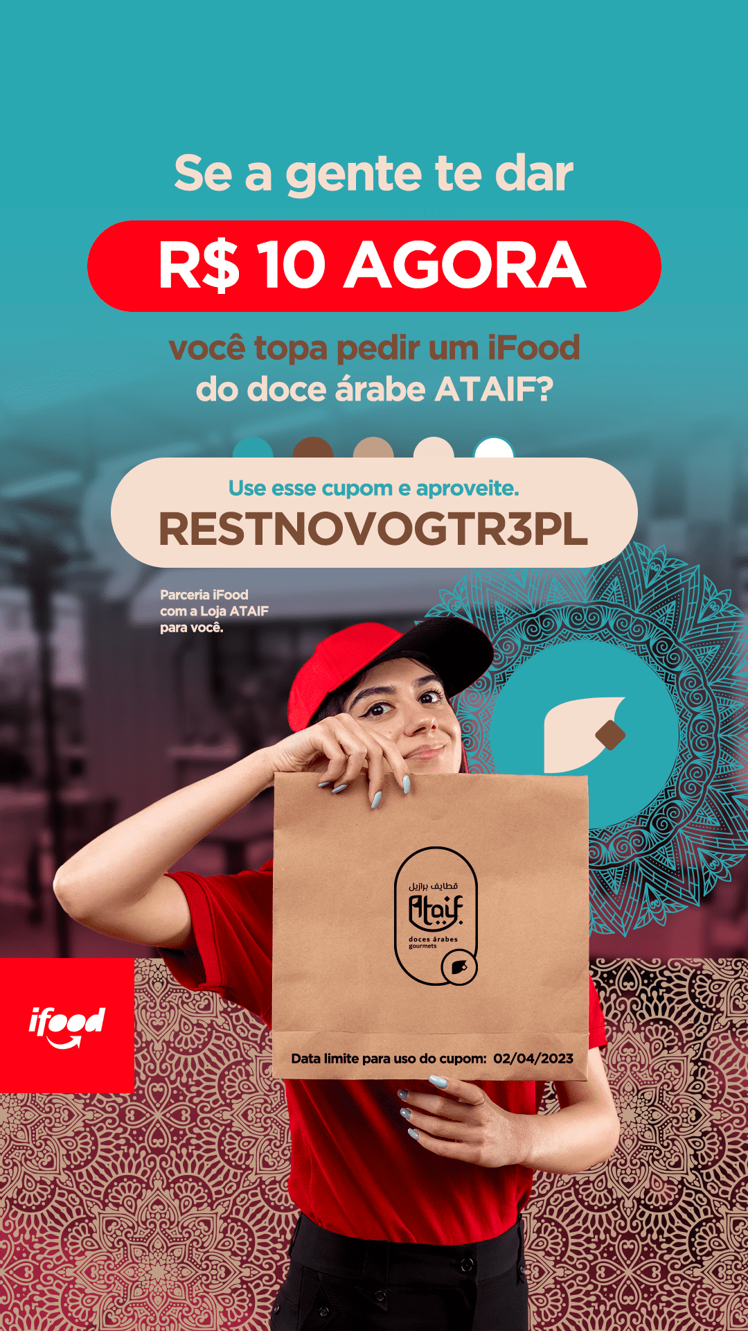
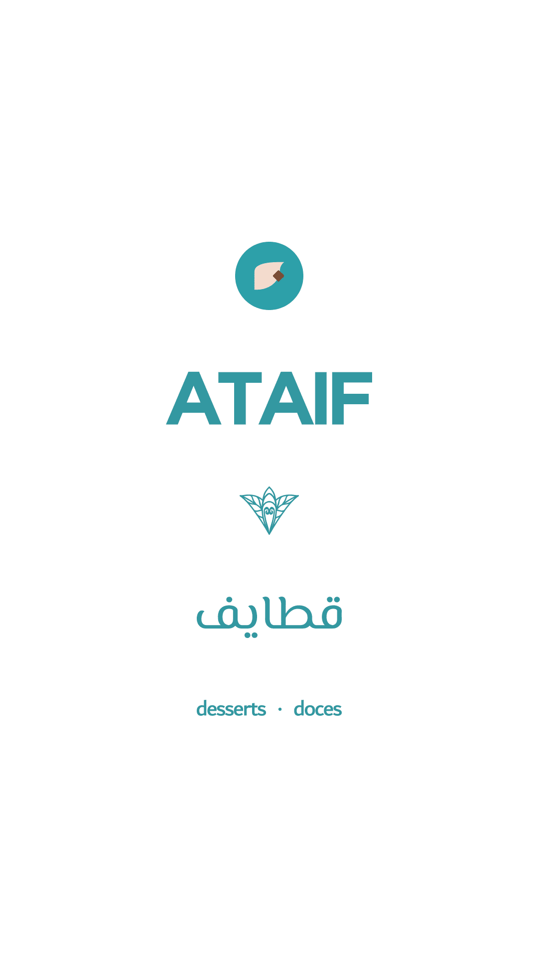
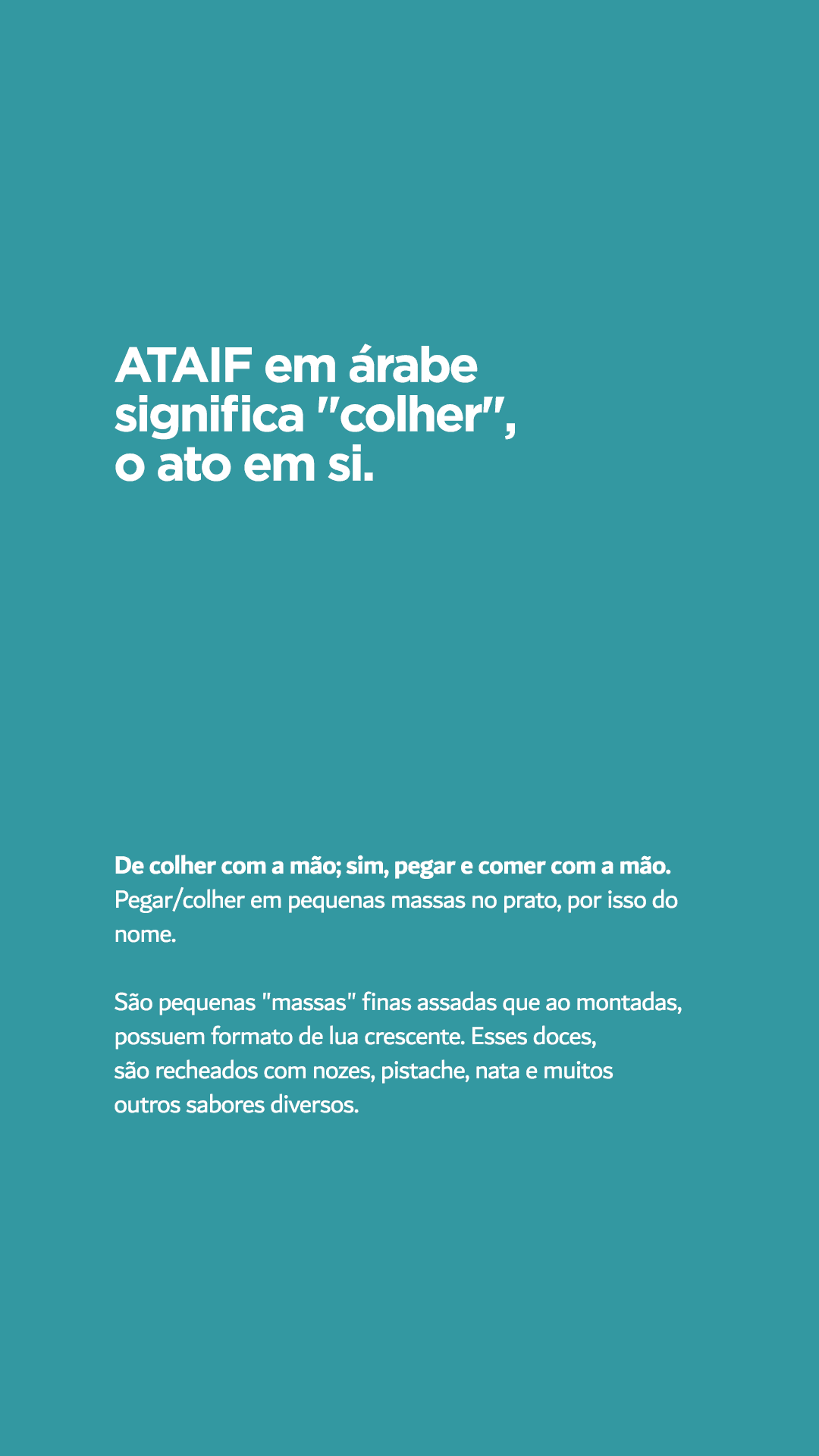
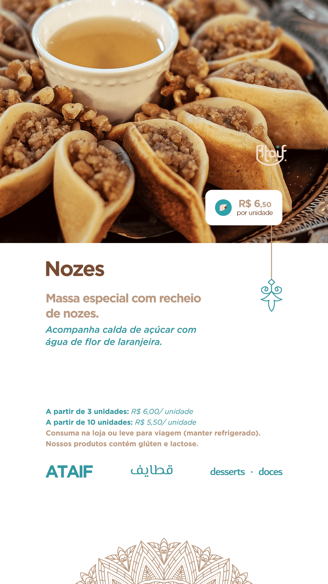
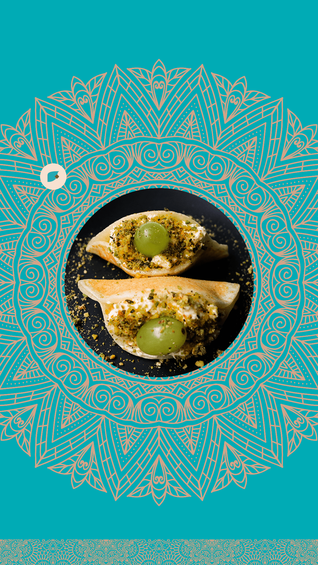
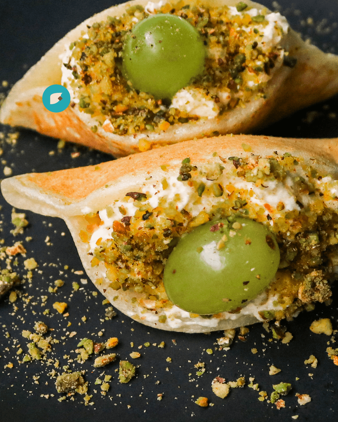
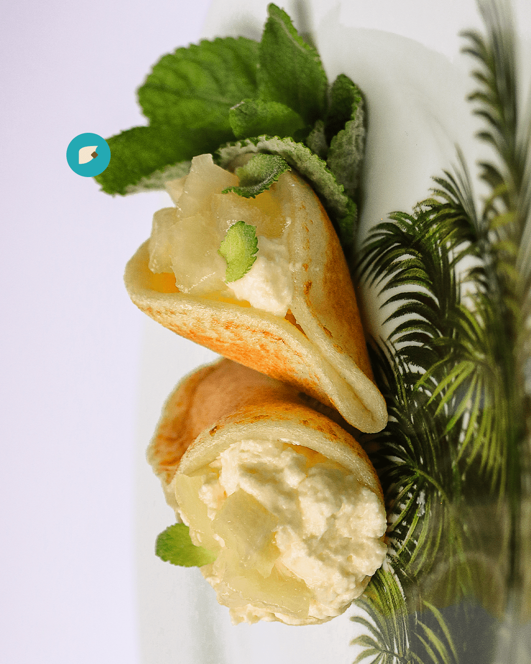
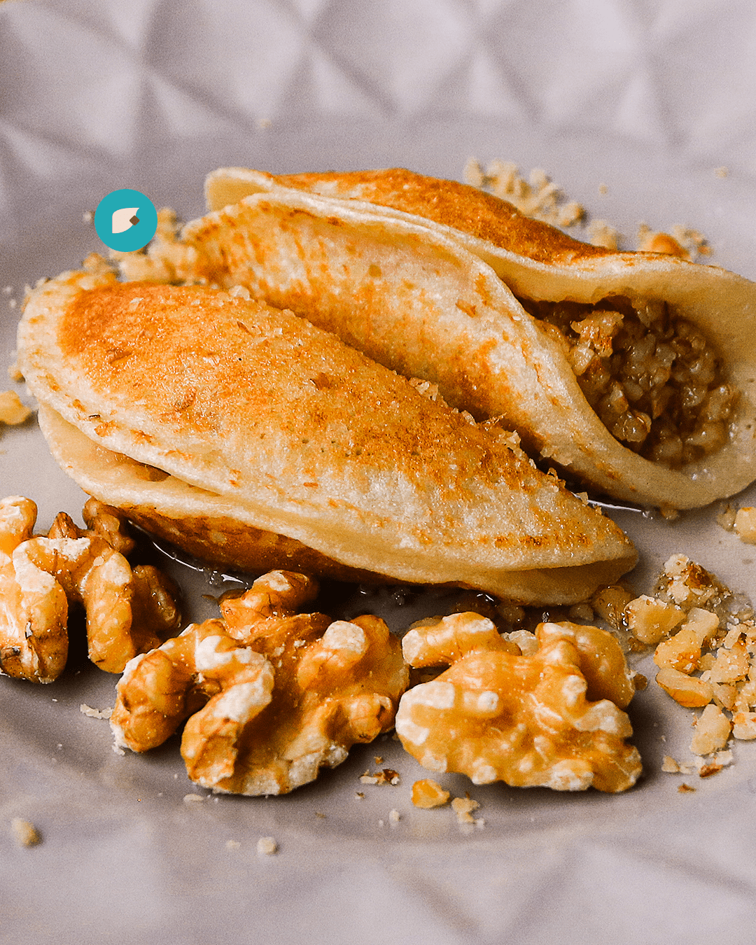
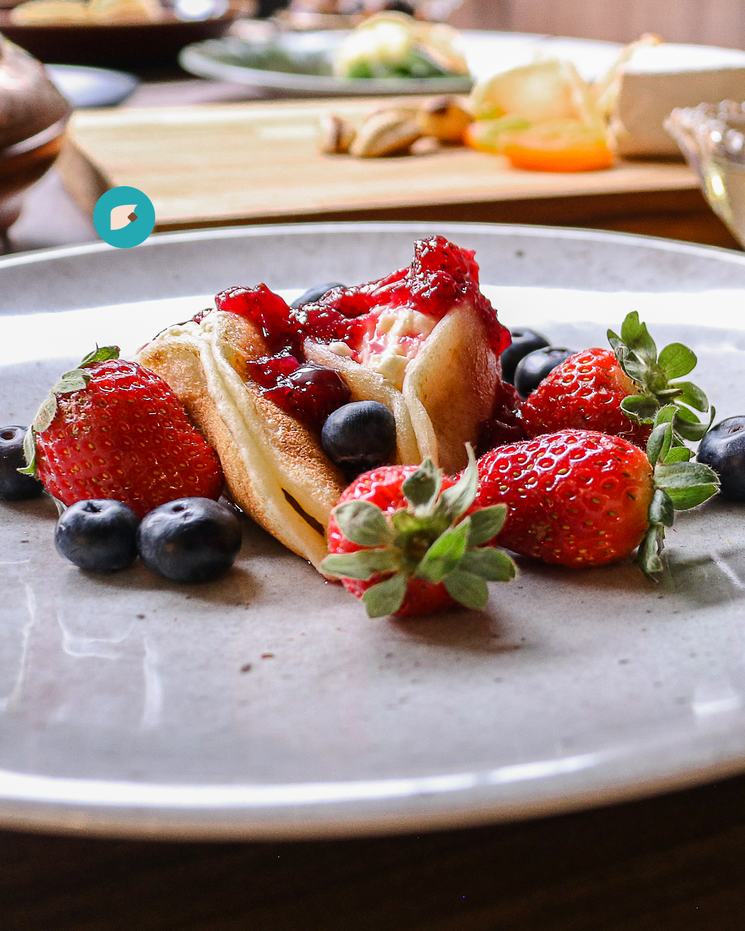
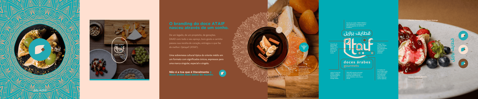
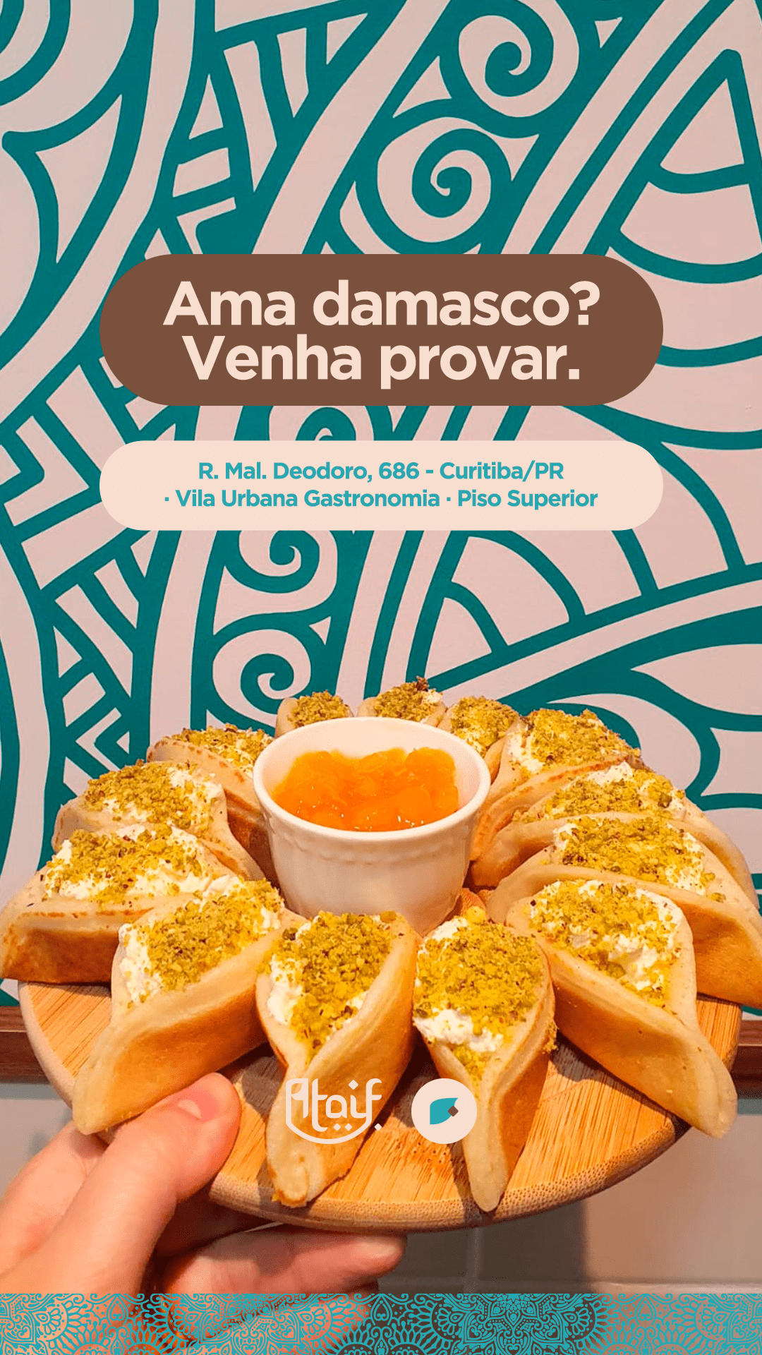
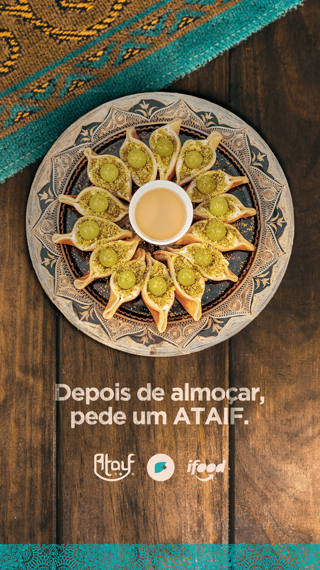
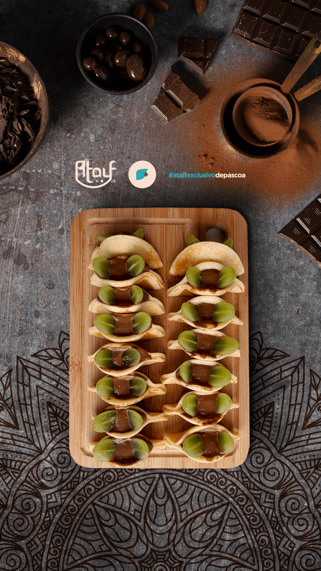
Cultural Insight & Naming: The name “ATAIF” derives from Qatayef. Historically, the sweet (a crescent-shaped stuffed pancake) is linked to generosity. The etymology refers to the action of “scooping up” or “gathering”.
Core Concept: “A generous act of gathering.” The brand doesn’t just sell sweets; it sells the warmth of Arab culture.
Visual Identity Construction
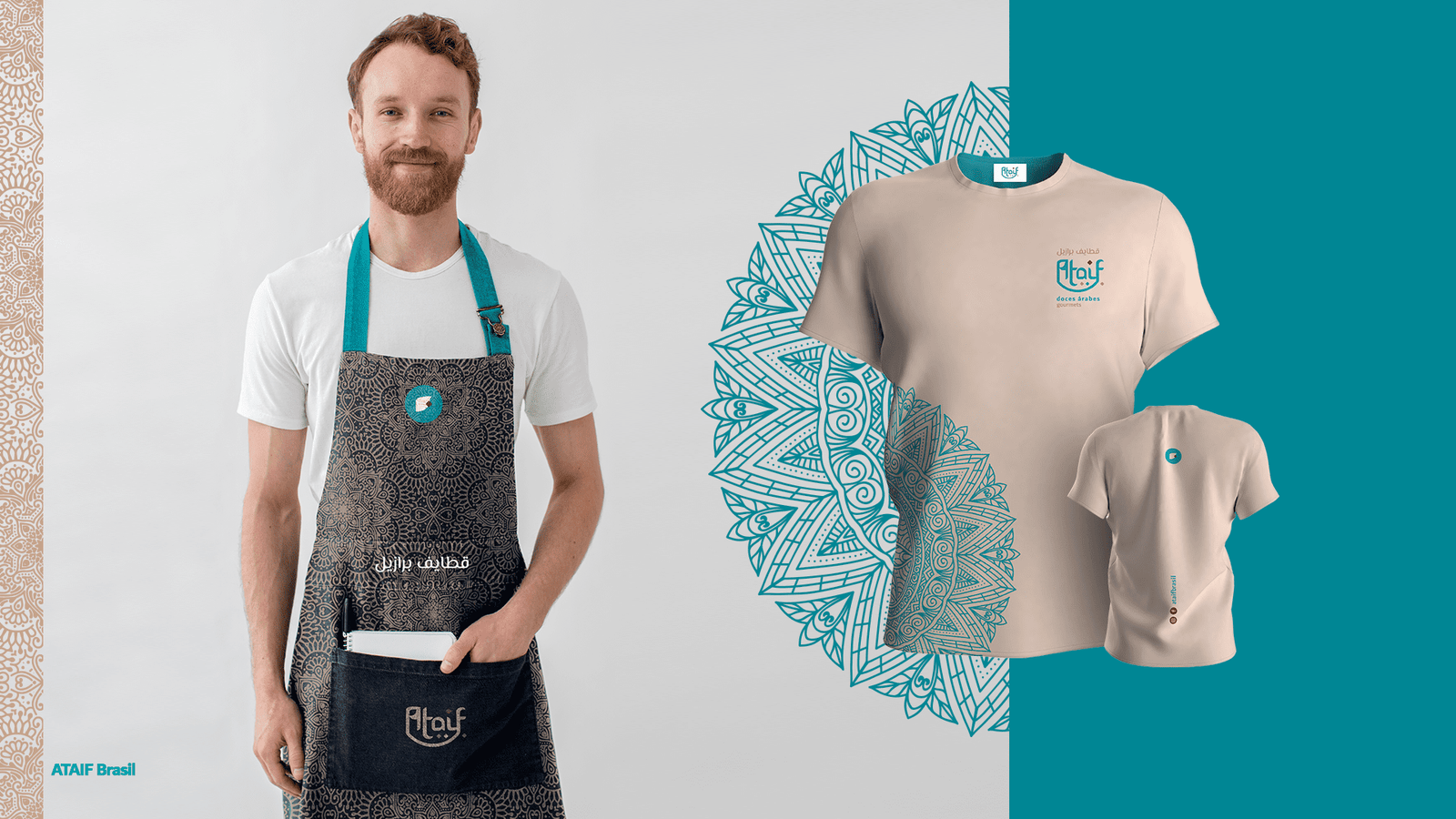
We developed a visual system that bridges Arabic calligraphy with Western readability:
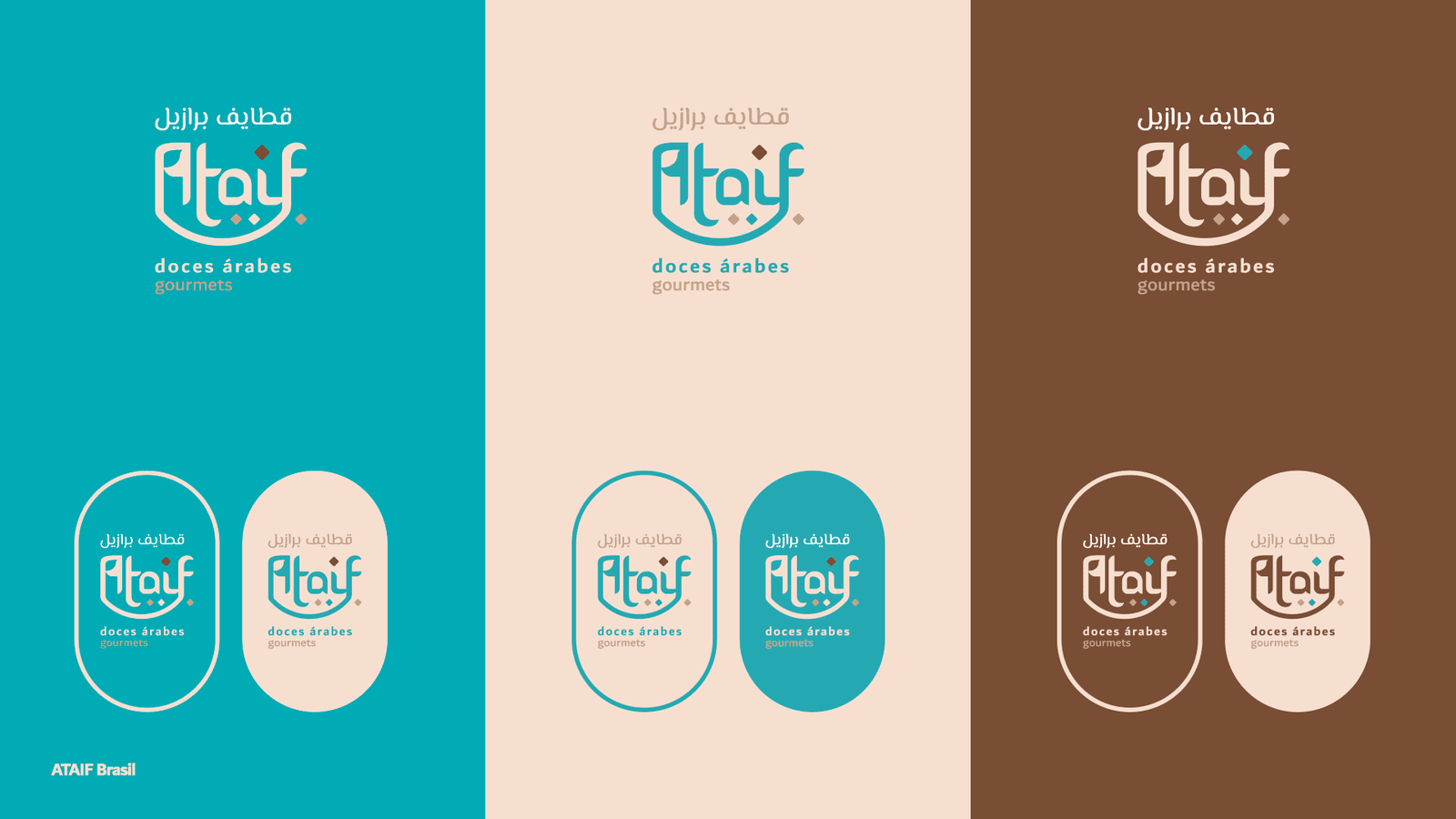
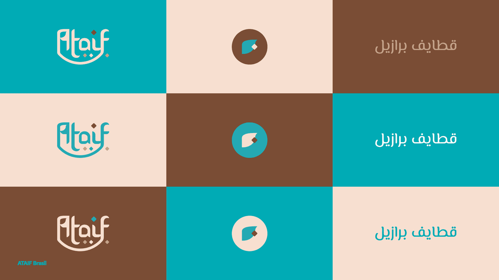
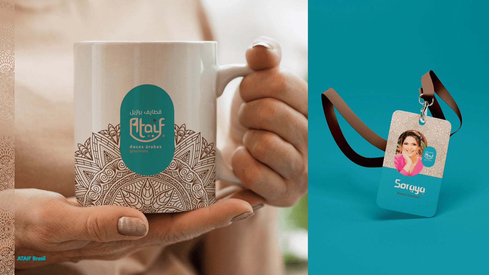
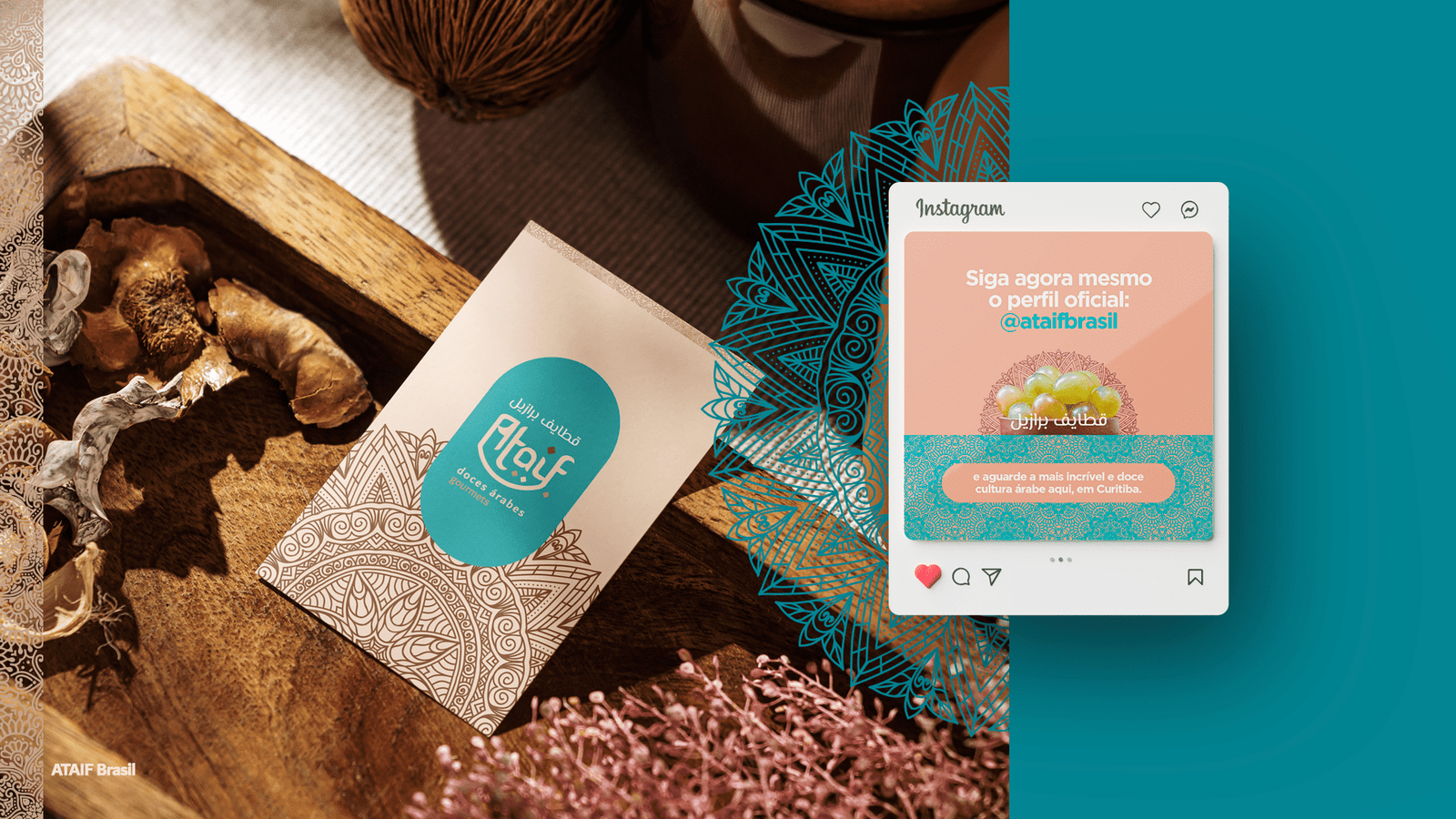
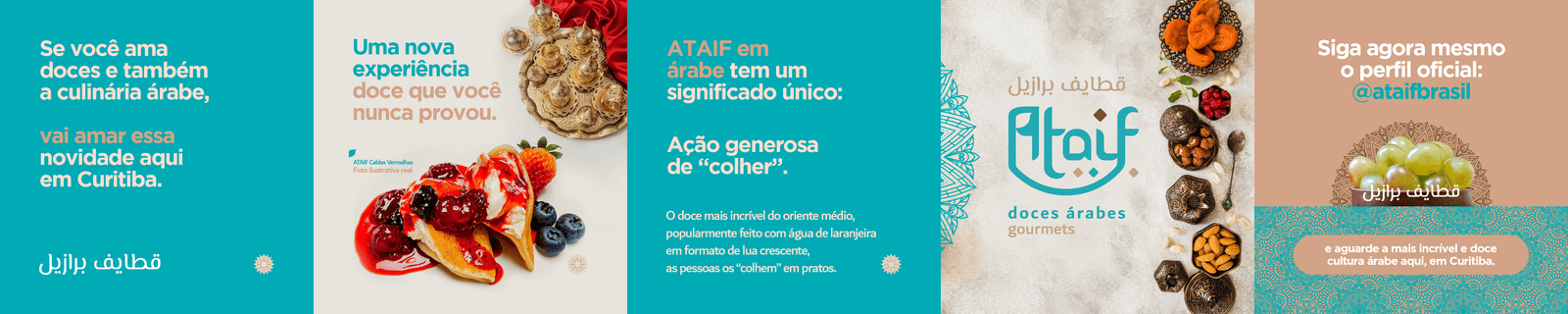
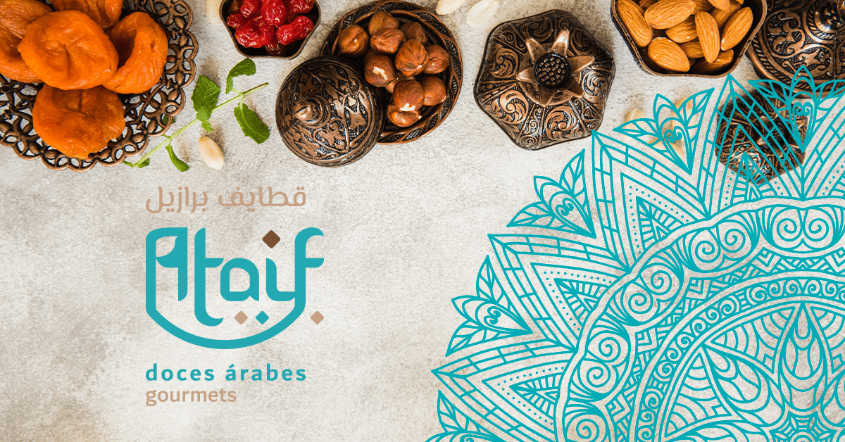
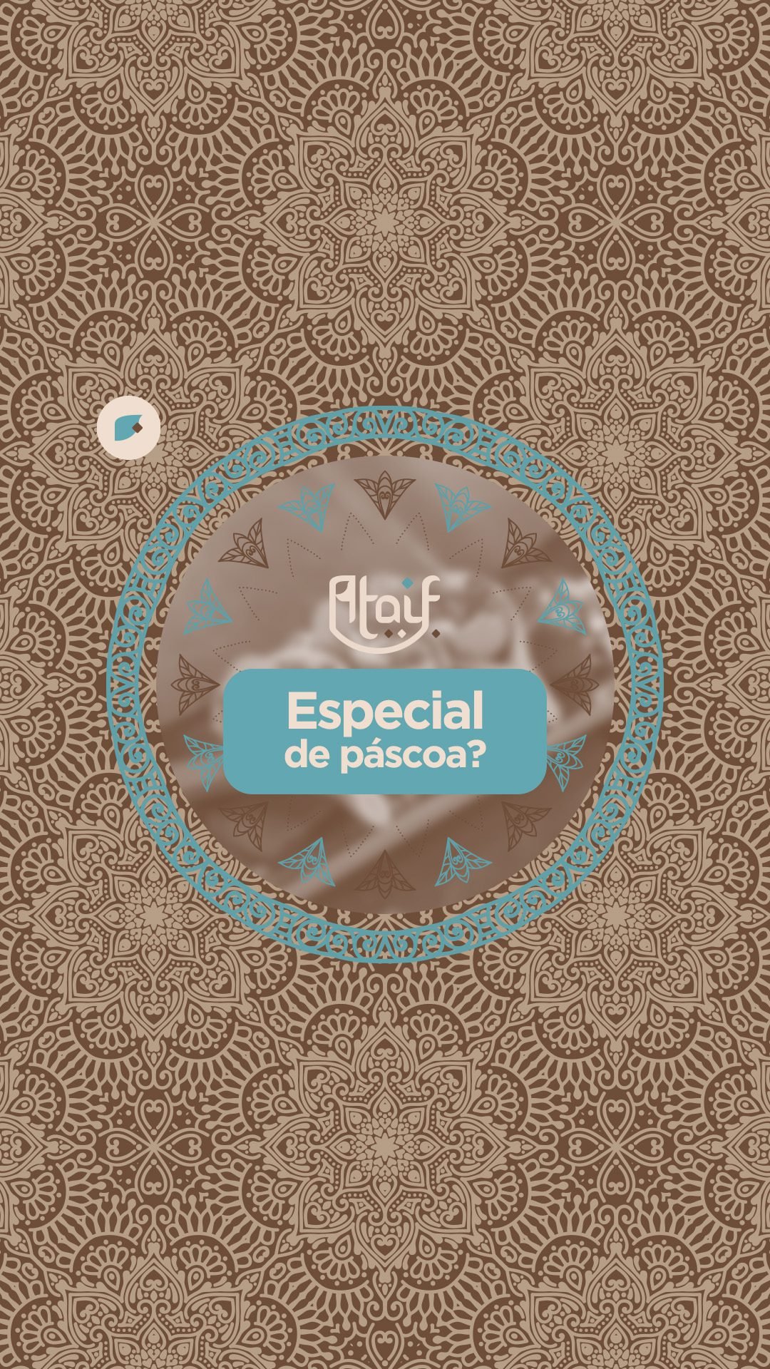
Hybrid Logo: Custom lettering designed to evoke the strokes of the Arabic alphabet (fluid lettering) while maintaining clear legibility. The shape mimics the crescent curve of the pastry.
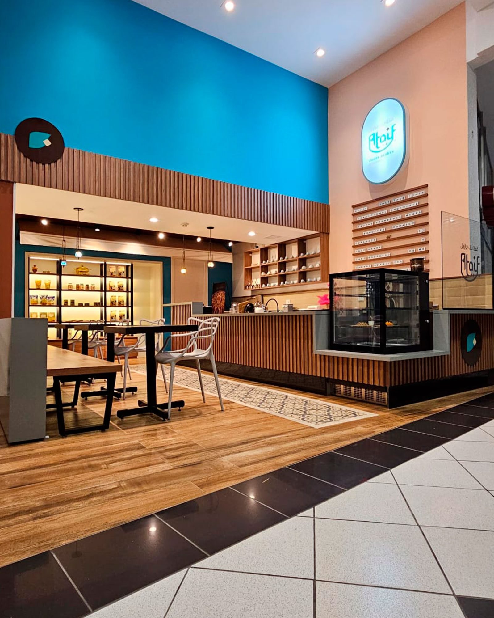
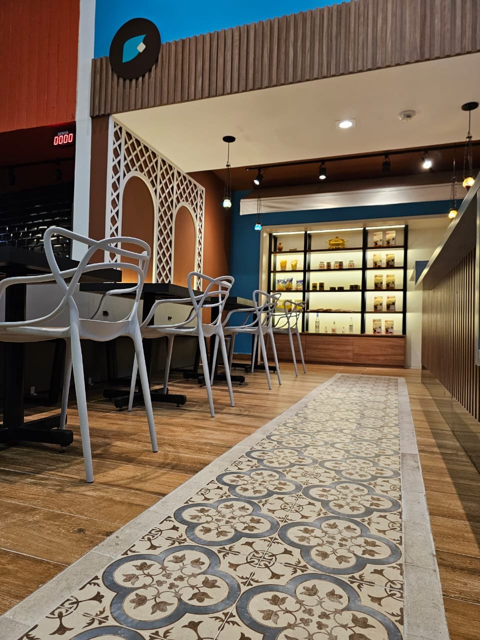
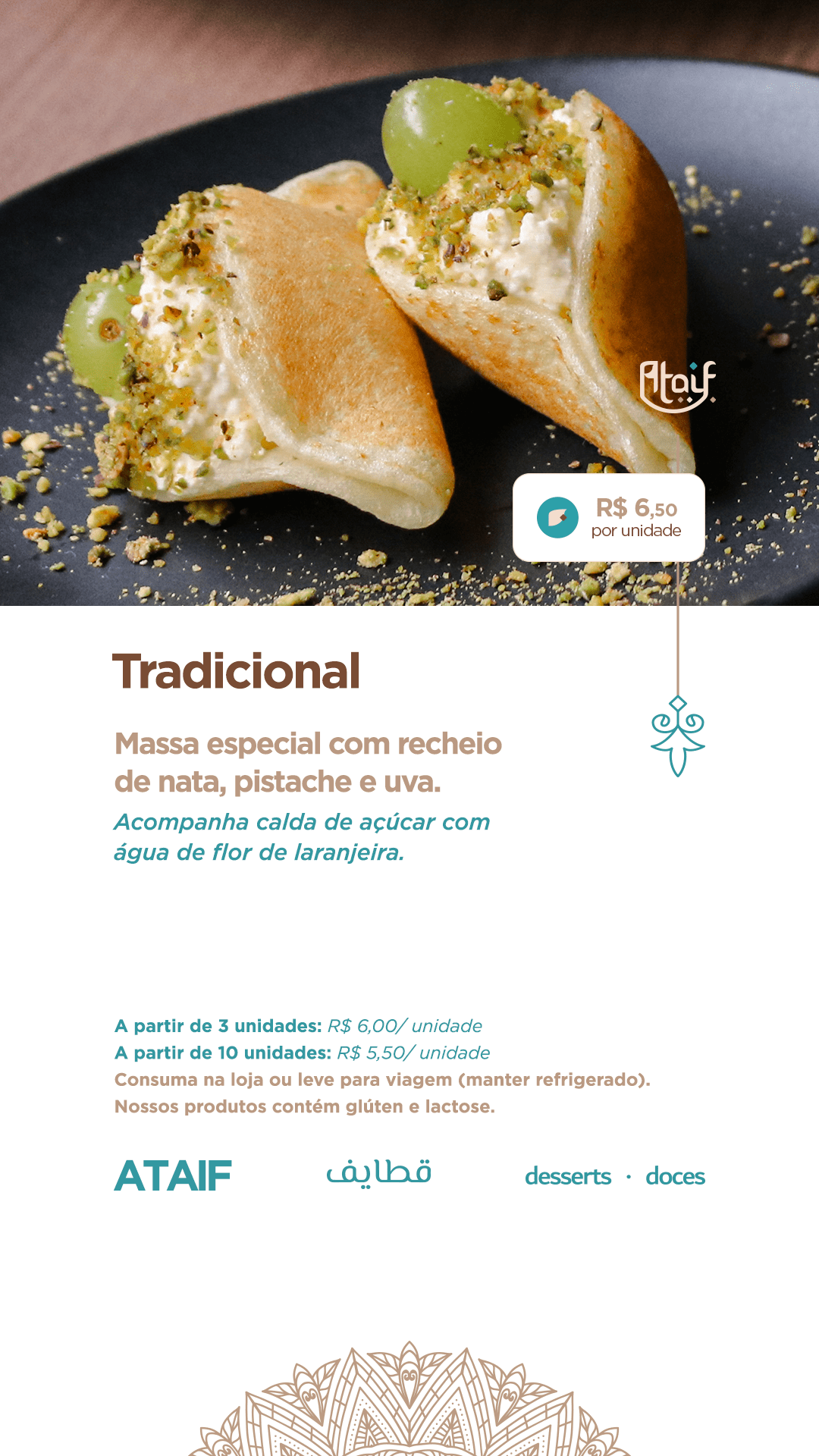
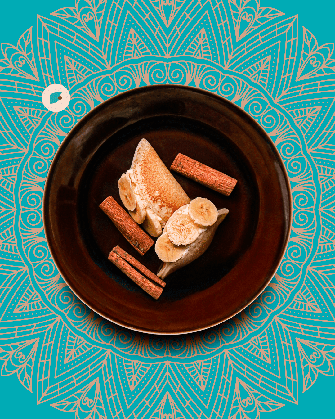
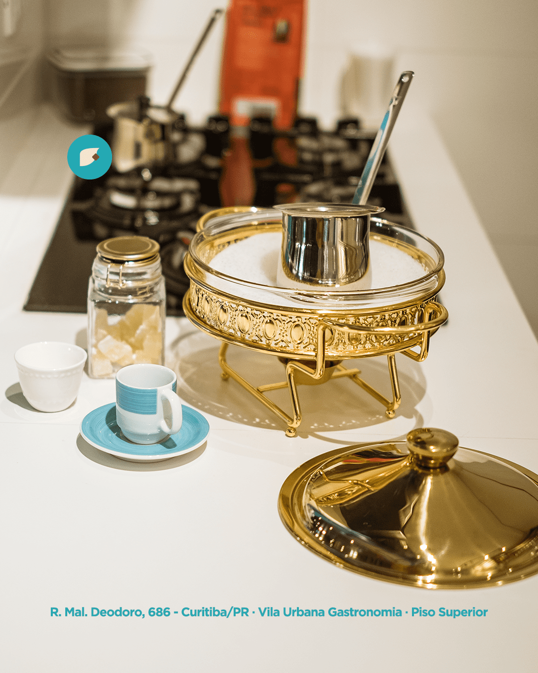
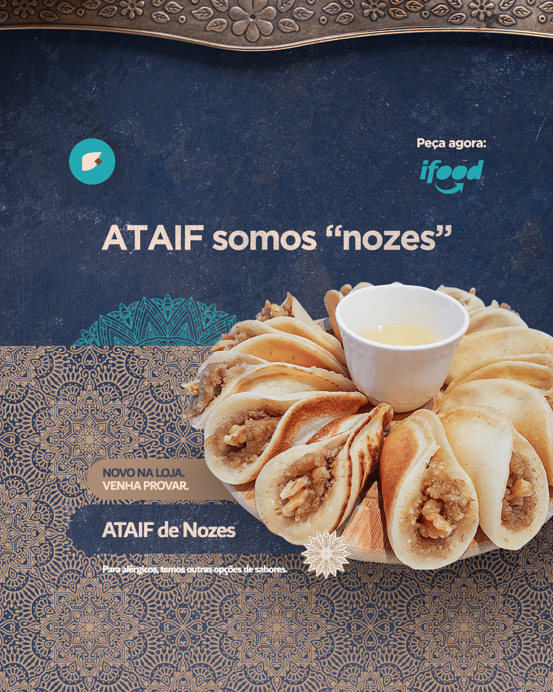
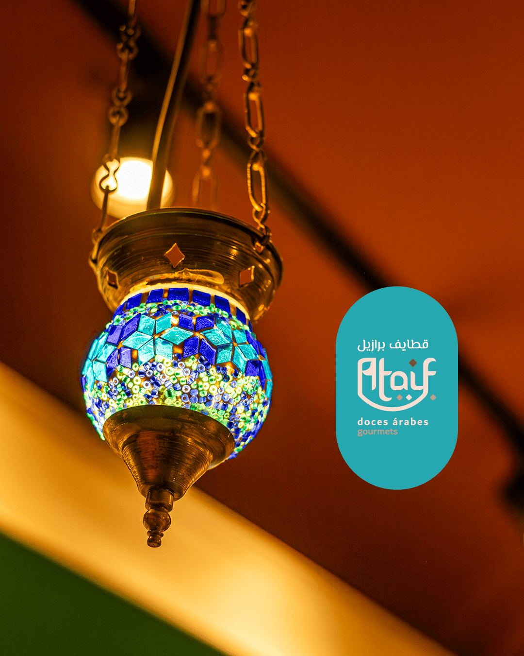
Color Palette (Flavor & Origin): Shades of Turquoise (Pantone 7710 C), representing Middle Eastern architecture, combined with earthy and cream tones that stimulate appetite.
Retail Design & Product Expansion
The brand’s versatility allowed for its application in two distinct business models, supporting the menu’s evolution:
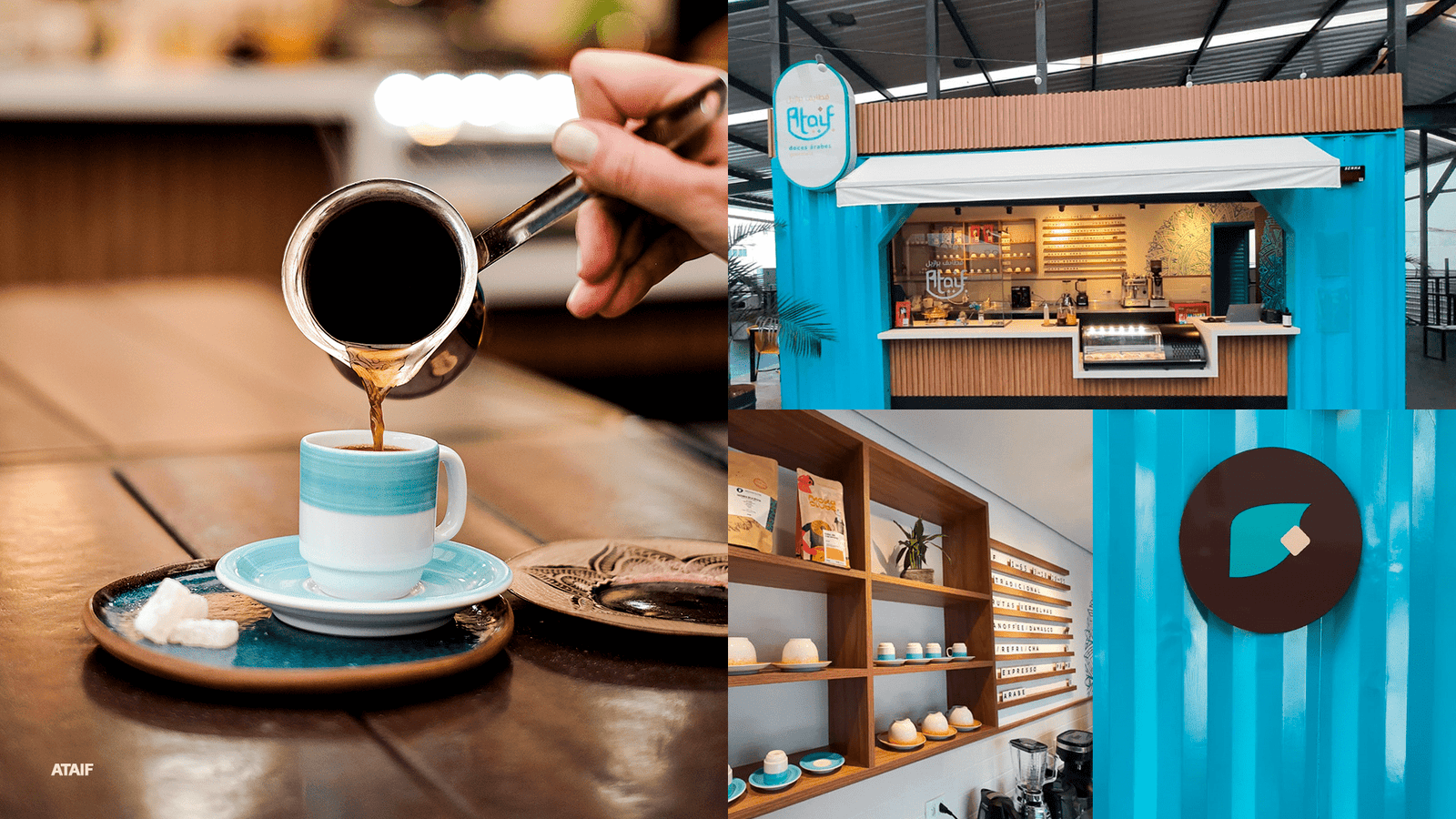
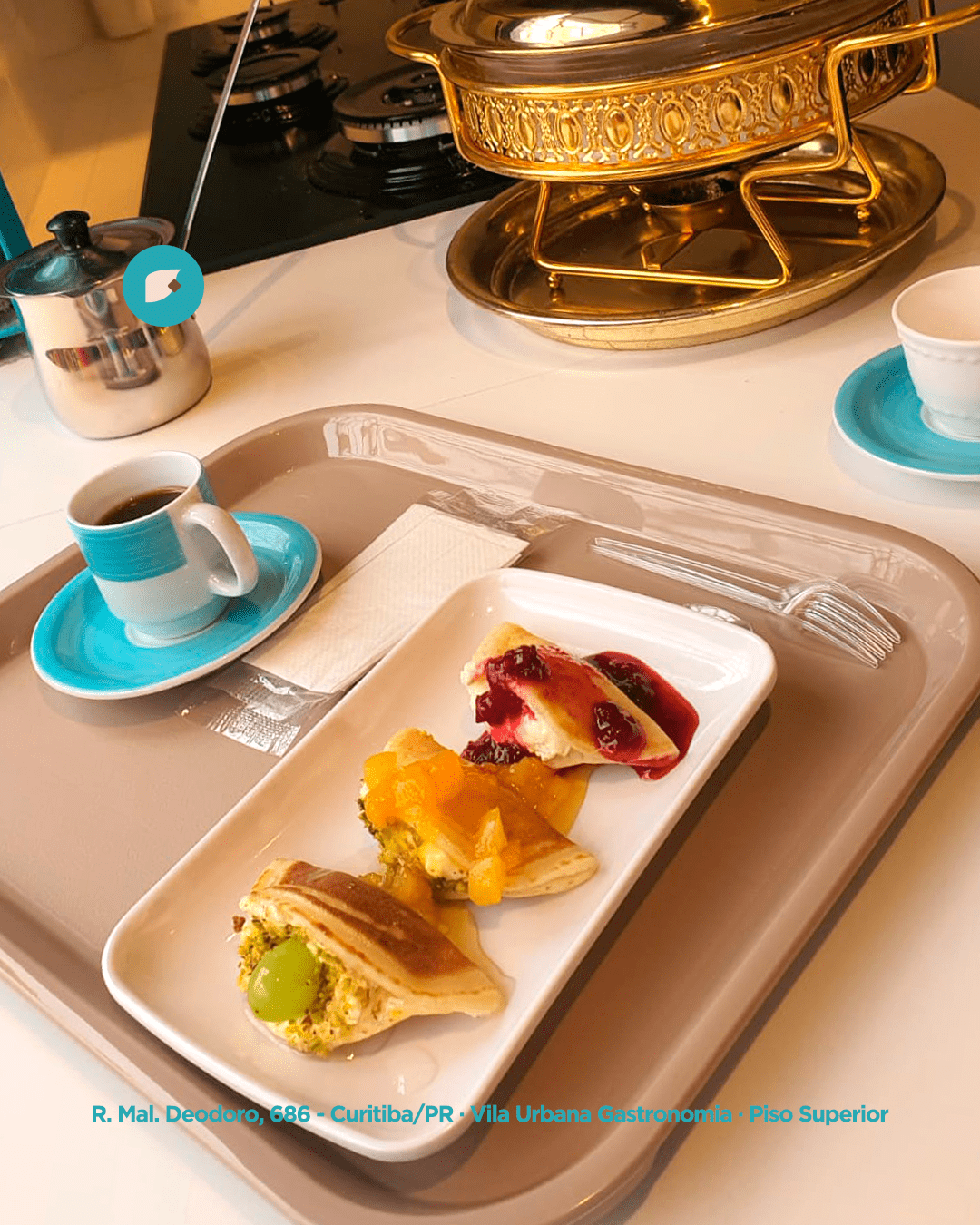
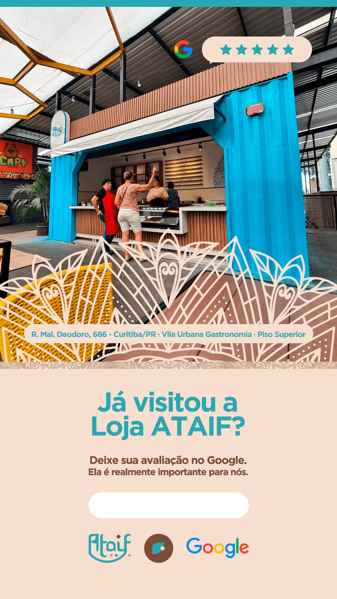
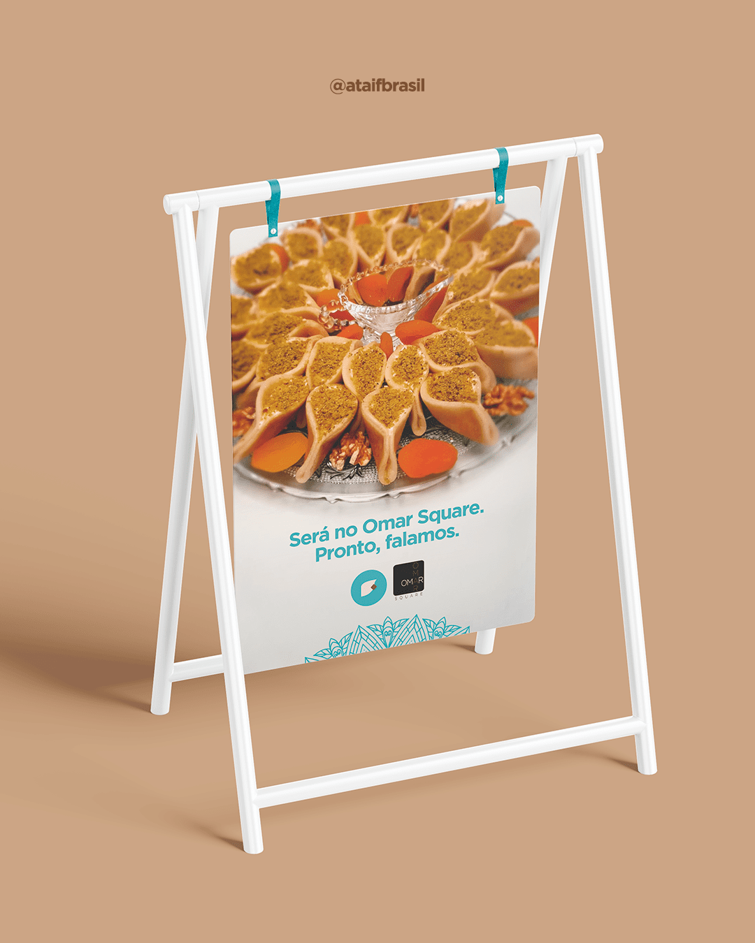
The Container Model (Vila Urbana): Focused on Grab & Go and high visibility. The turquoise structure acts as a “3D billboard,” attracting curious customers to try the flagship product (the Ataif sweet) quickly.
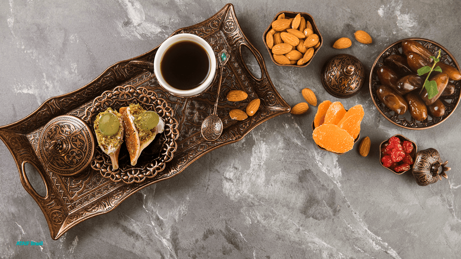
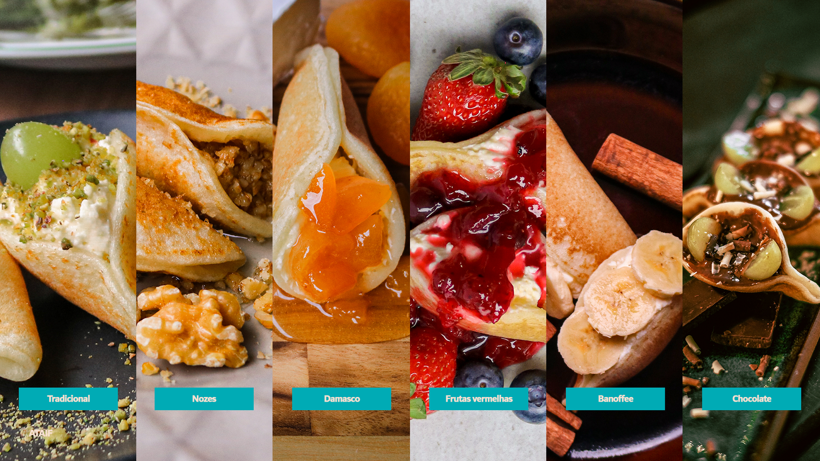
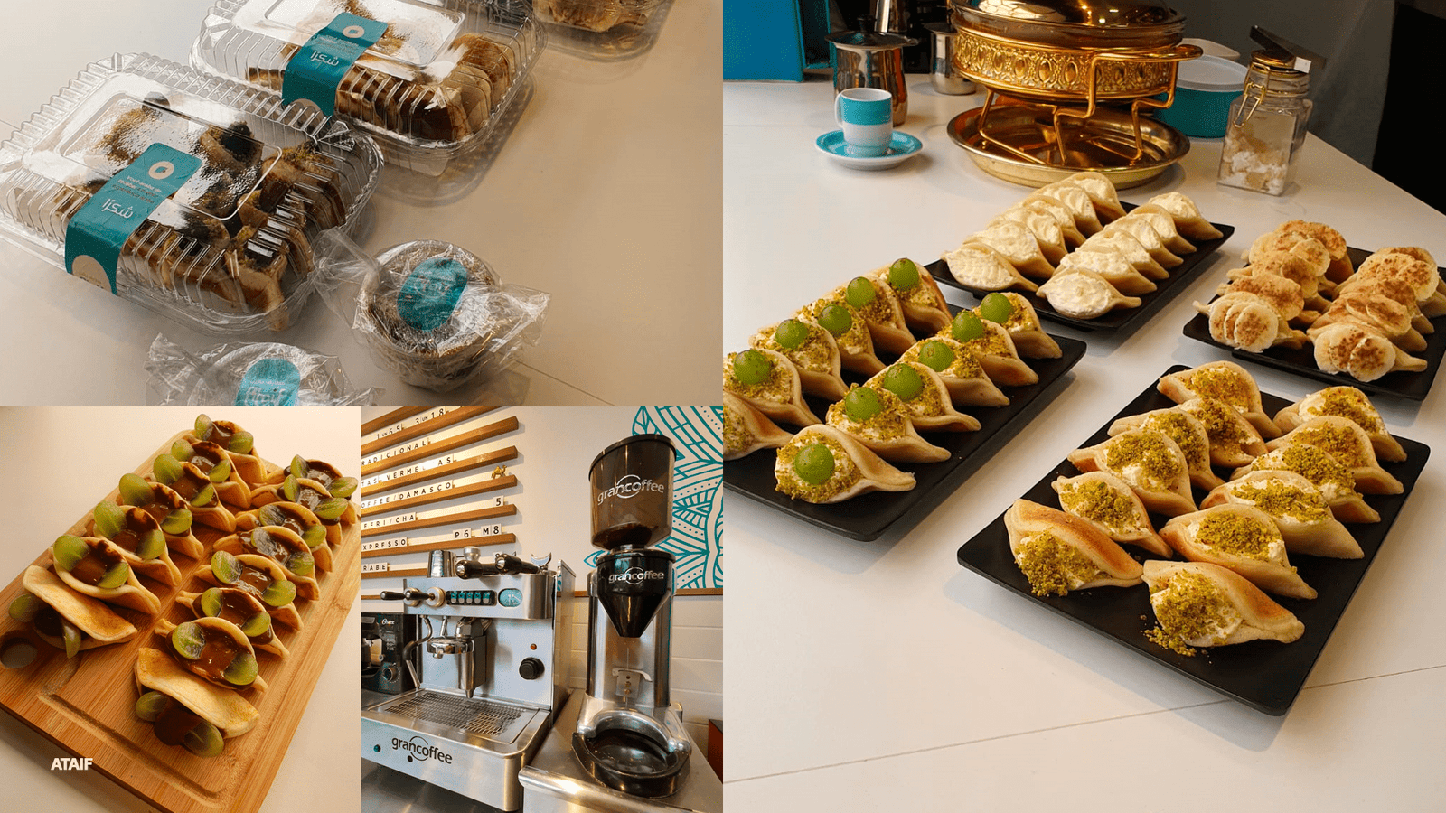
The Emporium & Restaurant Model (Shopping Omar): This marked the brand’s consolidation. At the physical store in Shopping Omar, the visual identity embraced the portfolio expansion. The space was designed to house not just a sweet shop, but a Full Emporium featuring savory Arab dishes, artisanal ice creams, and imported goods. The interior design, using light wood and warm lighting, organizes this complex product mix without visual clutter, creating a complete cultural immersion experience.
Content Strategy (Visual Funnel)
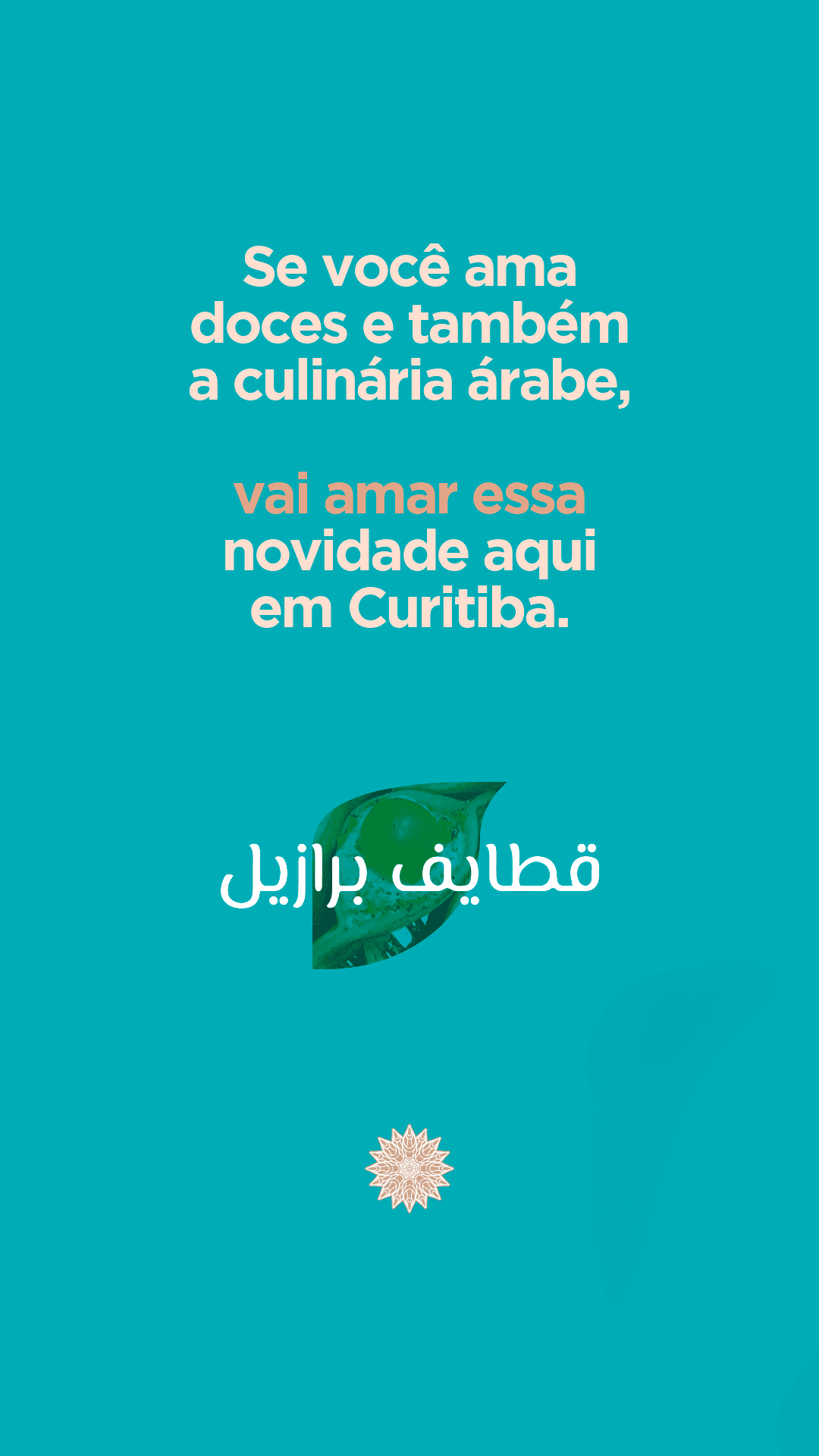
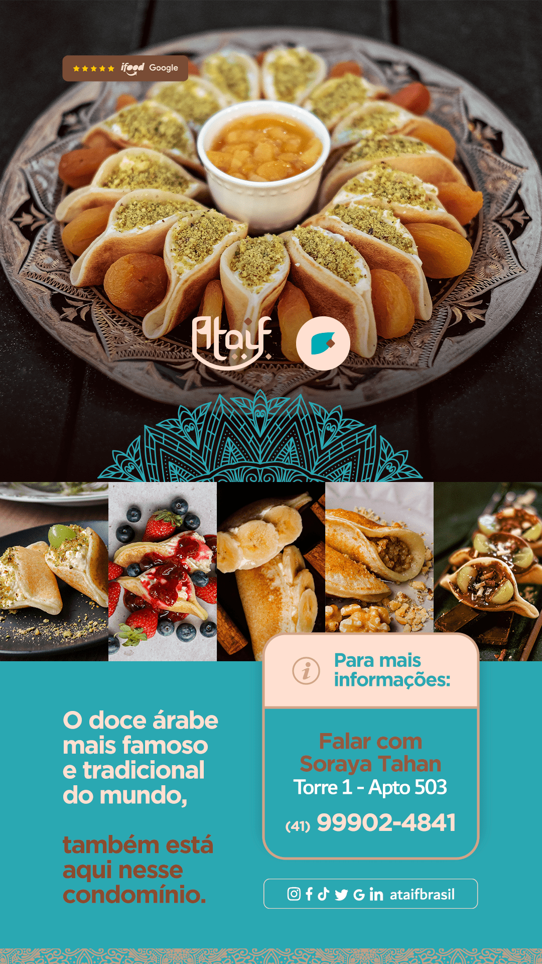
Education: Posts explaining “What is Ataif?” to break down the barrier of the unknown.
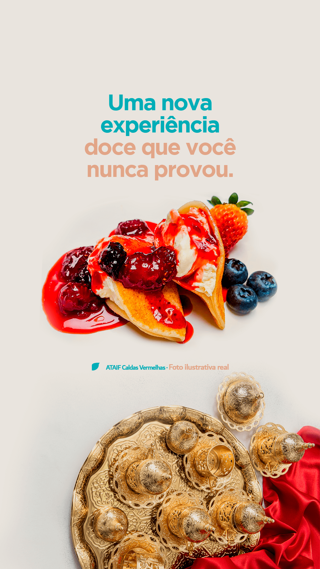
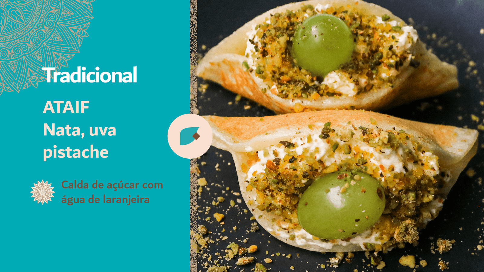
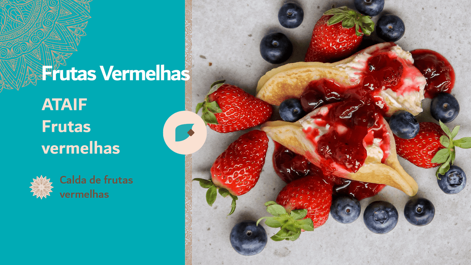
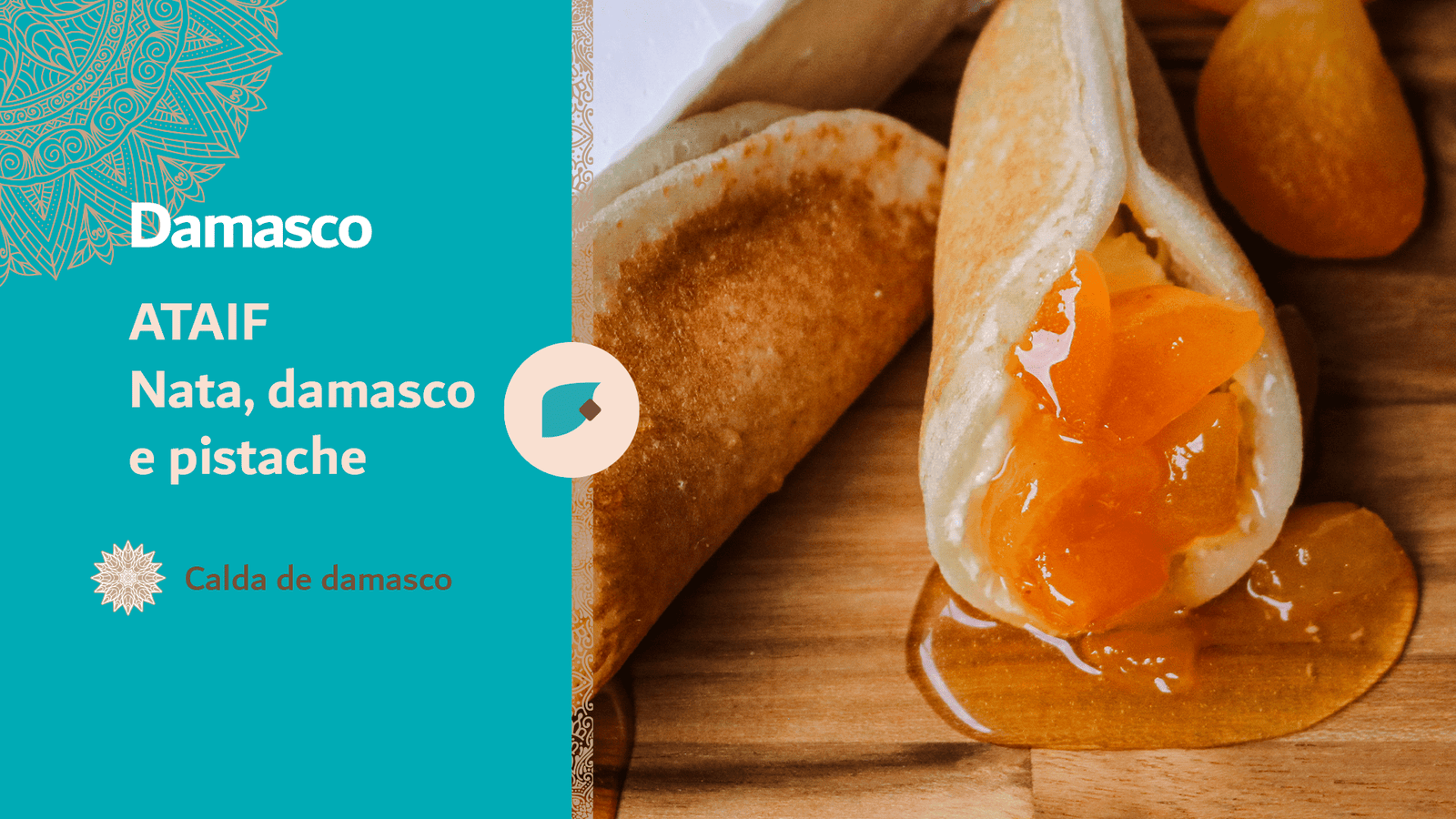
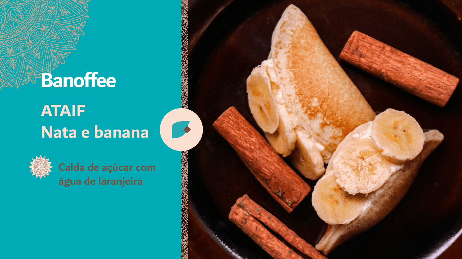
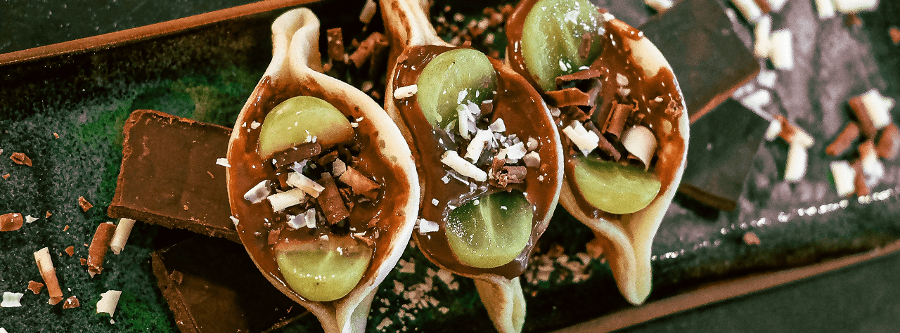
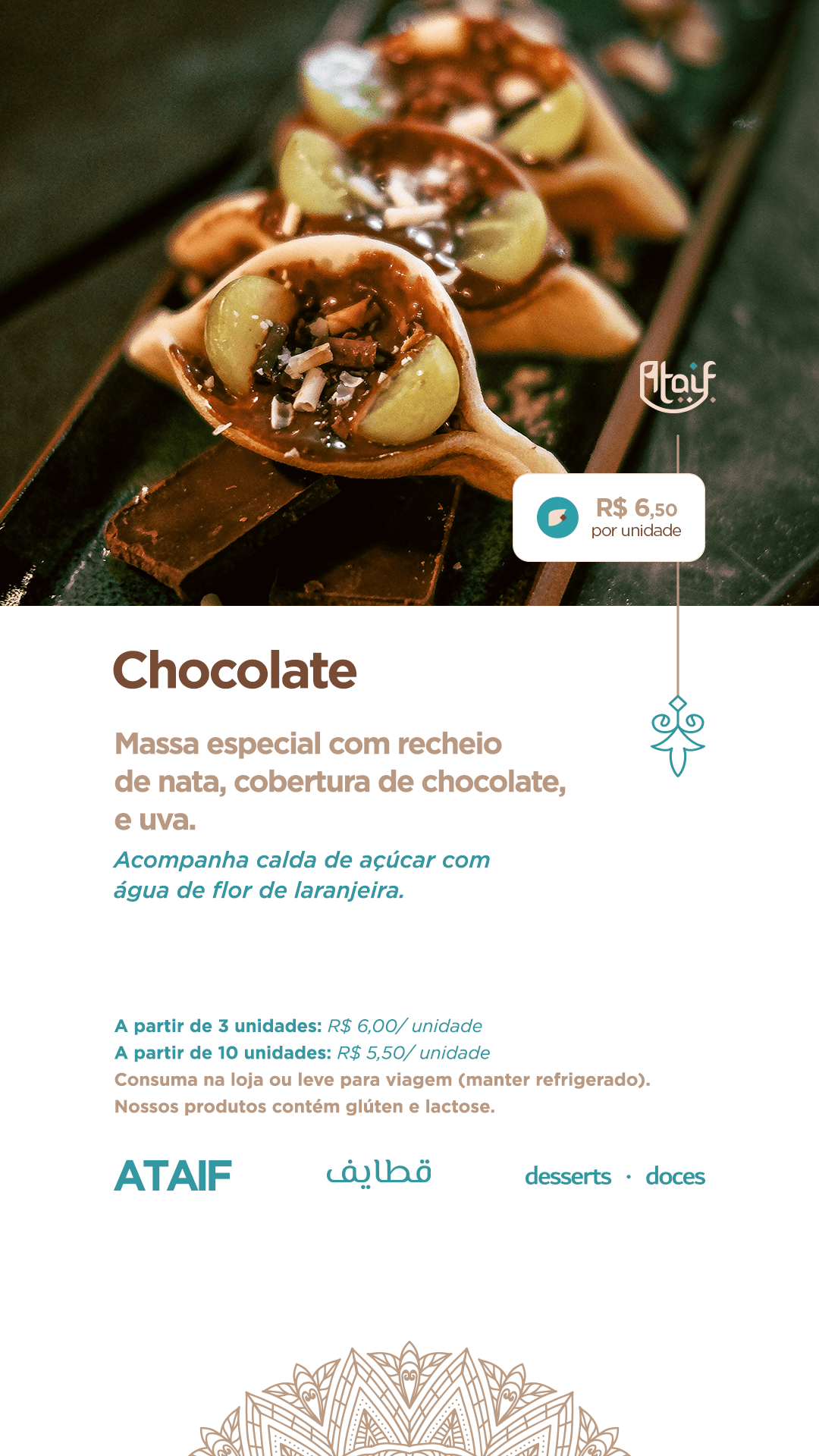
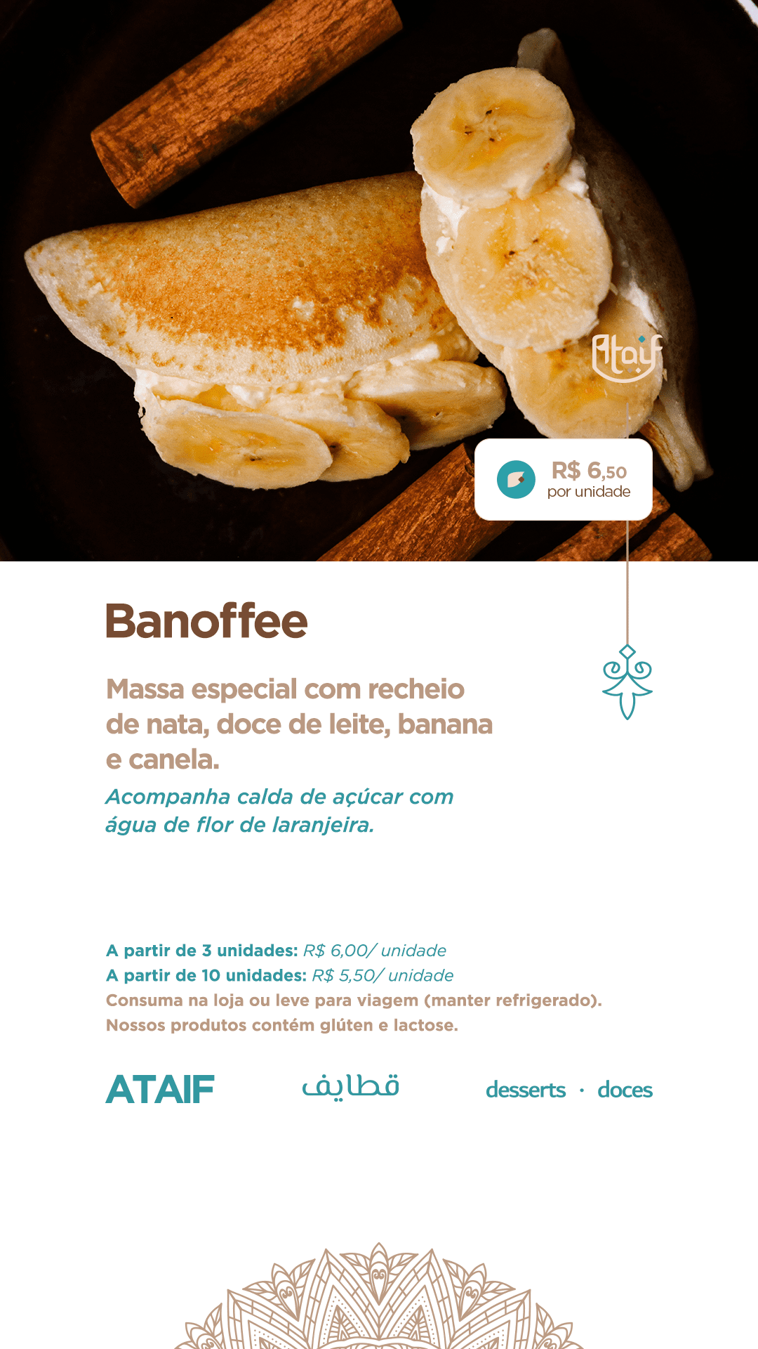
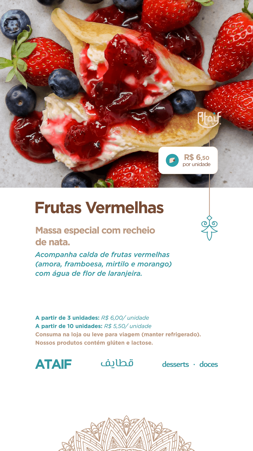
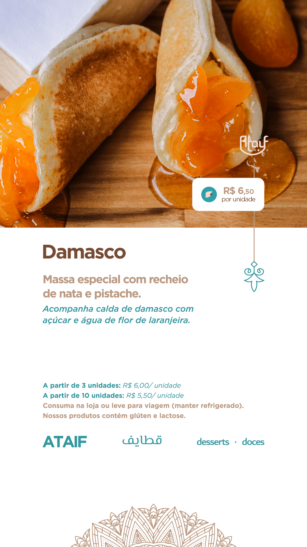
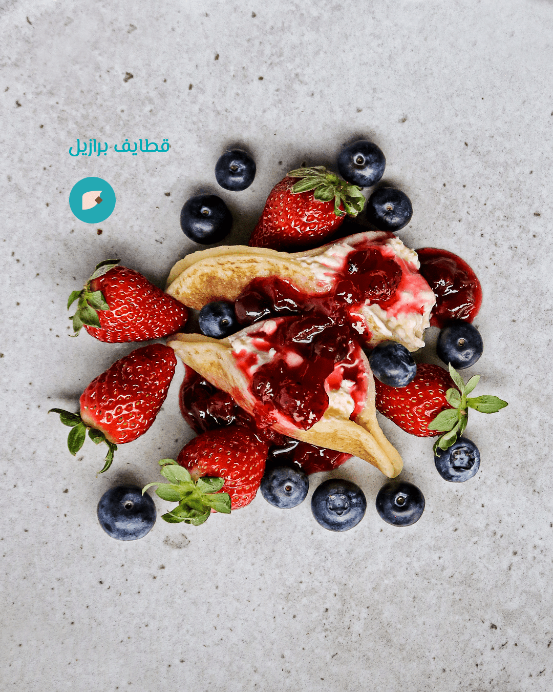
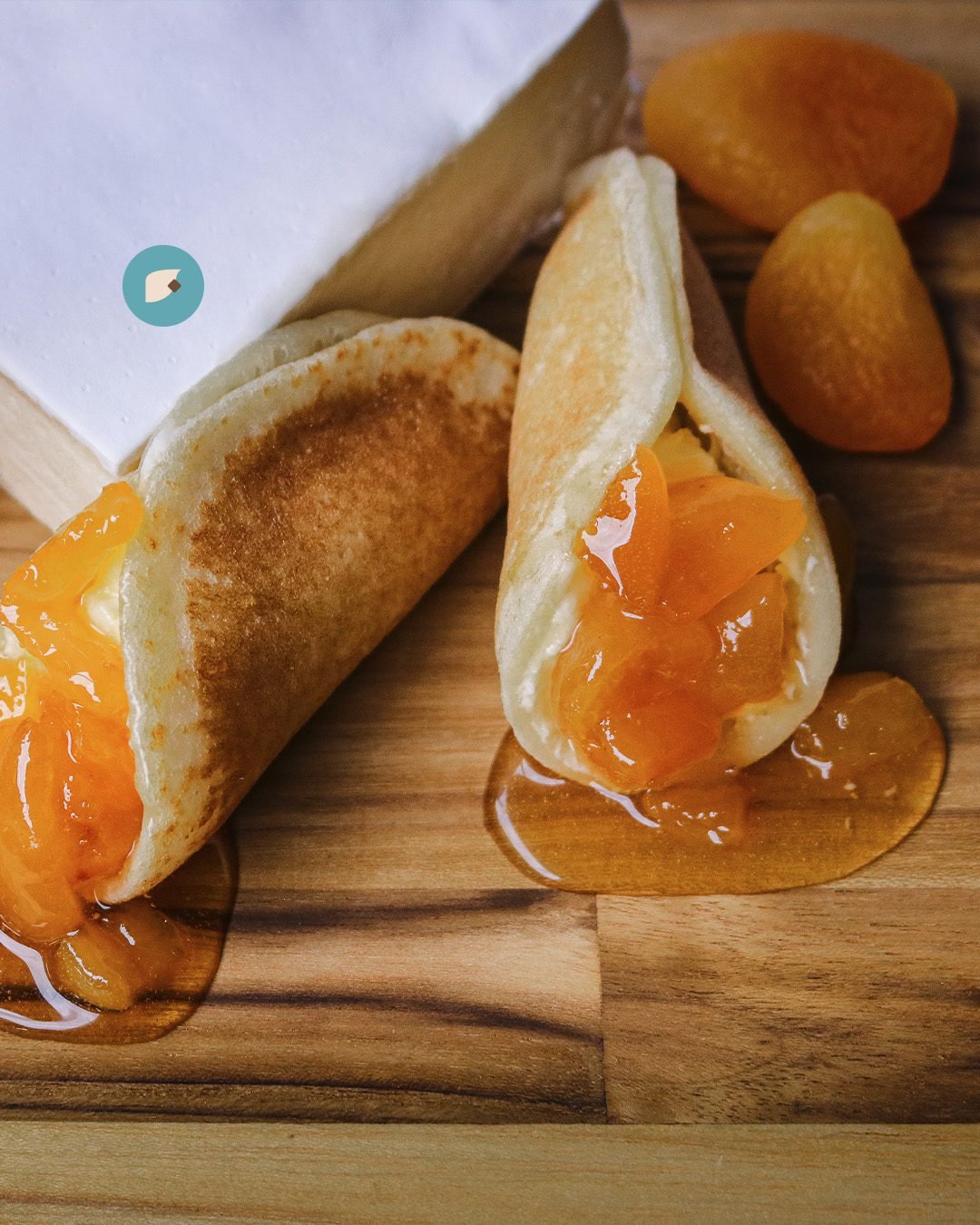
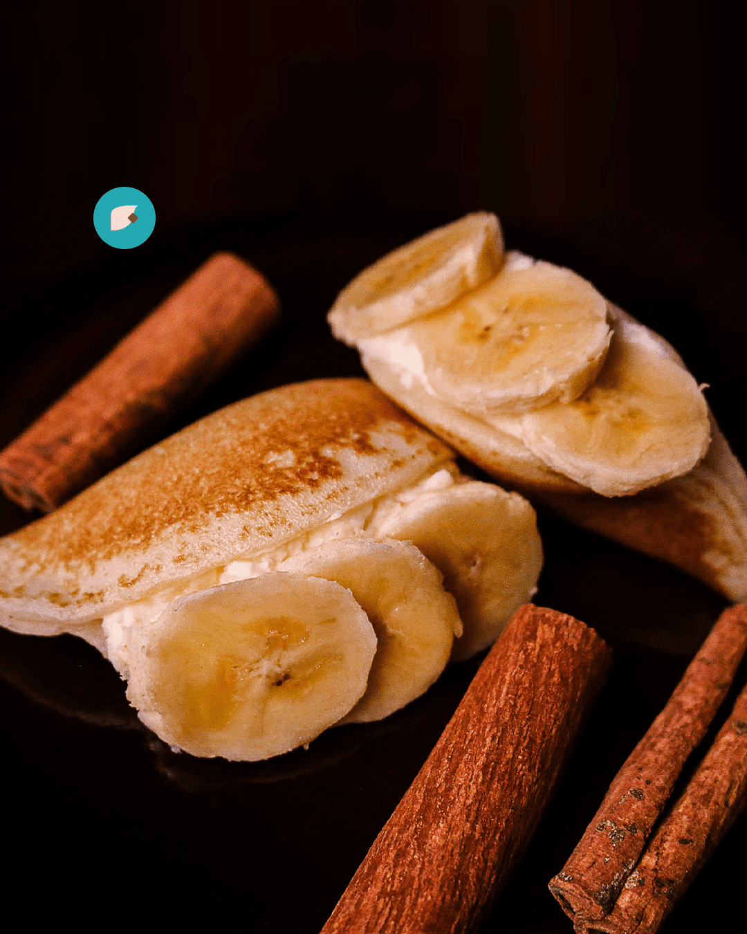
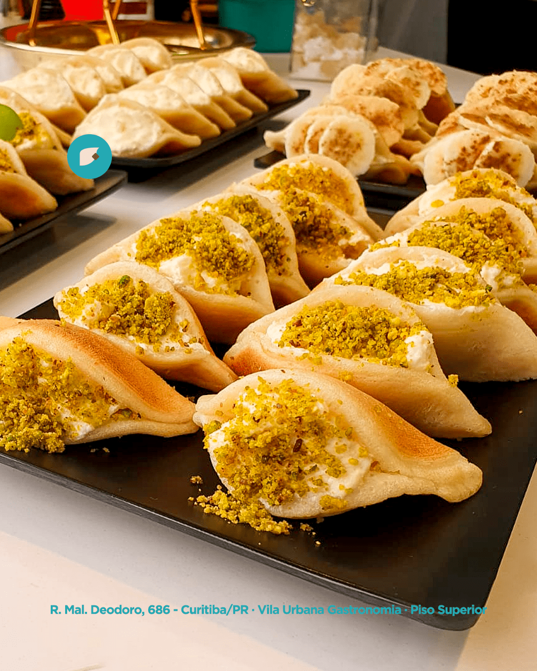
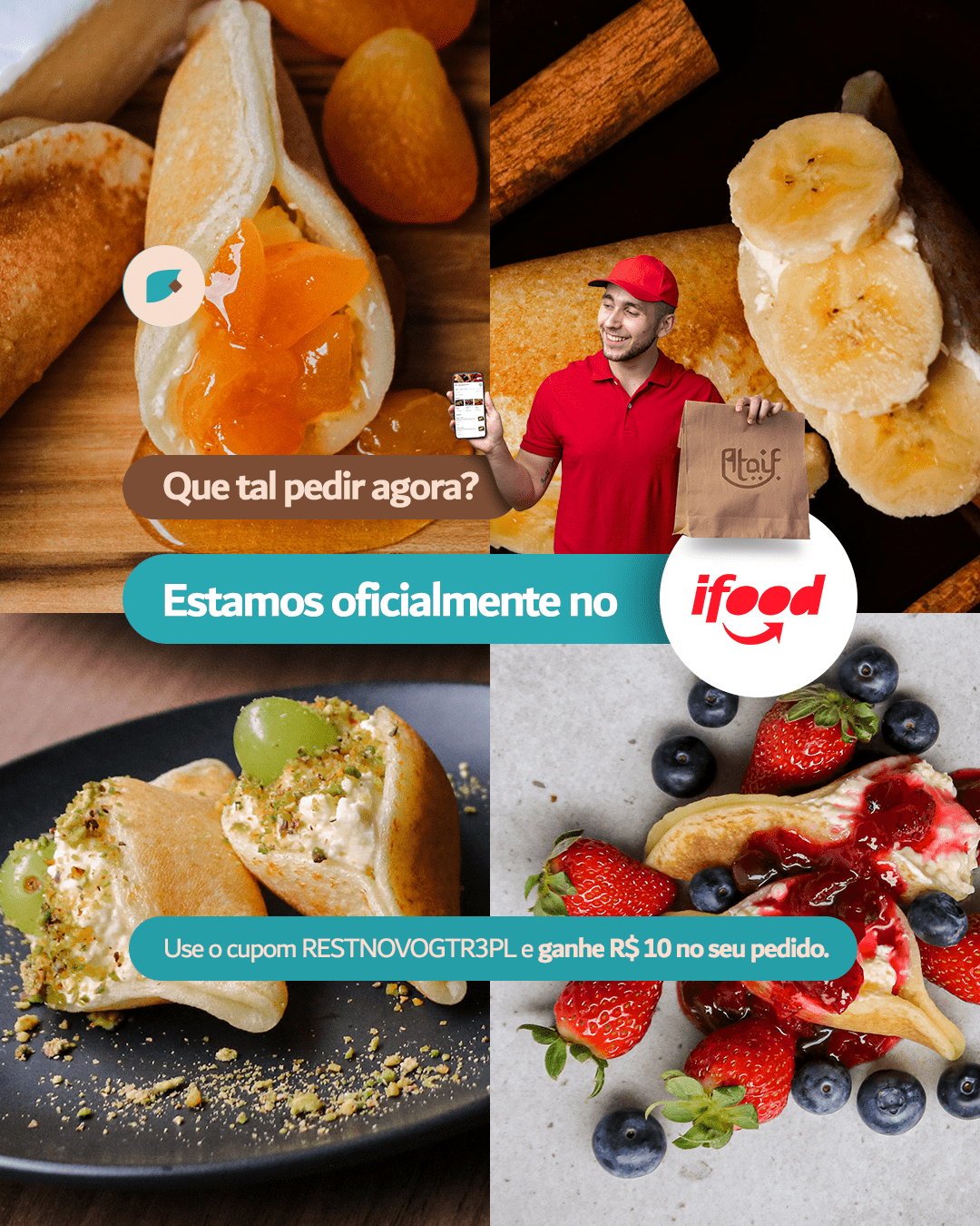
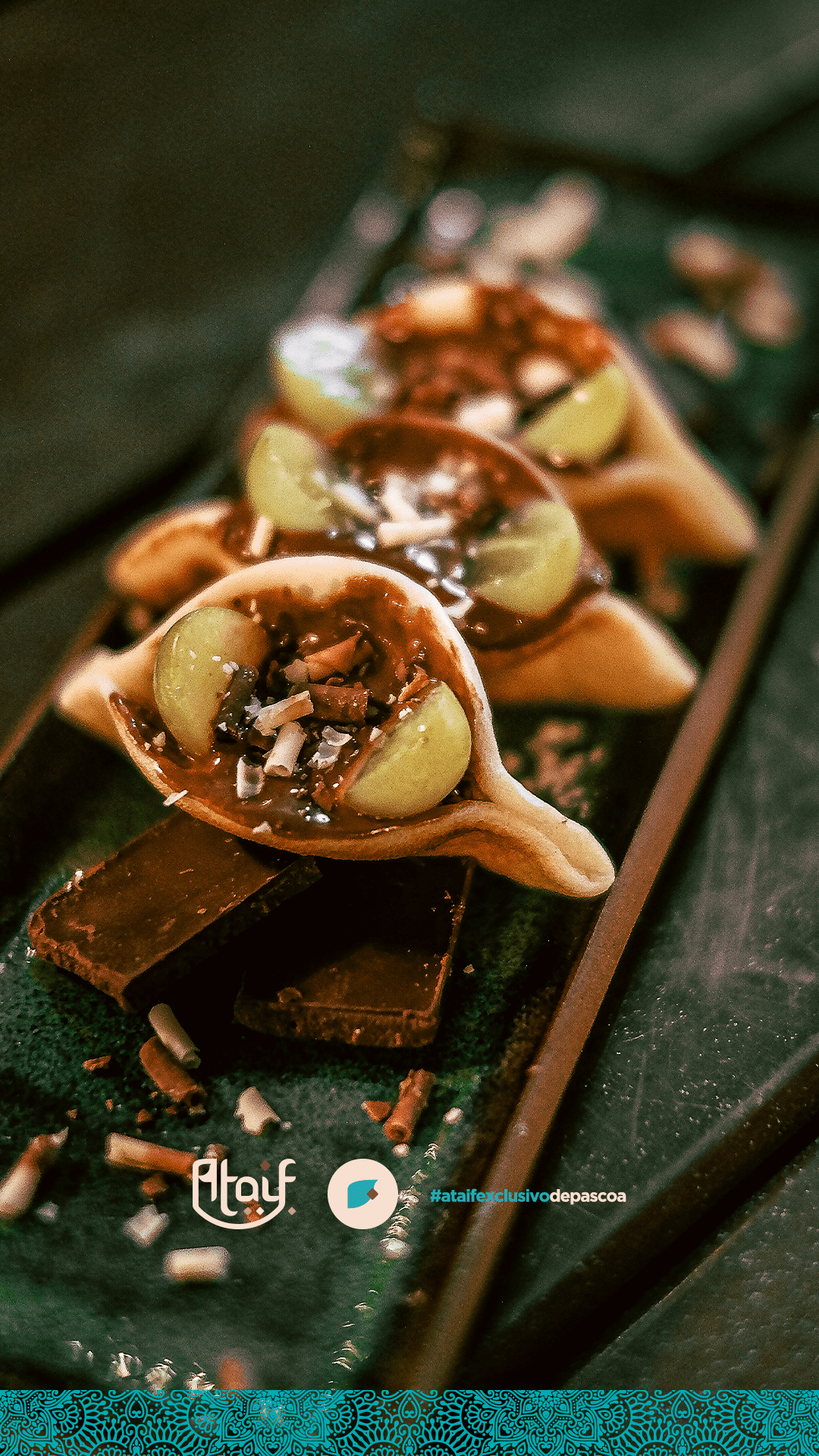
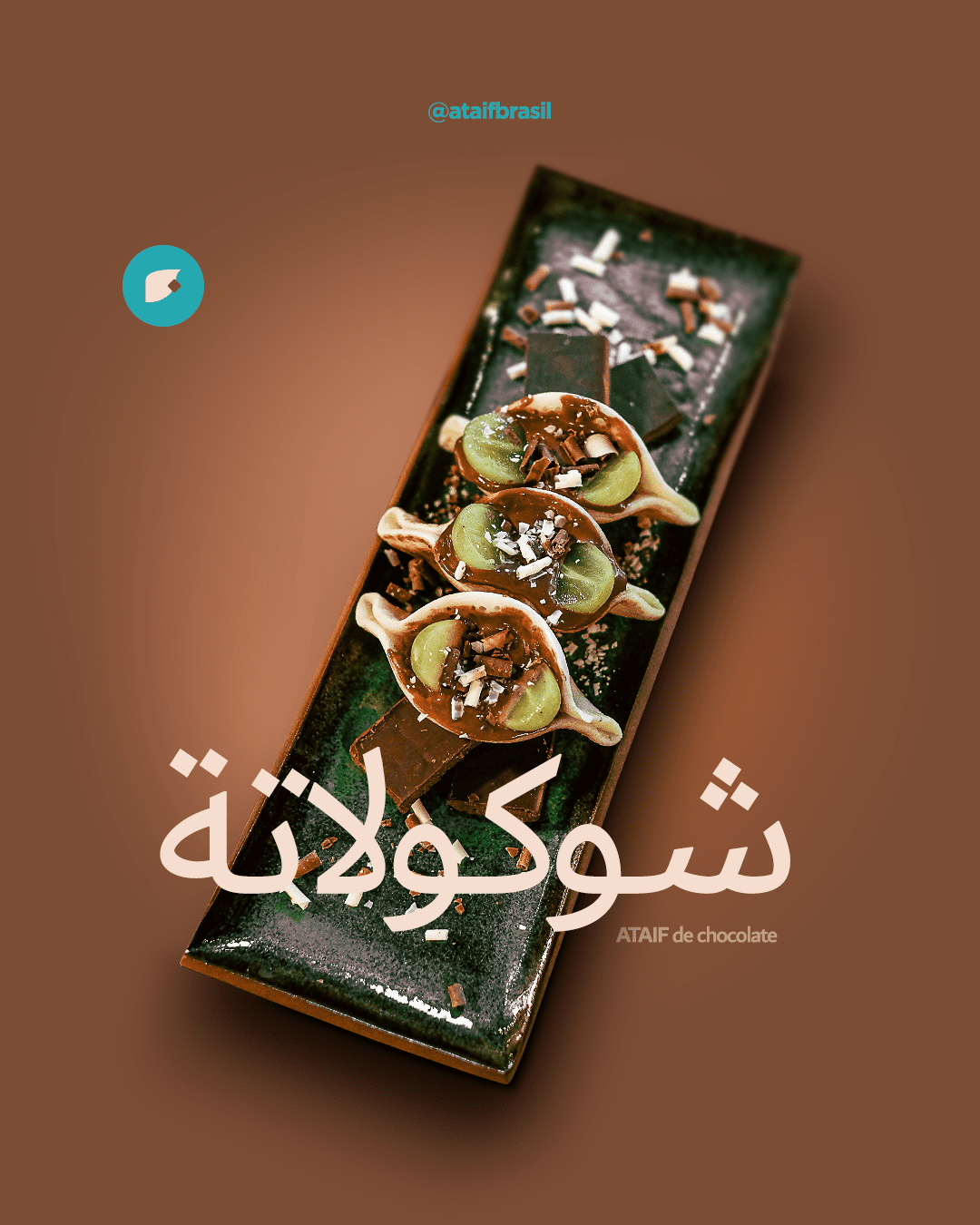
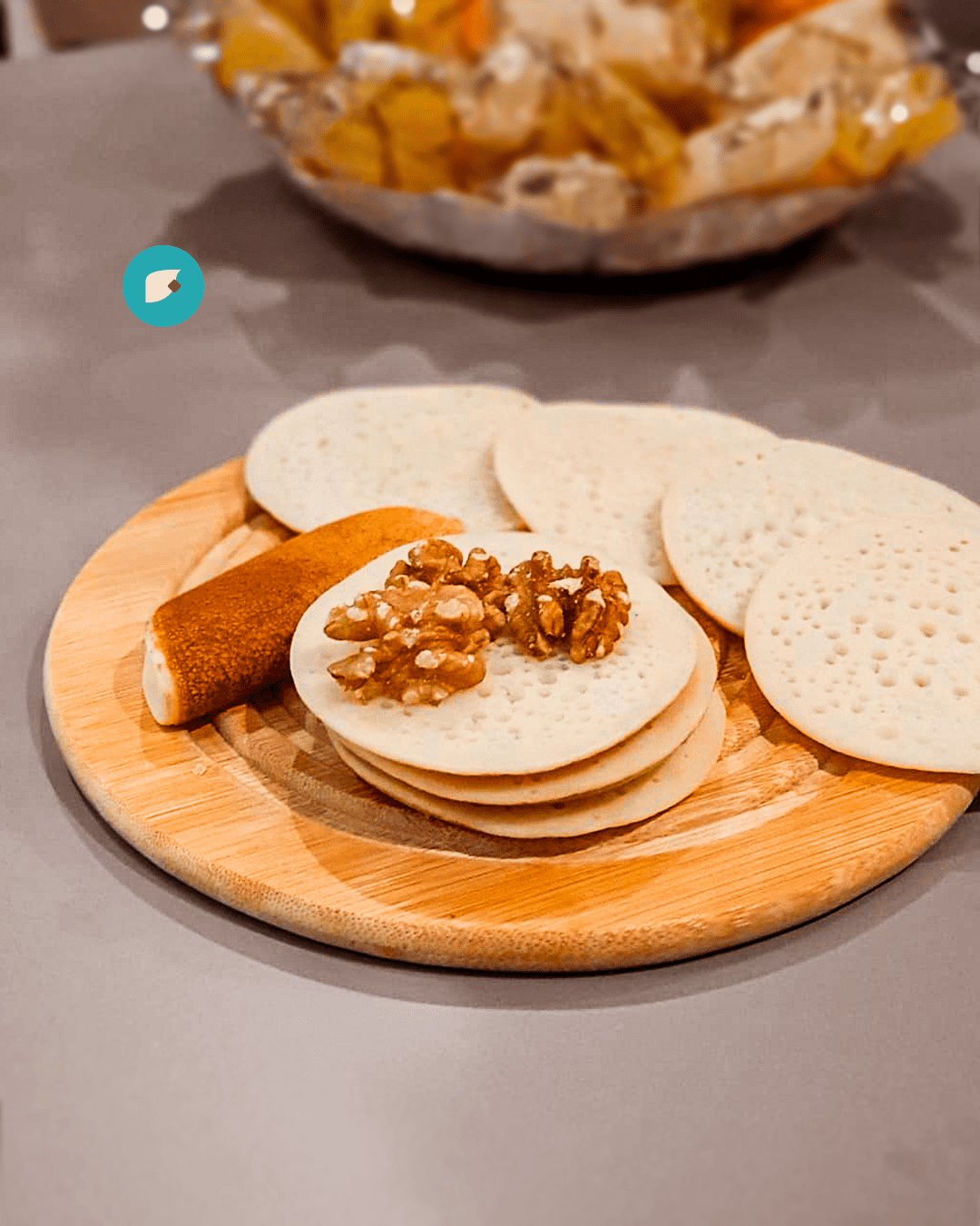
Desire (Food Porn): Macro photography focusing on textures (syrups, pistachio, fillings) to trigger visual hunger and highlight the quality of the emporium’s ingredients.
The Result
ATAIF evolved from a single-product sweet shop into a respected gastronomic complex at Shopping Omar. The visual identity proved to be timeless and elastic, supporting the brand’s growth into new categories (restaurant and emporium) while maintaining the sophistication of the launch.