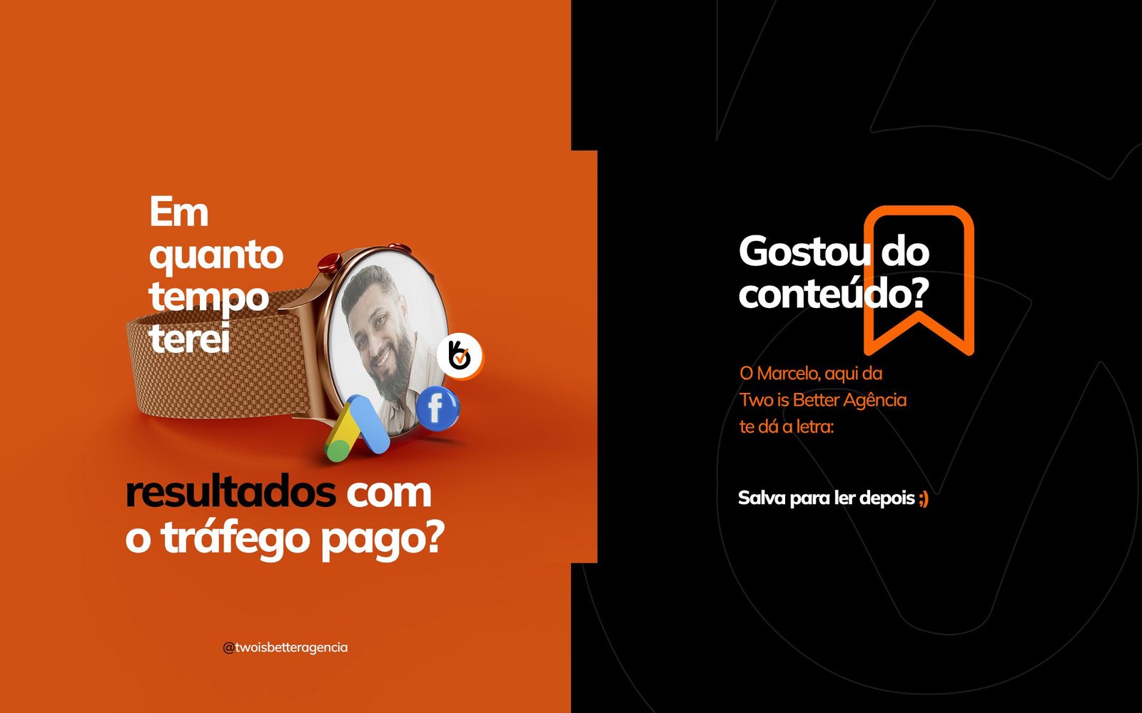
About the Project
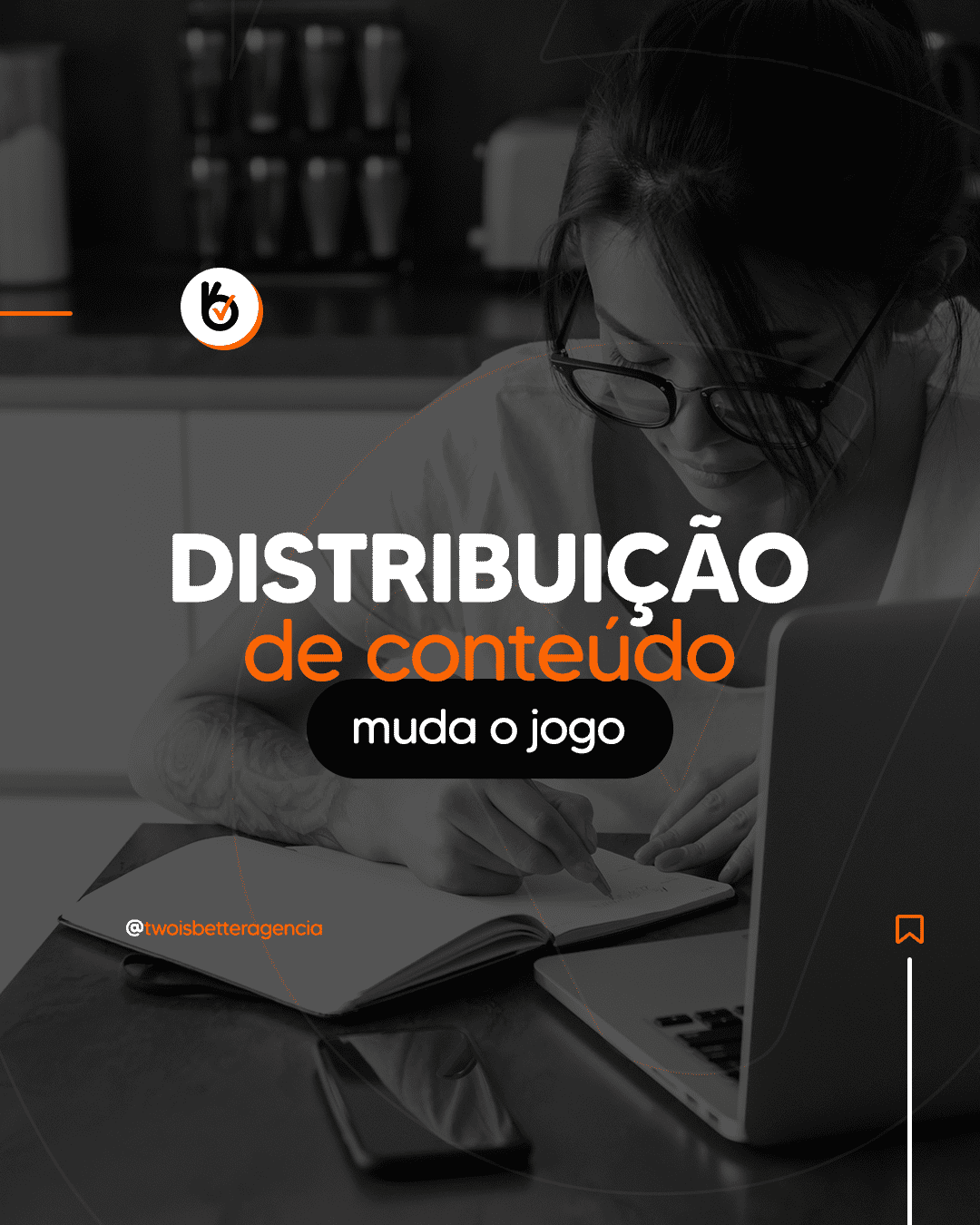
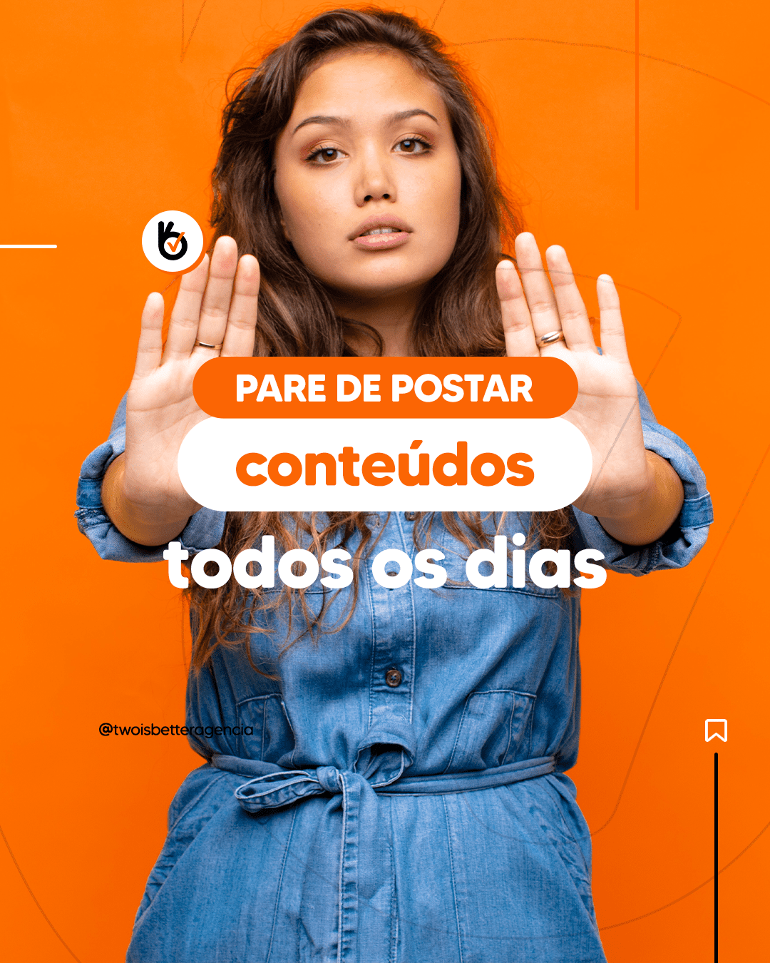
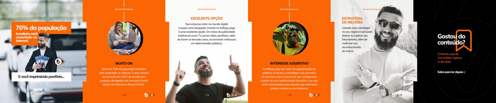
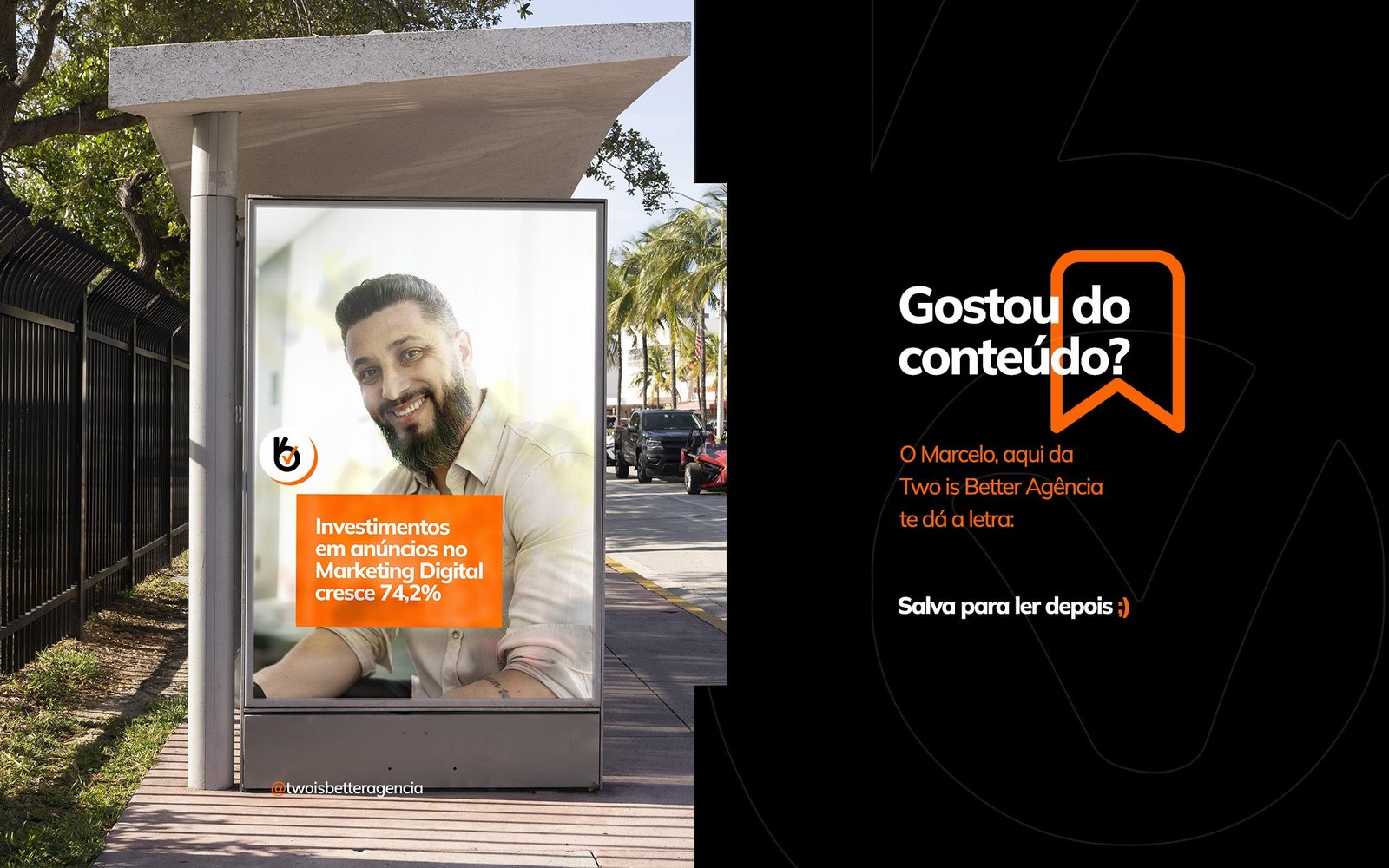
Development of visual identity and creatives for the TwoIsBetter marketing agency’s Instagram. The goal was to create a visual standard that conveyed creativity and authority, standing out in a feed saturated with digital marketing content.
The Strategy
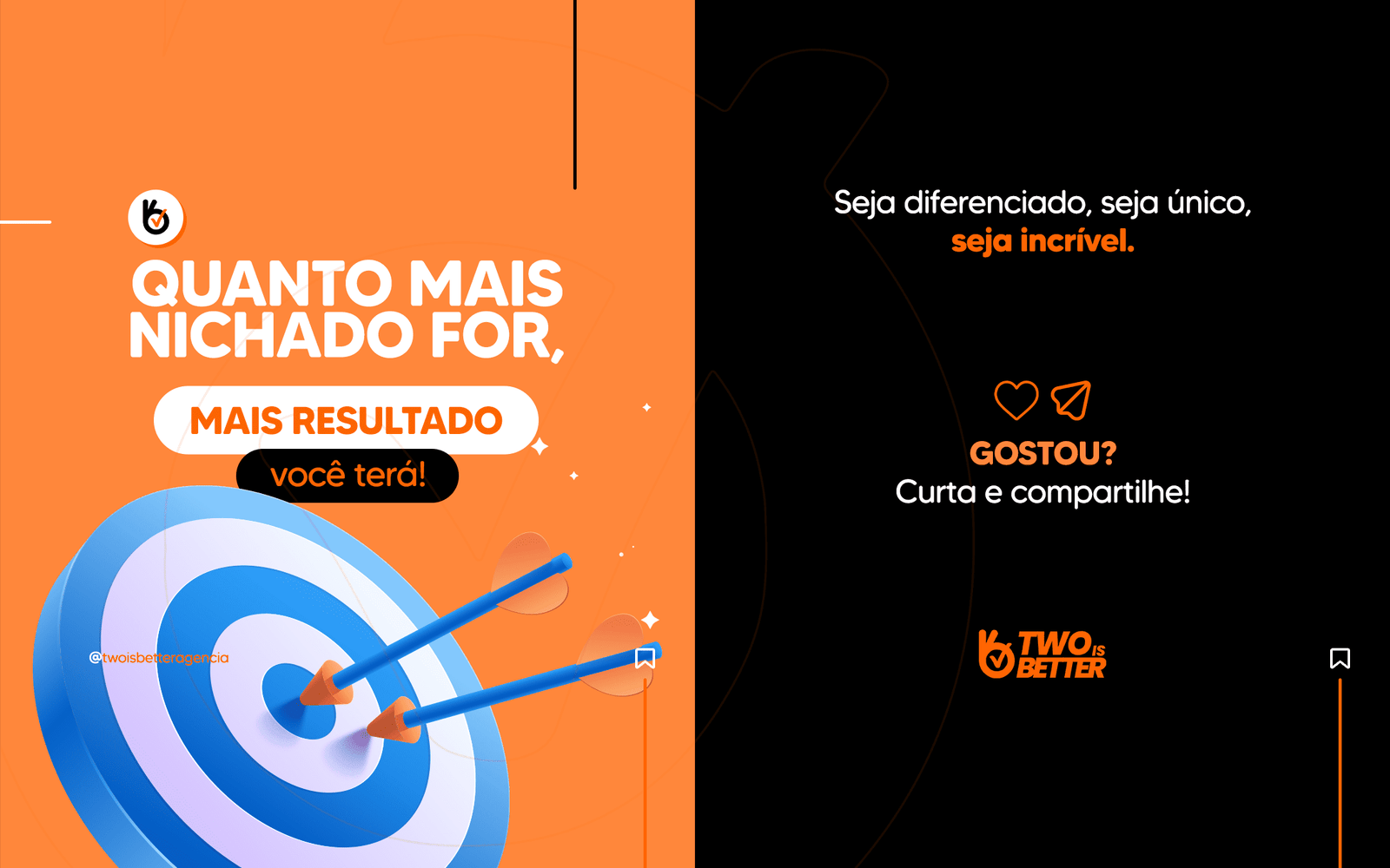
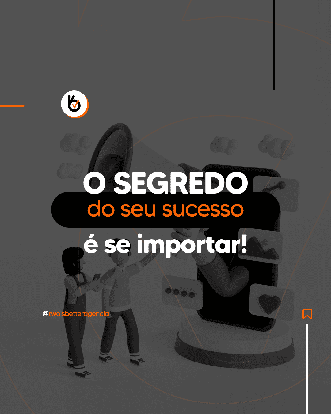
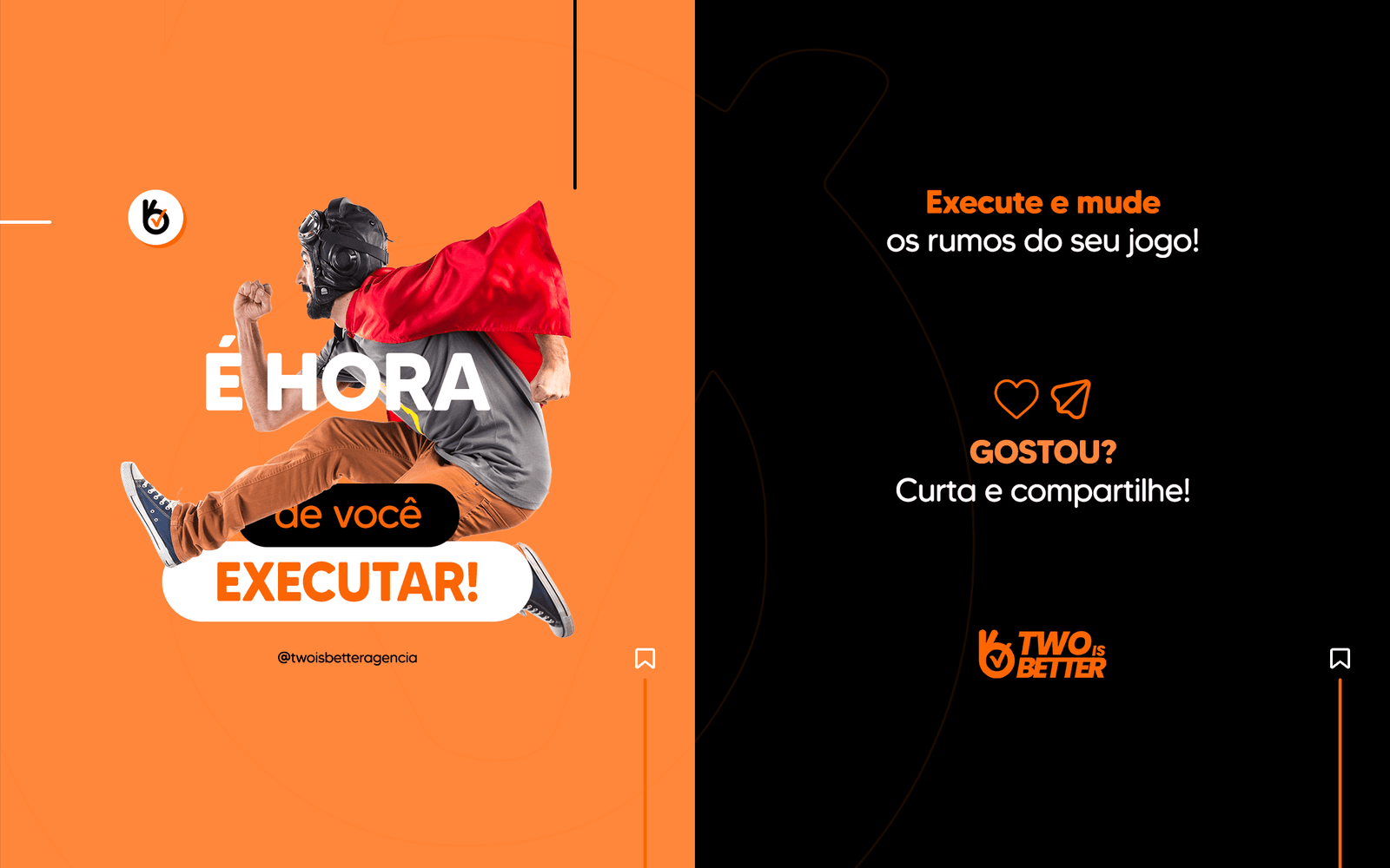
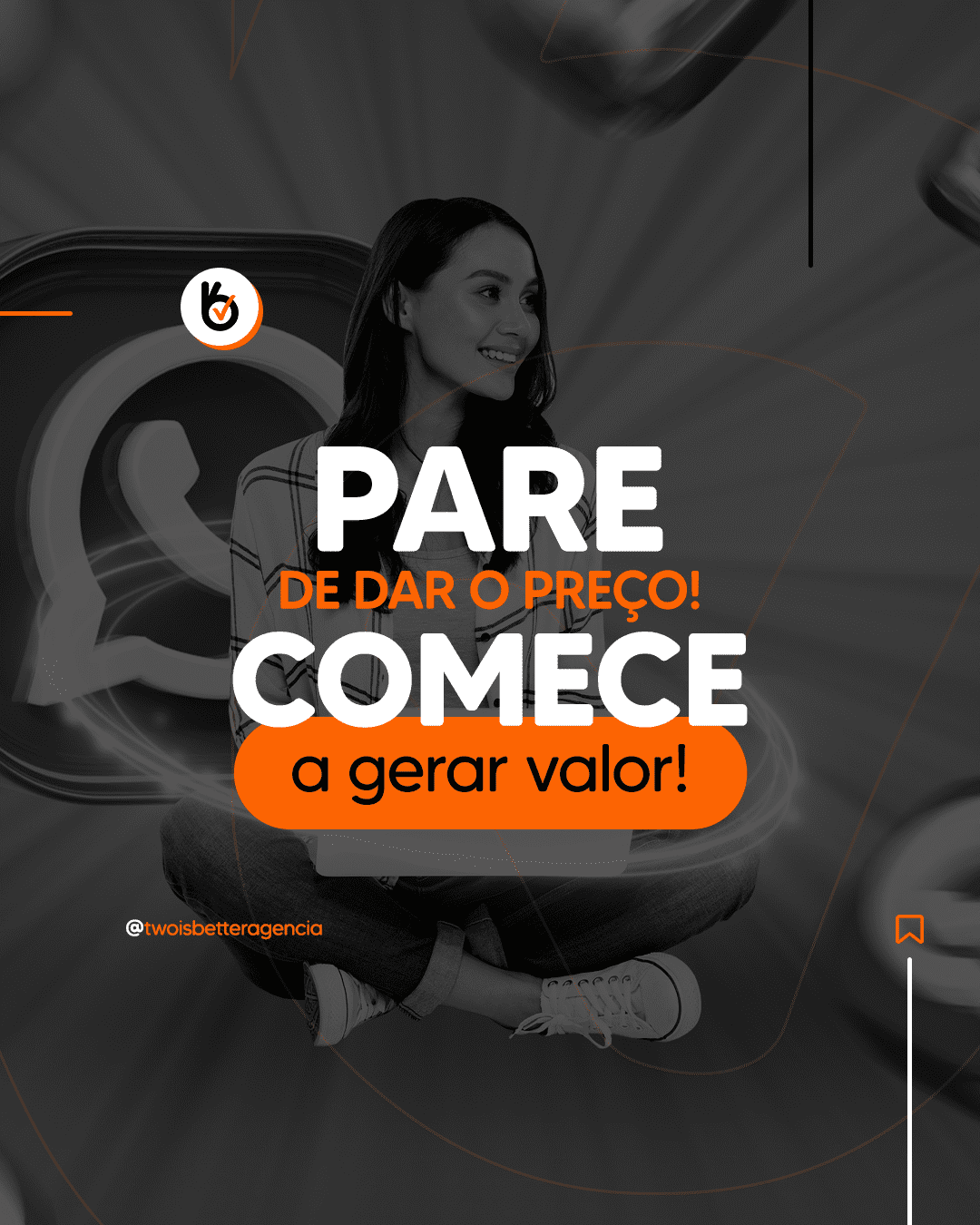
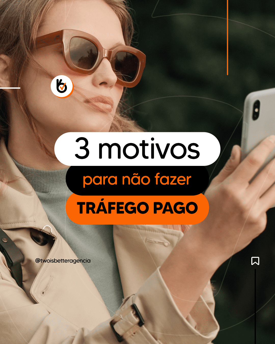
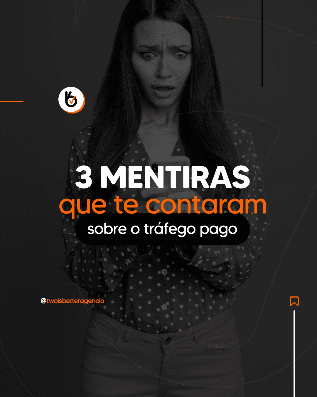
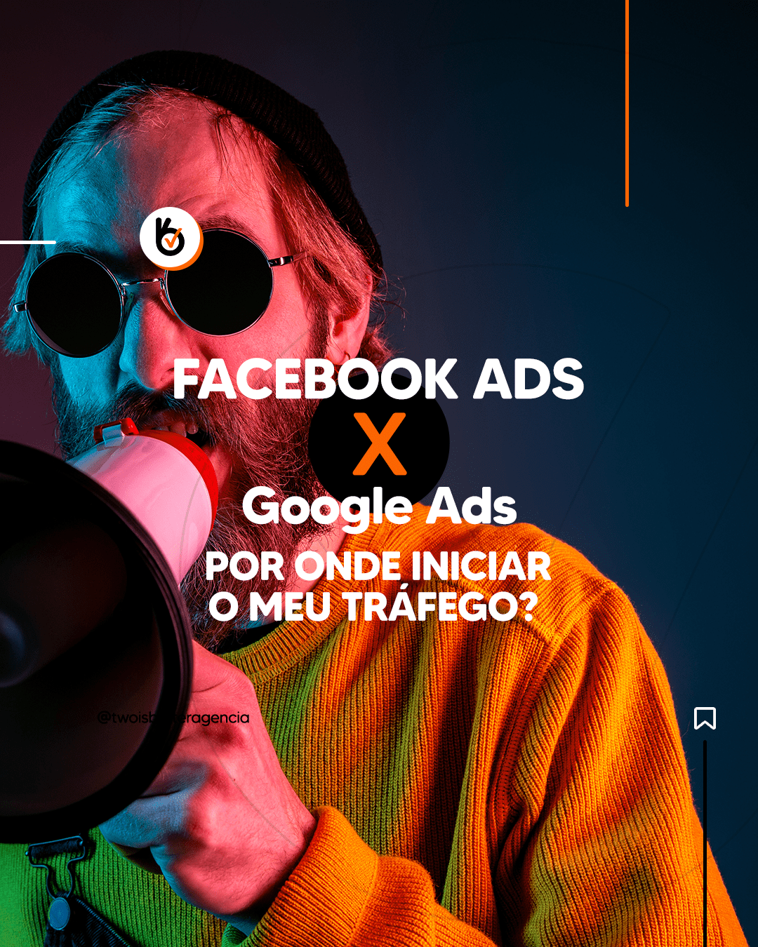
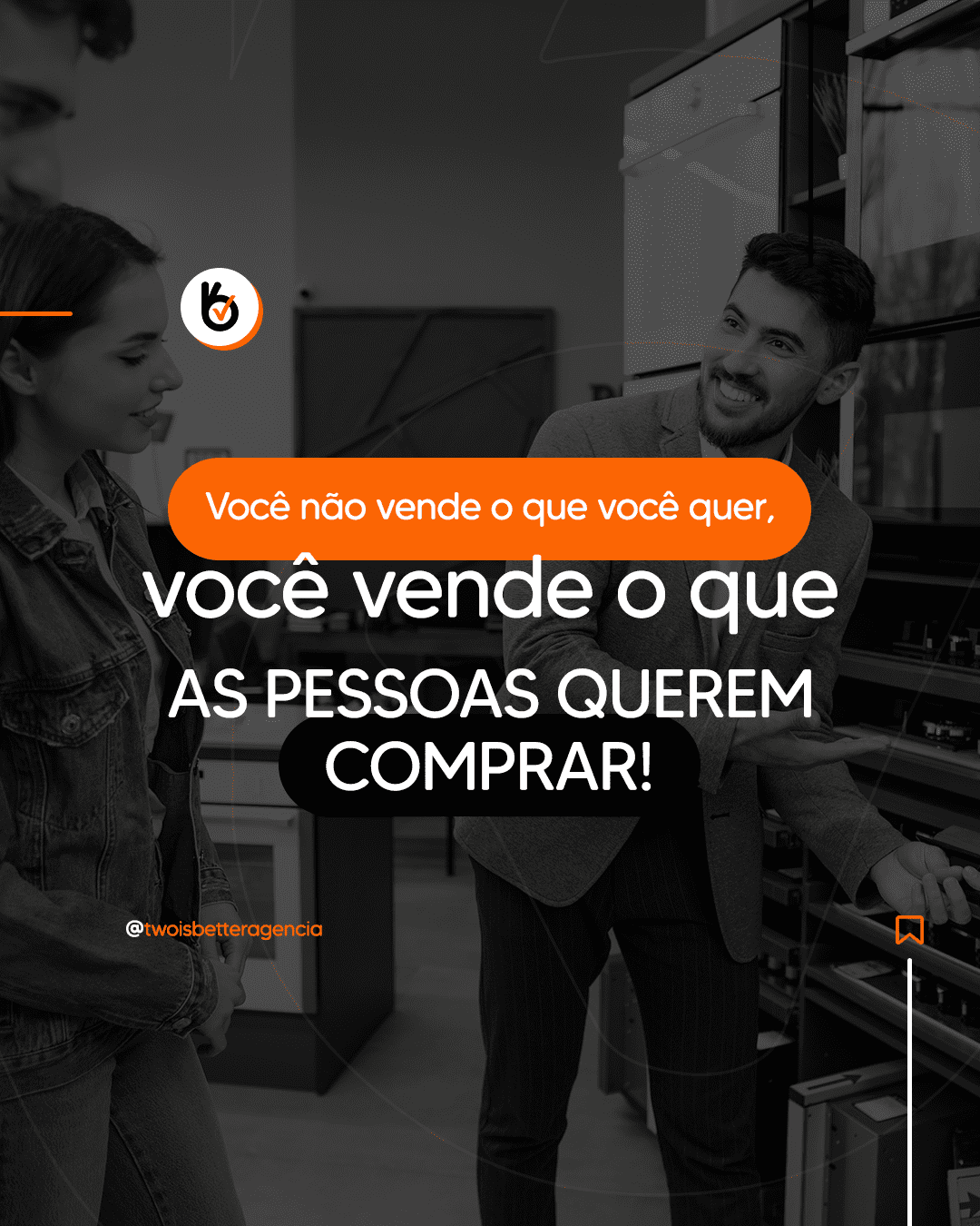
We bet on a “Loud” and modern visual style, focused on retaining attention through contrast:
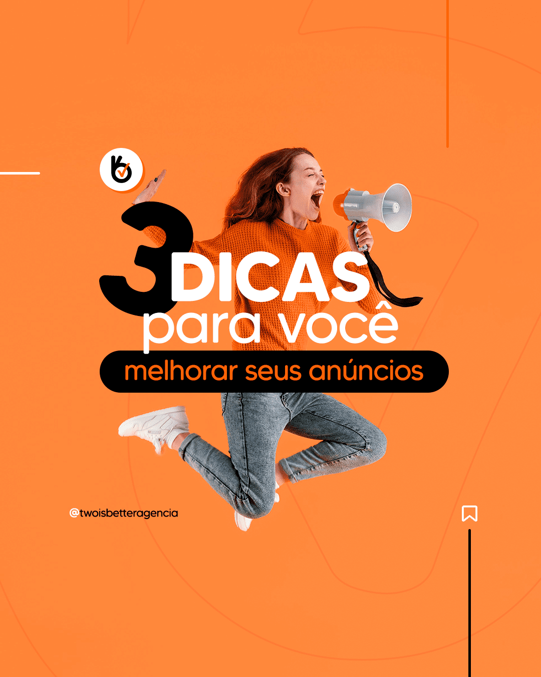
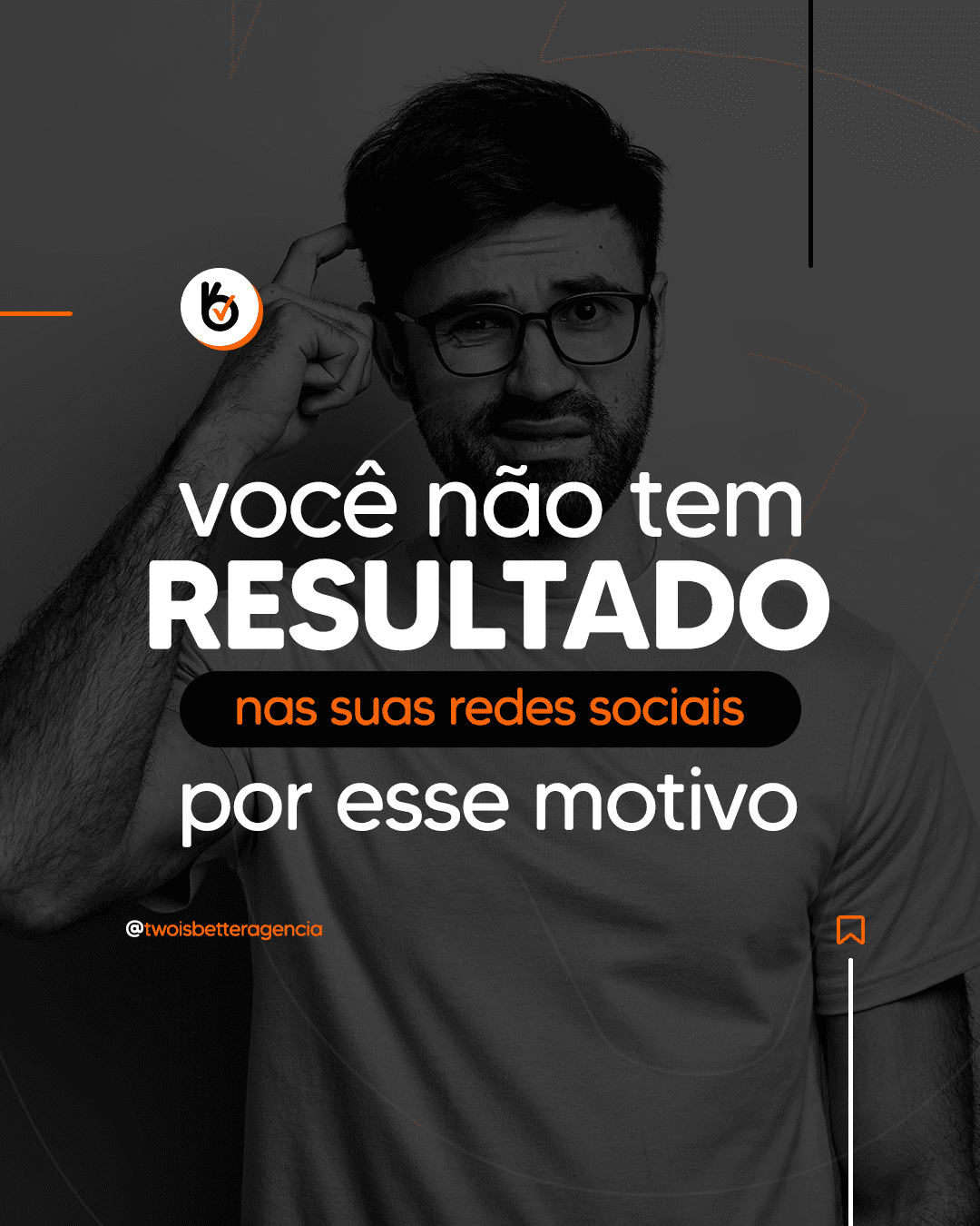
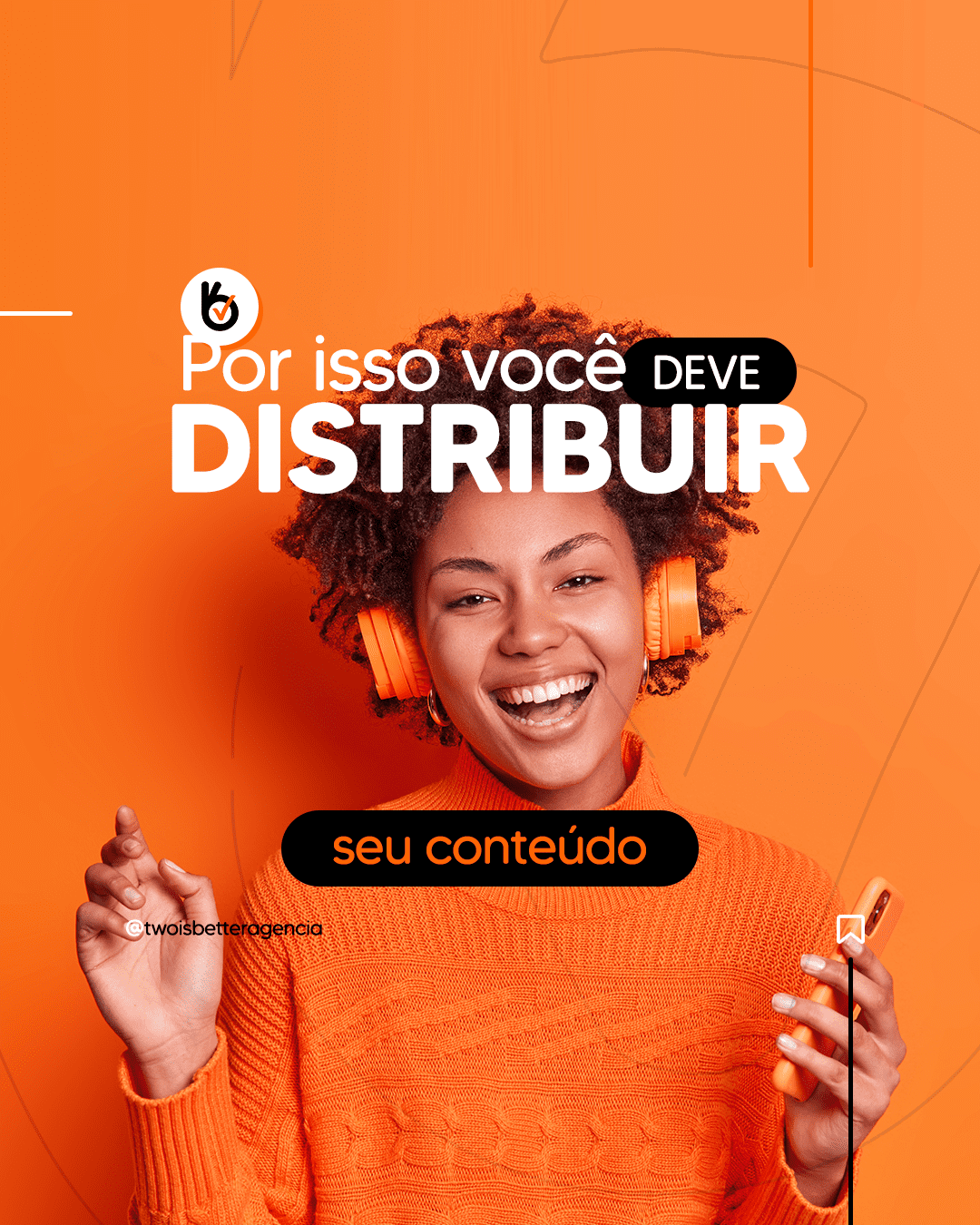
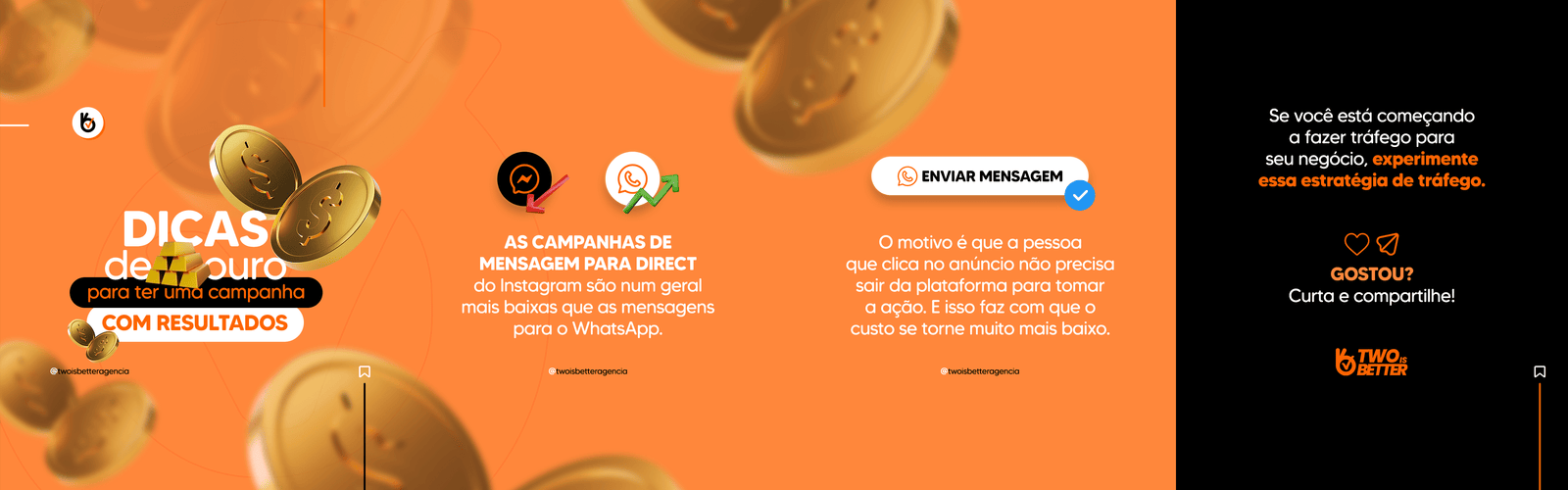
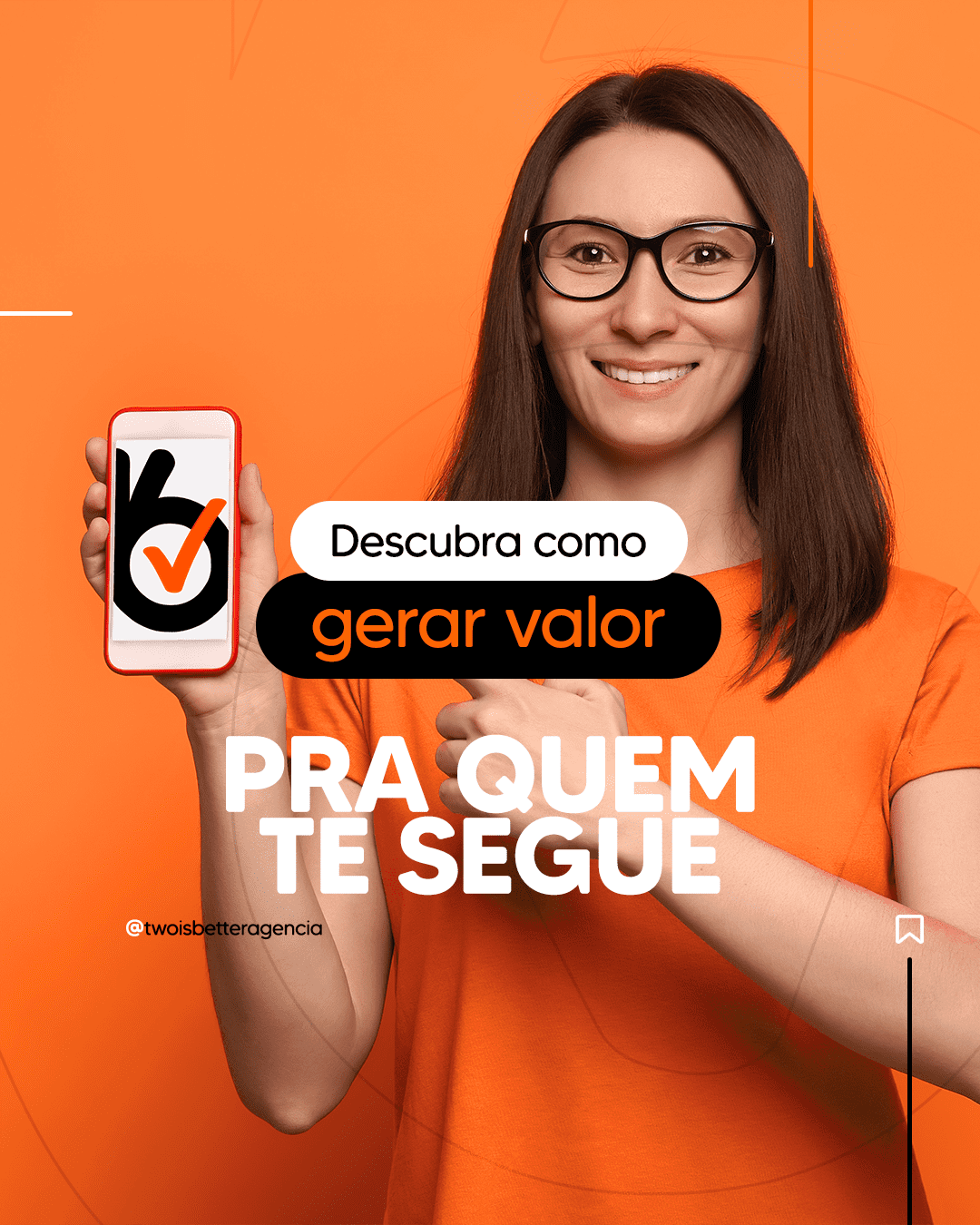
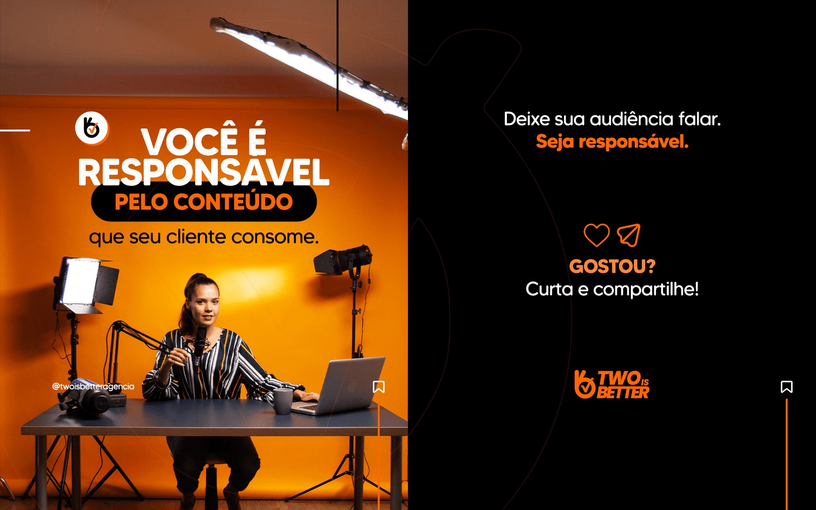
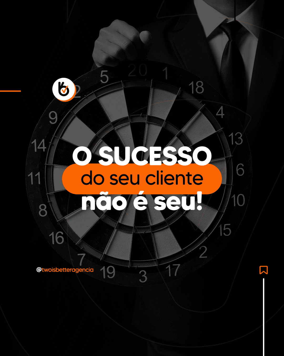
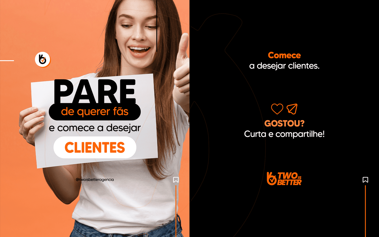
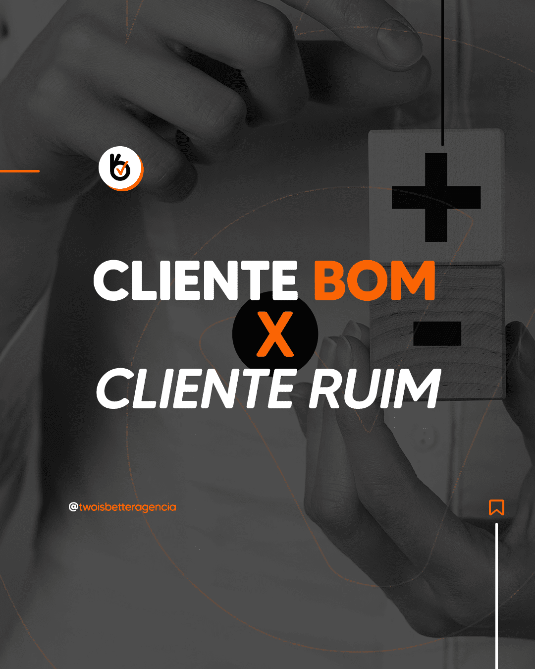
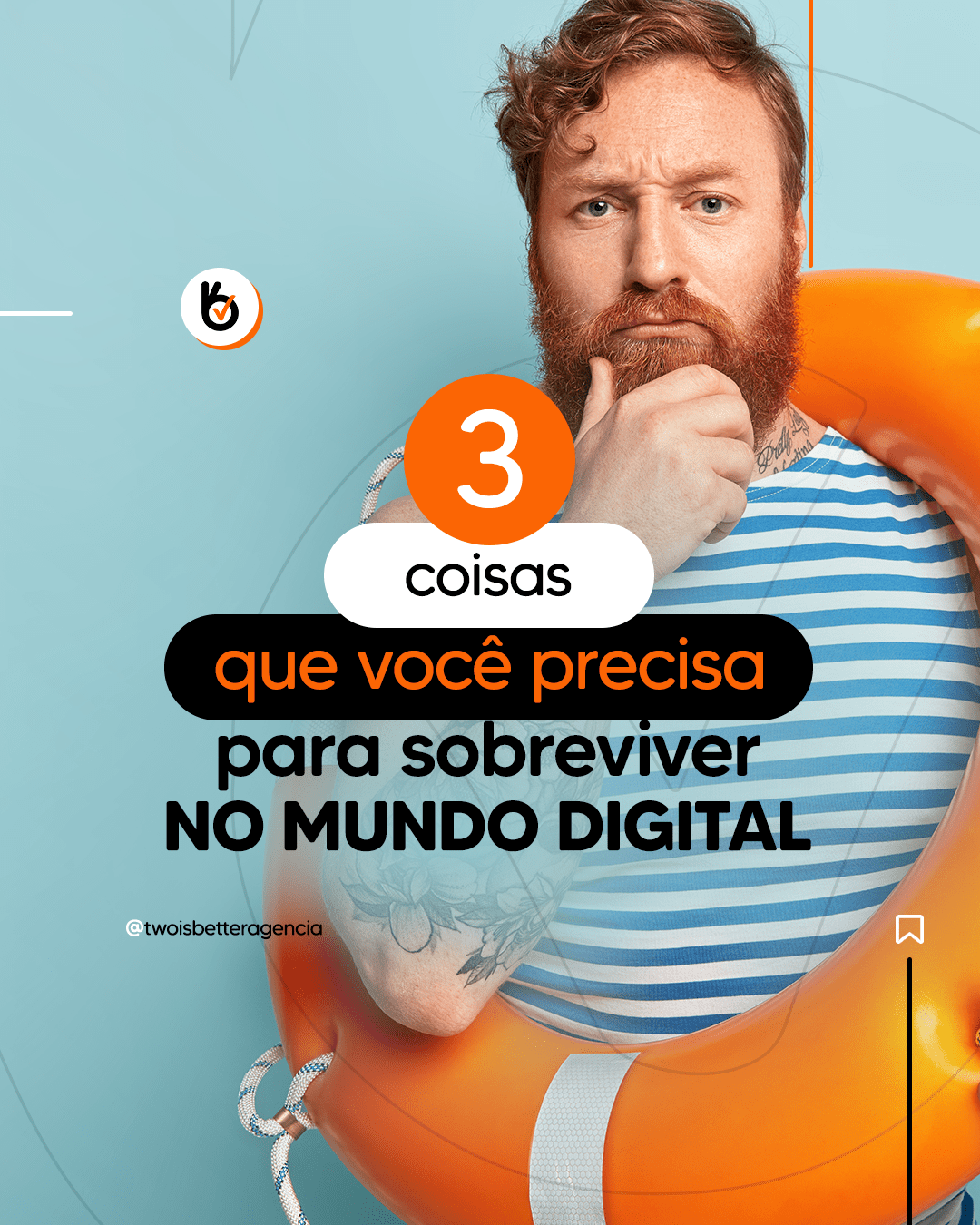
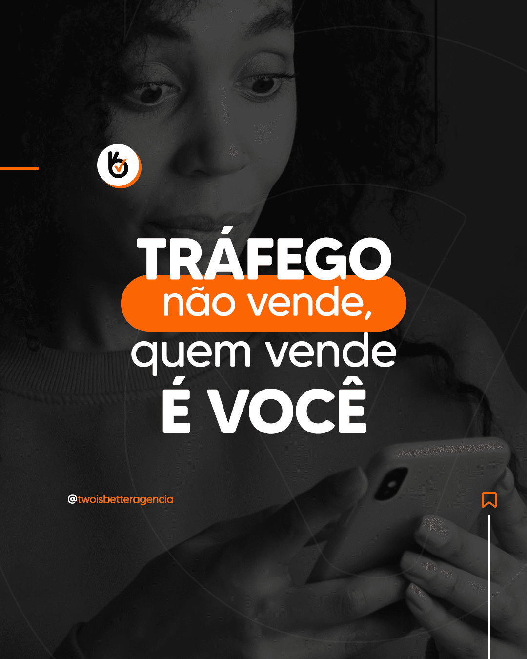
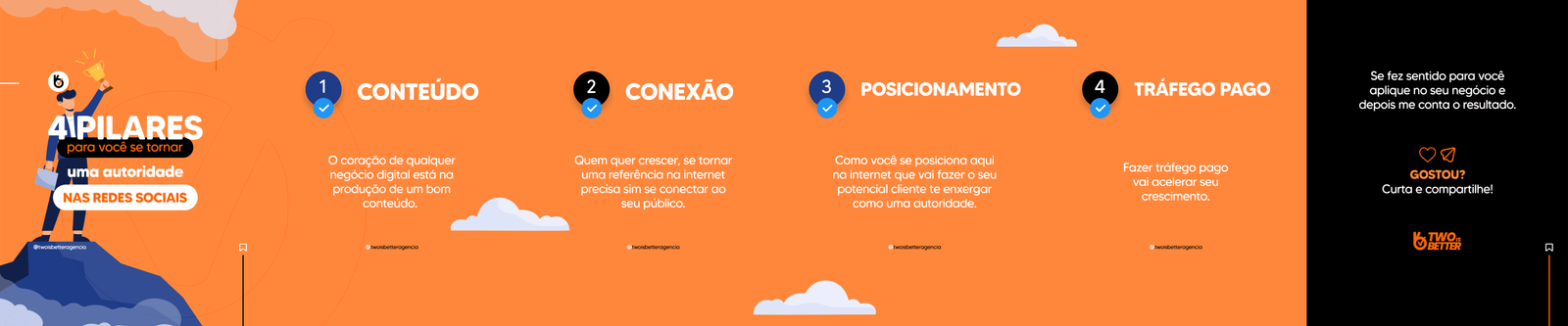
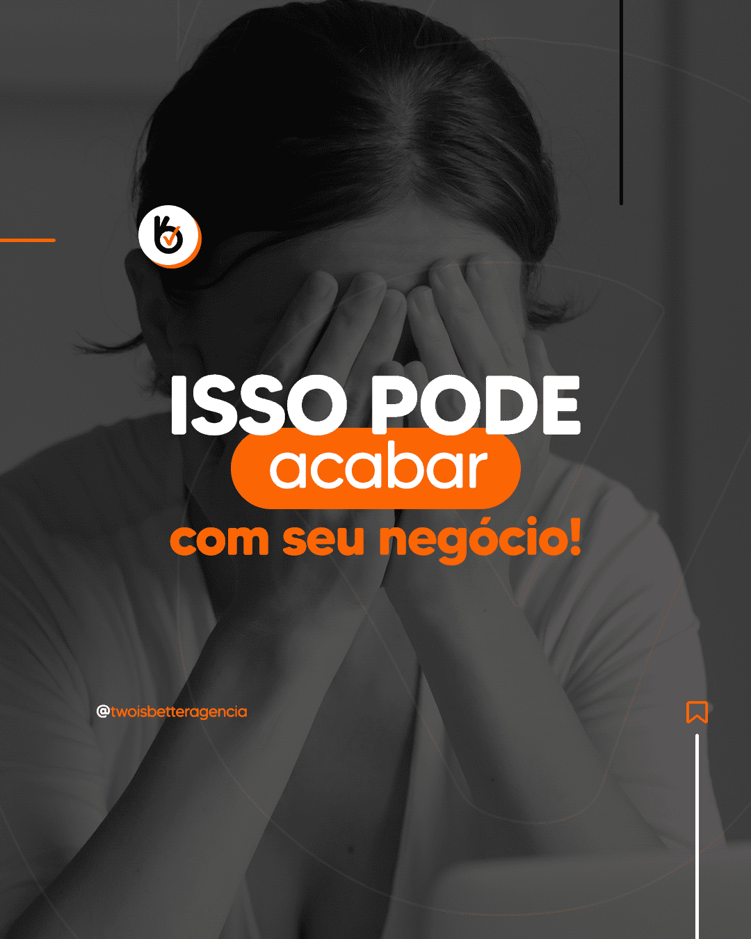
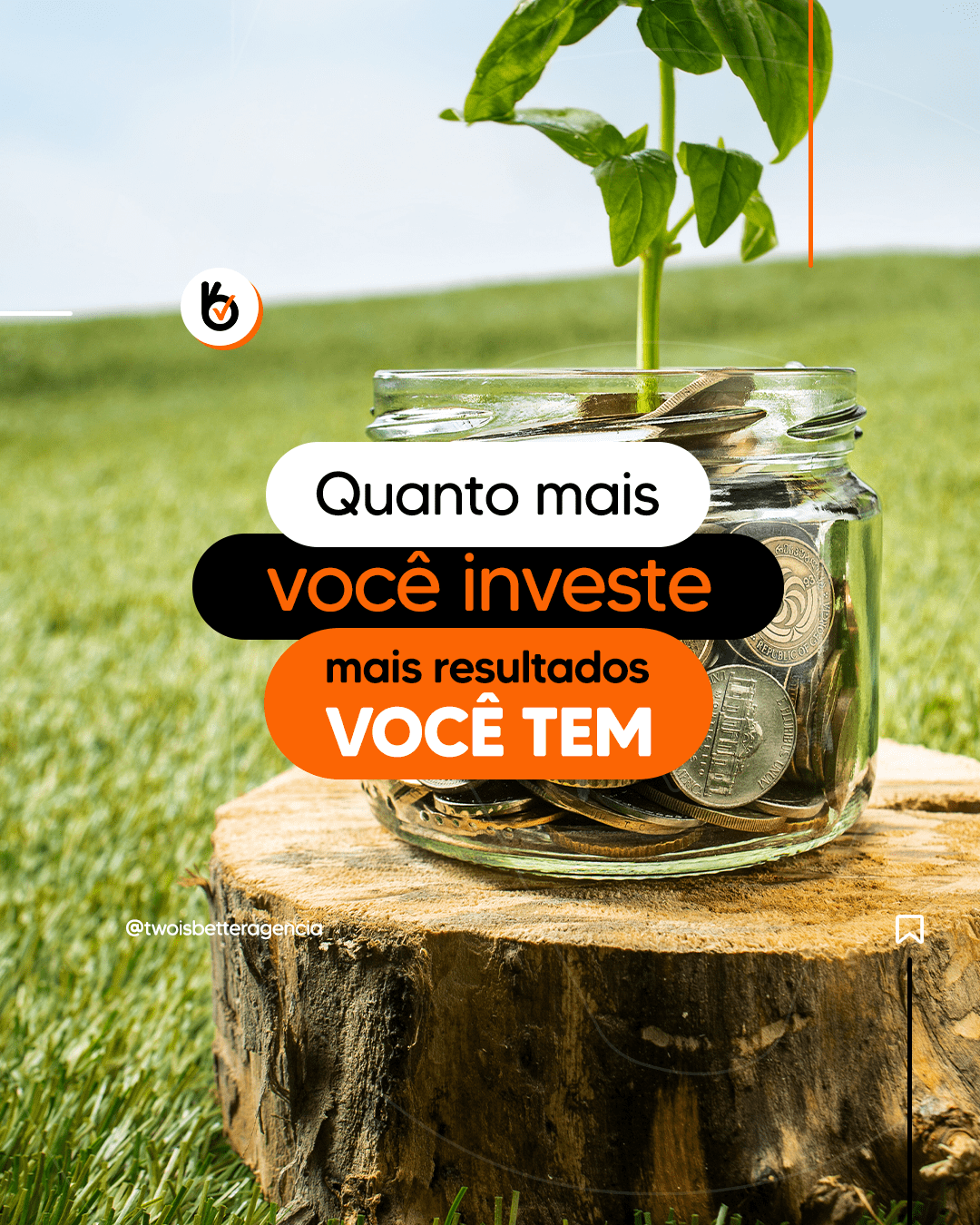
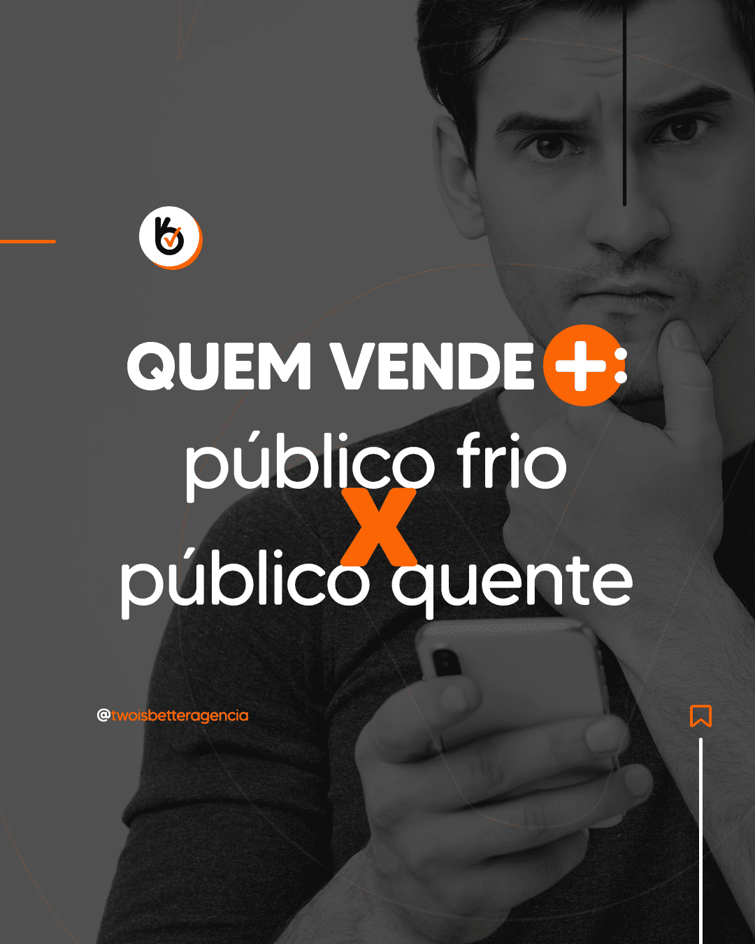
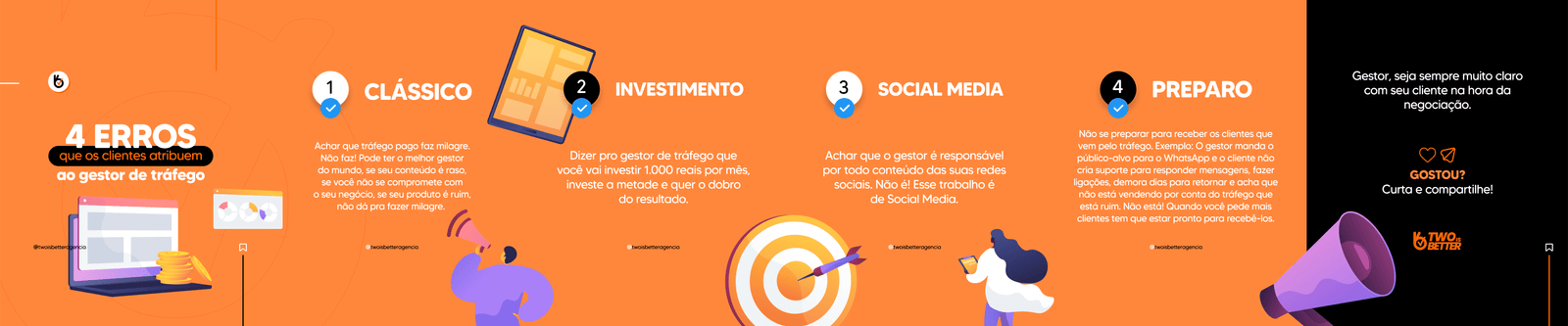
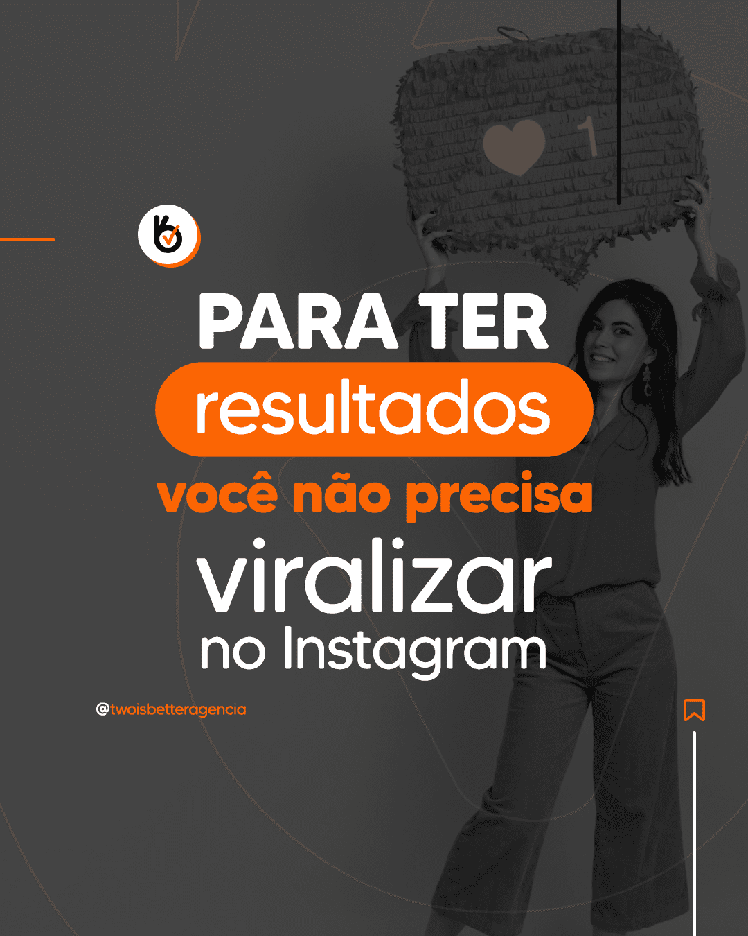
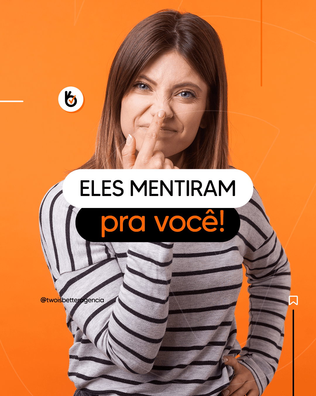
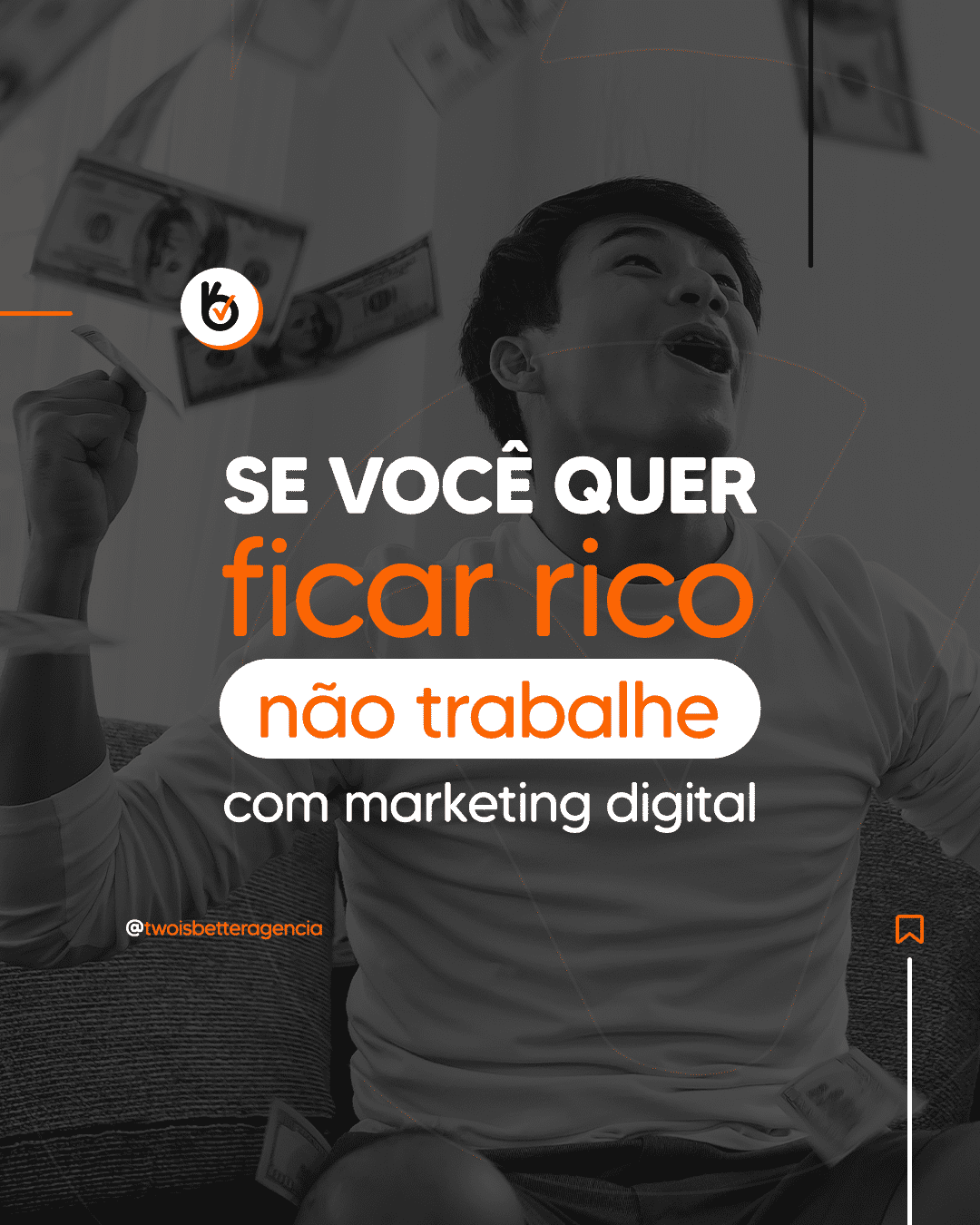
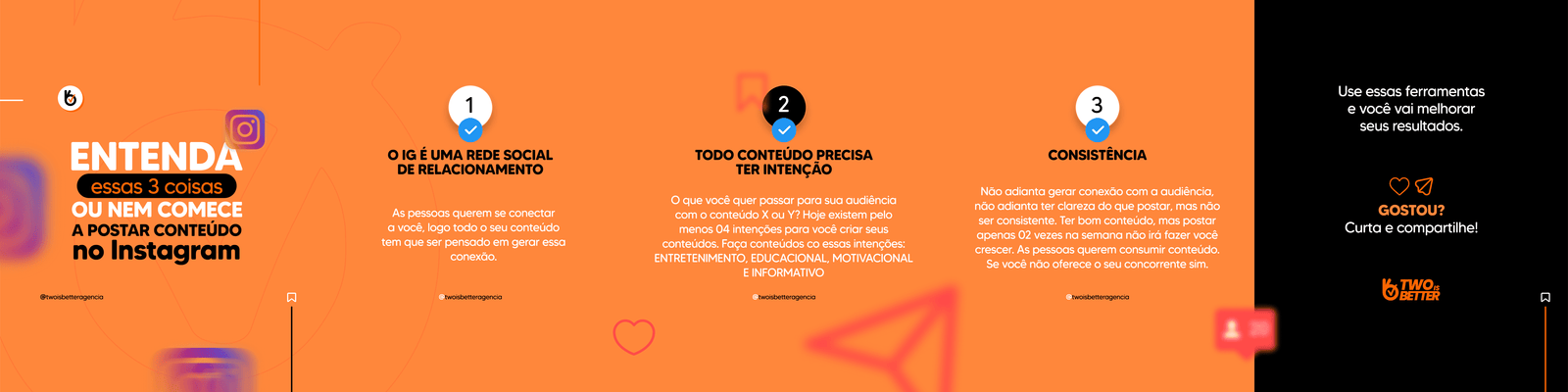
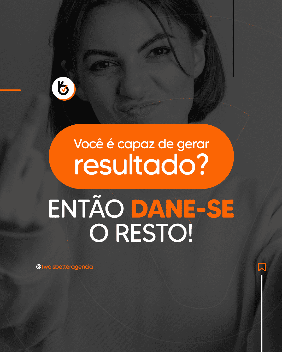
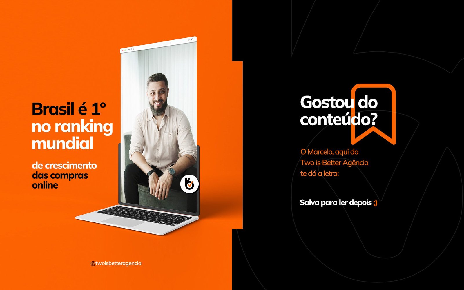
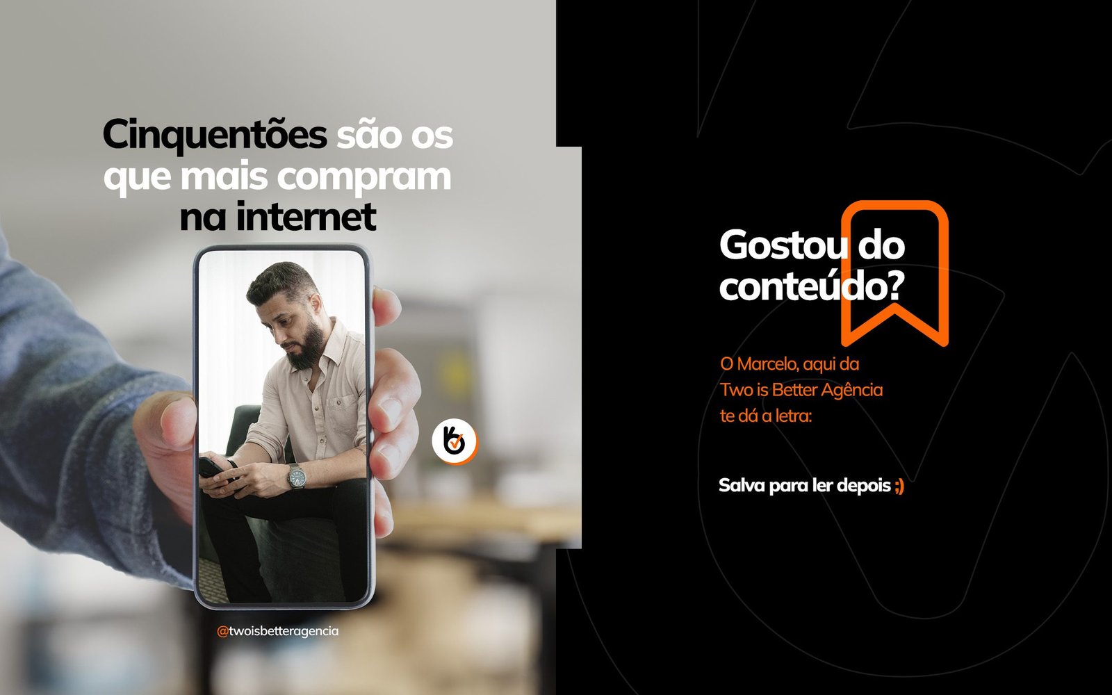
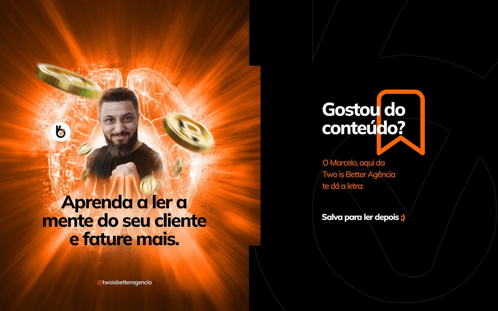
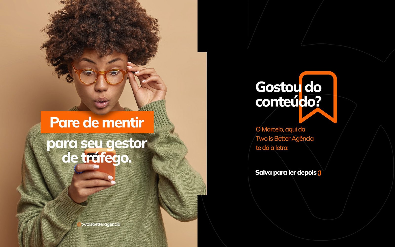
Energetic Palette: The combination of Vibrant Orange (creativity, action) with Charcoal Grey/Black (professionalism, seriousness) creates maximum contrast that prevents the post from going unnoticed.
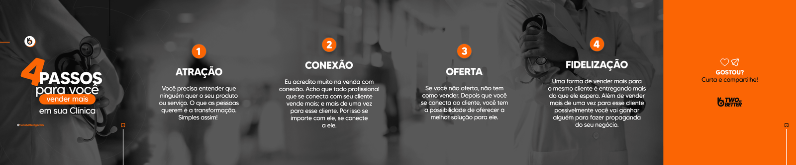
Headline Typography: Use of extra-bold sans-serif fonts in uppercase (“TIPS”, “RESULT”, “LIE”) to create immediate hierarchy. The text acts like a newspaper headline, delivering the content’s promise in seconds.
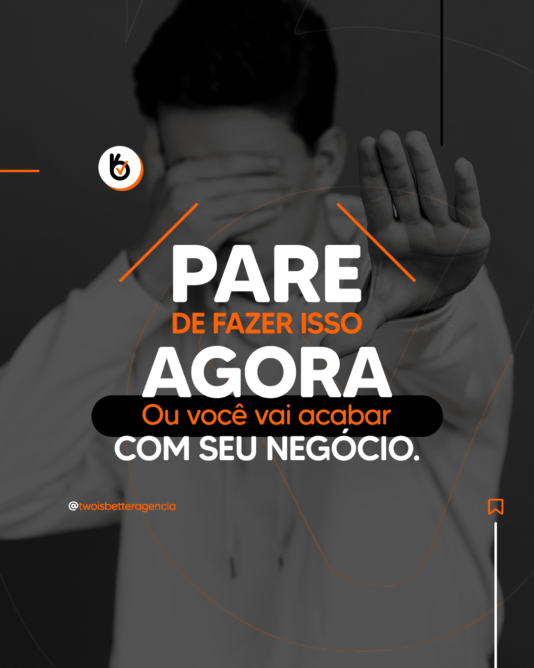
Emotional Connection: Selection of images that vividly illustrate the persona’s emotions (the frustration of zero results or the euphoria of nailing the strategy), generating instant identification.
Result
A feed with a strong proprietary identity, where each post acts as a digital billboard, increasing retention rates and engagement on educational content.