1. The Challenge: Tradition Meets Modernity in the Digital Realm
The redesign project for the Associação Comercial do Paraná (ACP) portal had a primary objective: to update the digital presence of a century-old institution. The challenge was not to create a new brand identity, but to build a new digital environment (layout) capable of organizing a vast ecosystem of services and information, making it accessible, modern, and intuitive for today’s business owners.
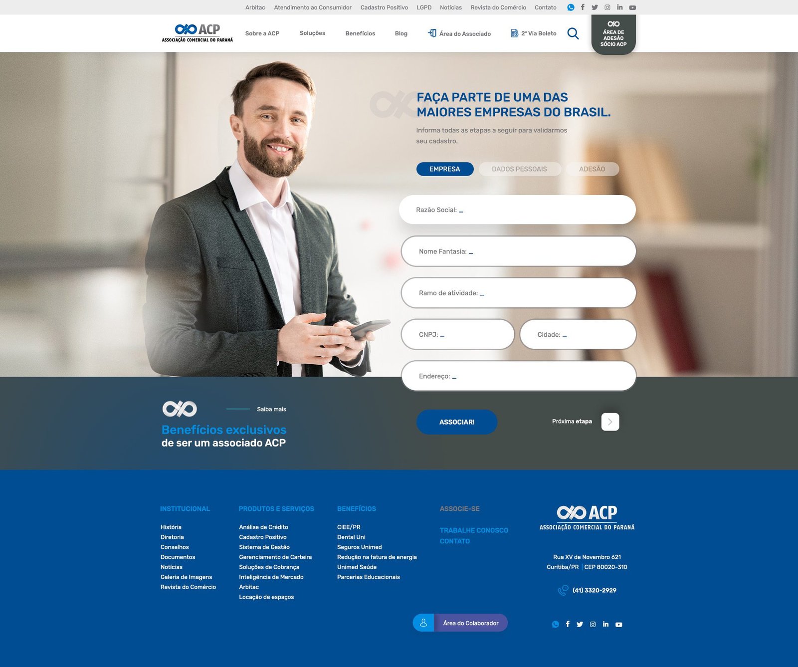
2. UI Design: Strategic Application of Identity
The existing ACP visual identity was translated to the screen with a “Digital First” approach. The layout uses the institutional colors hierarchically to guide the user:
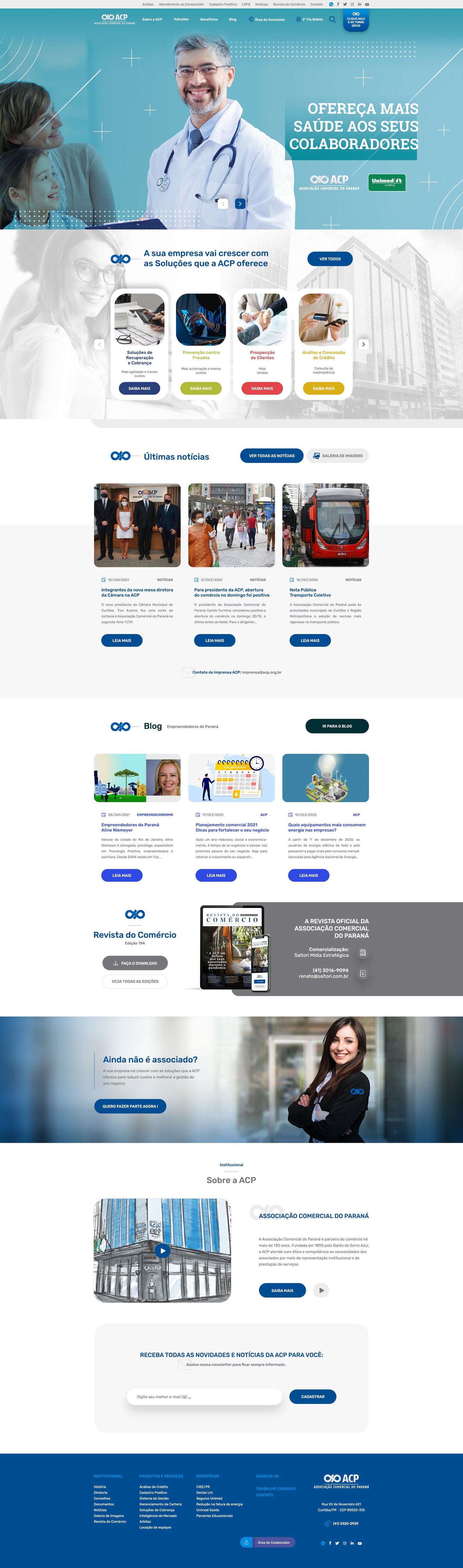
Chromatic Hierarchy: Navy blue (corporate) was preserved for footer areas and solid headers to maintain stability. Meanwhile, vibrant shades of blue and cyan were introduced in gradients and highlight elements (buttons and banners). This brings freshness and a tech-forward feel to the layout without mischaracterizing the official brand.
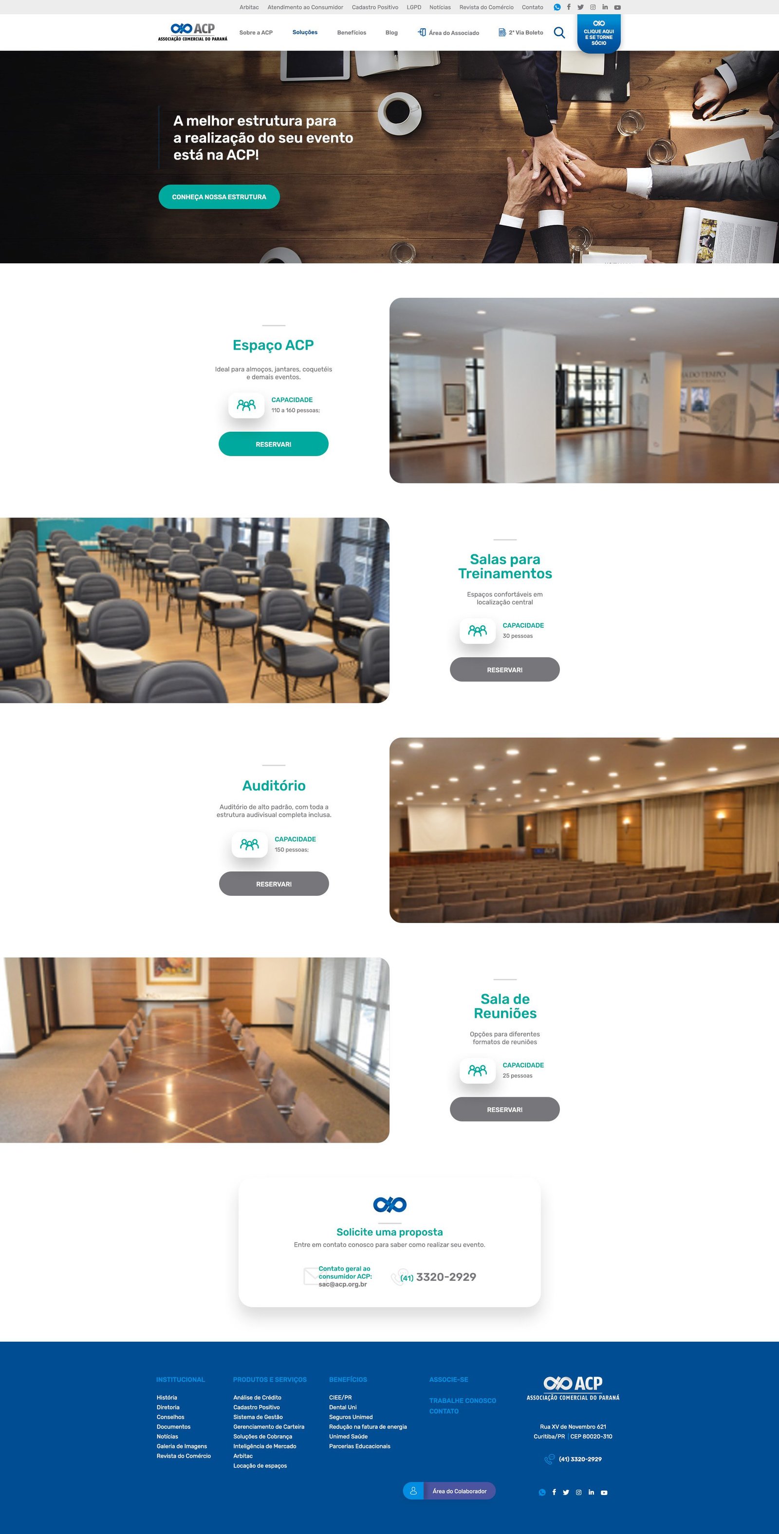
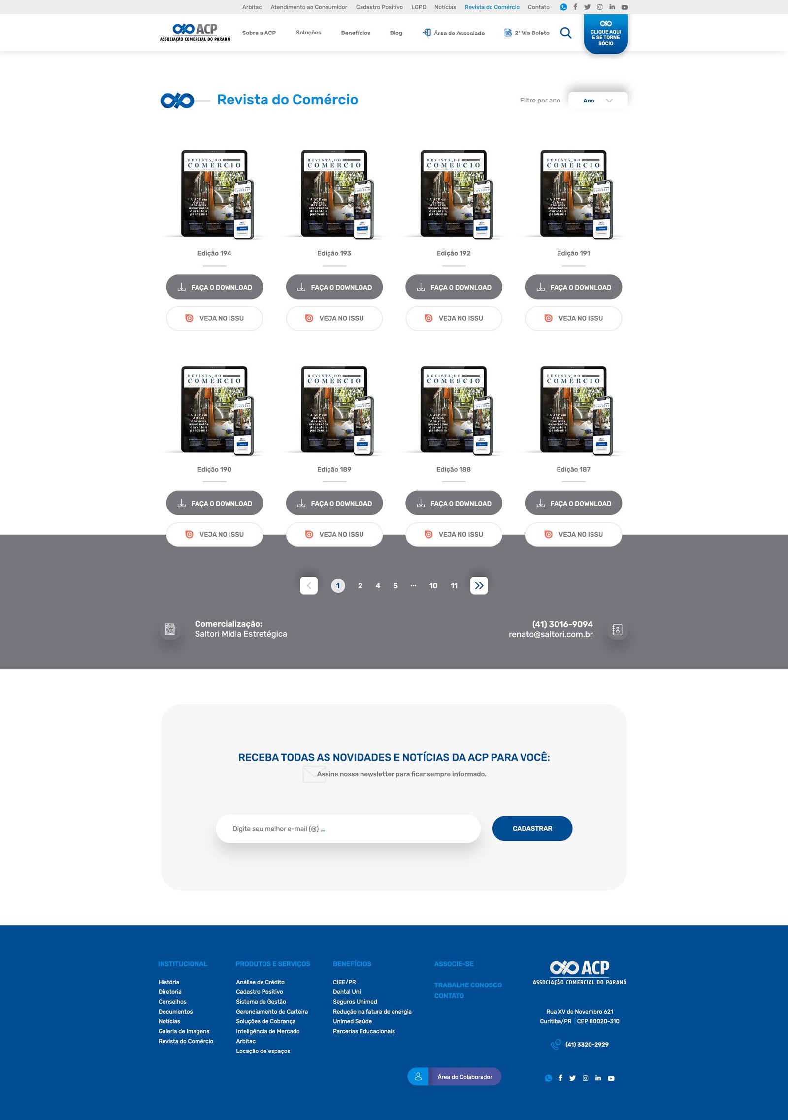
White Space: To avoid the visual clutter common in corporate portals, the new layout makes generous use of white space. This allows the content to “breathe,” conveying organization and transparency.
3. Information Architecture & Navigability
A highlight of the project is its modular organization. The site functions as a solutions hub:
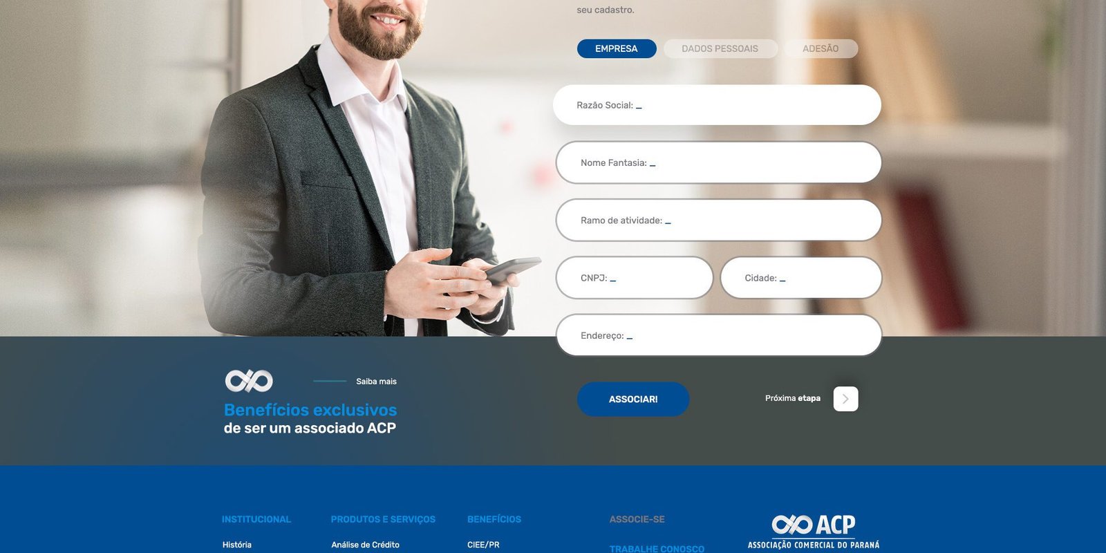
Card System: In the services section (“Your company will grow…”), we utilized a card-based layout. This UI choice facilitates quick scanning, creates clear segmentation between products, and offers friendly touch targets for mobile devices.
Segmented Navigation: The layout visually divides content into distinct blocks—Solutions, News, Blog, and Magazine. Each section has a clear spacing identity, allowing users to understand where they are and where to go next with zero cognitive strain.
4. Graphic Elements & Visual Style
To enrich the visual experience beyond photography, subtle support elements were integrated:
Tech-Inspired Graphics: In the main banner (Hero Section), fine lines, geometric shapes, and dotted patterns were overlaid on the images. These interface elements suggest connection, networking, and dynamism, reinforcing ACP’s role as a link between entrepreneurs.
Functional Iconography: Modern linear icons were applied to illustrate services, replacing long descriptions with visual cues that speed up comprehension.
5. Focus on Conversion & Usability (UX)
The layout isn’t just aesthetic; it’s functional and results-oriented.
Strategic Calls to Action (CTAs): Rounded buttons with high-contrast colors (such as solid blue or green for partners) were placed in prime screen locations, encouraging immediate action (e.g., “Join Now,” “Learn More”).
Humanization: The image selection and element arrangement prioritize photos of real people and business scenarios, creating an empathetic interface that connects the visitor to the institution.