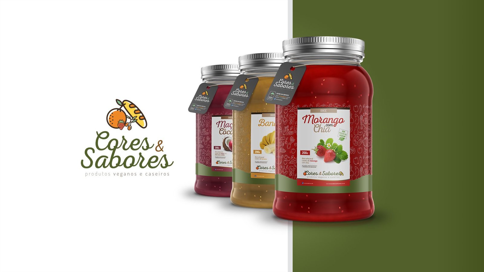
About the Project
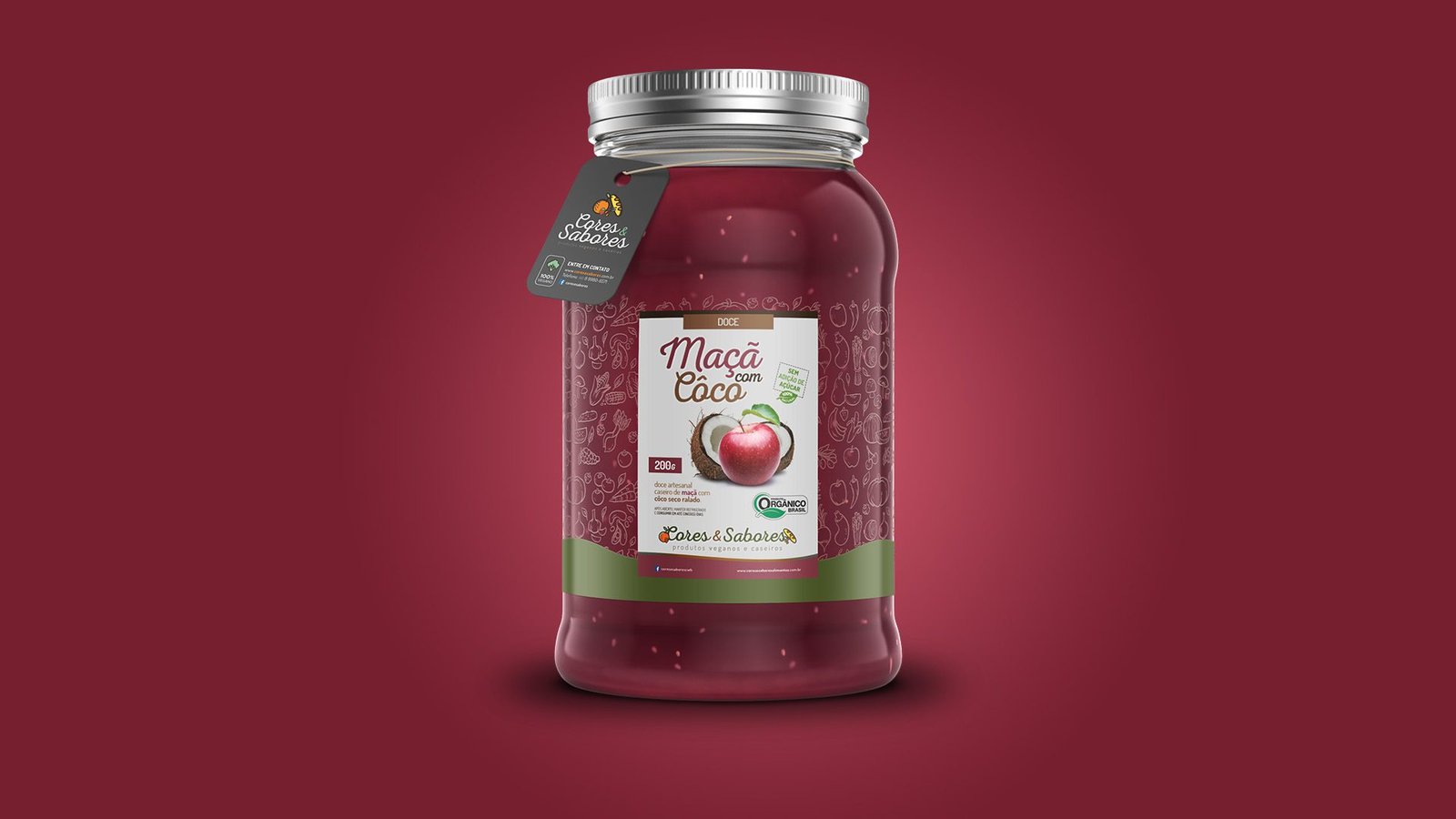
Visual identity and packaging line creation for Cores & Sabores (Colors & Flavors), a brand specializing in homemade, vegan, and organic jams. The challenge was to convey the purity of the ingredients and the care of the artisanal process on a label that projected credibility and stood out at the point of sale.
The Visual Strategy (The “Farm to Jar” Concept)
The design was structured to evoke affective memories of homemade food, but with a modern guise:
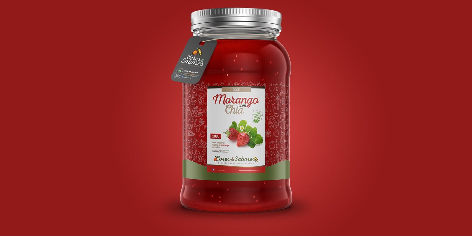
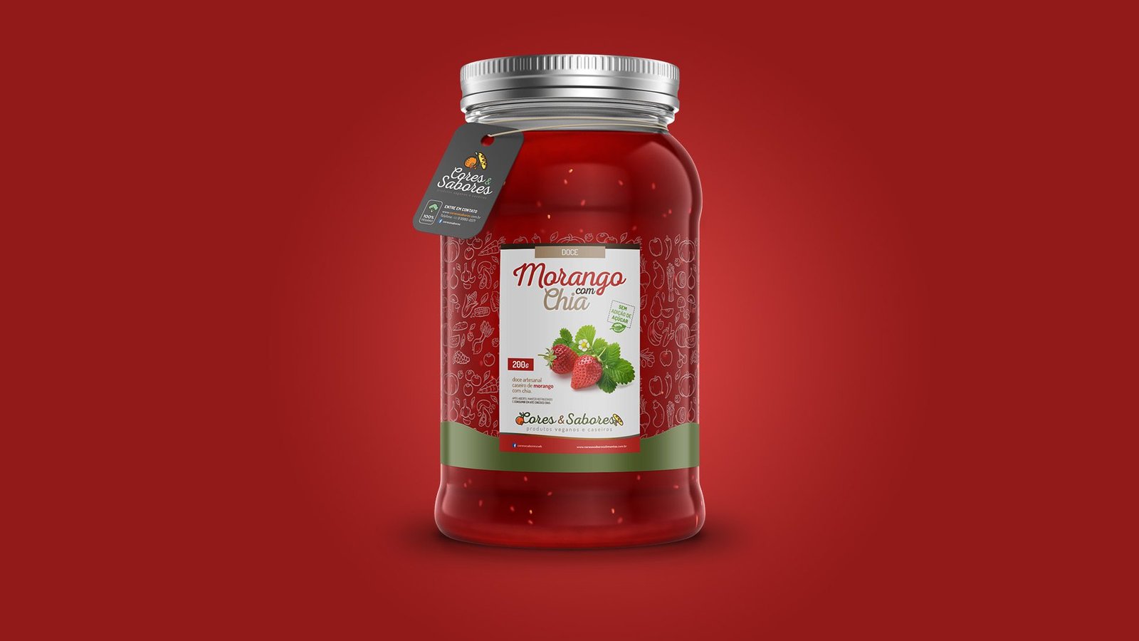
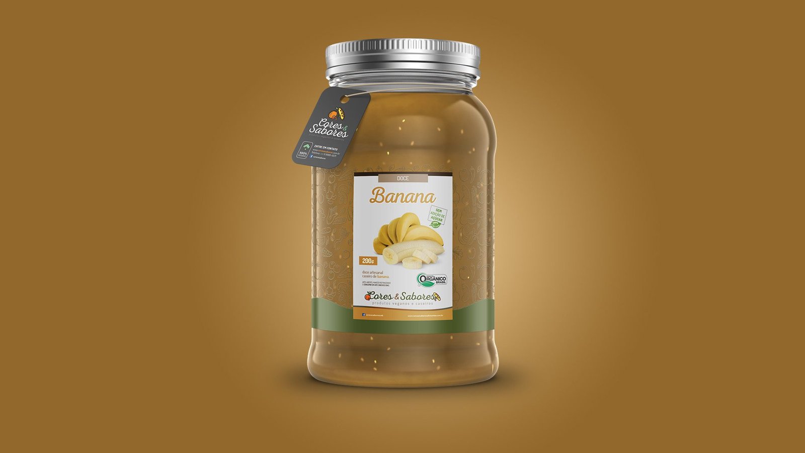
Information Architecture: The label features a special die-cut that moves away from the standard square shape, creating a more organic and fluid silhouette. This allows for greater visibility of the product inside the jar, reinforcing the brand’s transparency.
Color & Flavor System: We developed a strict Color Code to facilitate quick identification on the shelf. Each flavor has a dominant color that harmonizes with the product:
Vibrant Red: Strawberry with Chia.
Ochre Yellow: Banana.
Wine/Purple: Apple with Coconut.
Illustration and Texture
The label background features a “doodle” pattern (freehand linear drawings) of fruits and vegetables. This subtle detail reinforces the natural origin of the inputs and adds a layer of visual texture that enriches the packaging without cluttering the reading.
Mixed Typography: We combined a Script font for the flavor names, simulating handwriting on homemade preserve jars, with clean sans-serif fonts for nutritional information and seals (Organic Brazil, Vegan, No Sugar), ensuring technical readability.
The Result
A family of packaging that triggers appetite appeal and instantly communicates the brand’s health and sustainability values.