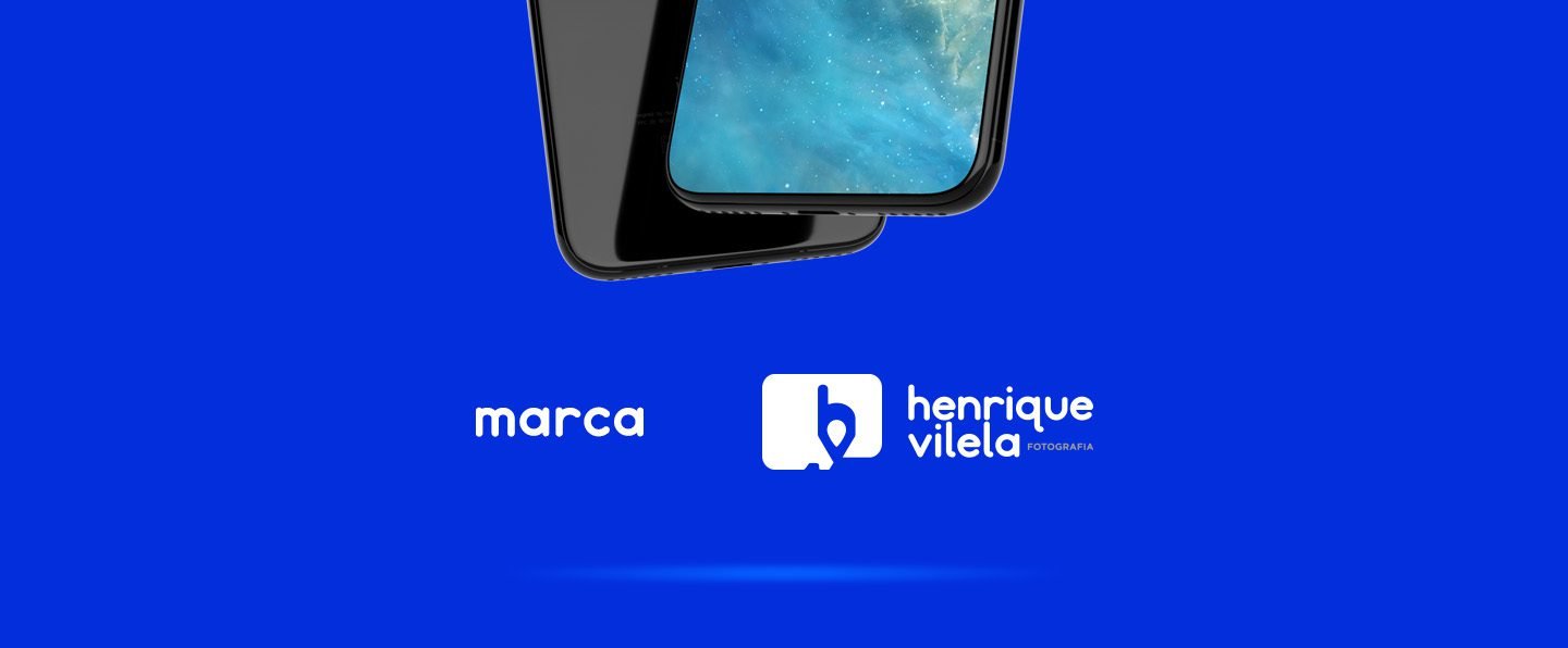
About the Project
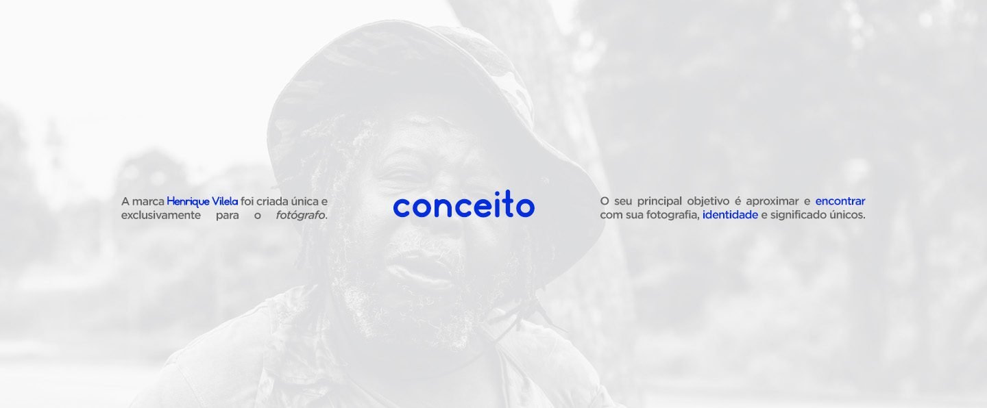
Complete brand construction and visual identity for photographer Henrique Vilela. The challenge was to create a brand that didn’t just sign the photos, but represented the professional’s philosophy: photography as a means of finding identities and recording unique moments.
The Strategy (The “Finding” Concept)
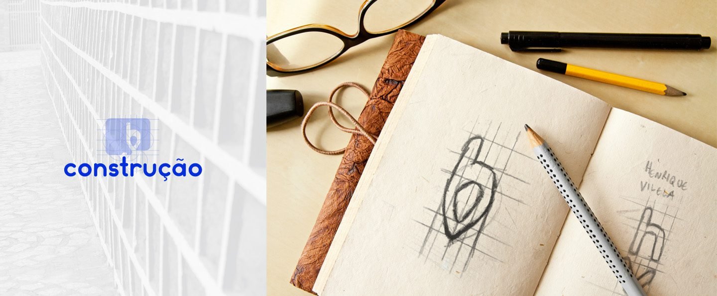
The brand was developed under the core concept: “Photography that identifies itself”. To translate this visually, we fused two universal elements into a minimalist symbol:
The Location Pin: Represents “Finding.” The photographer who goes to the location, who discovers the angle, and helps the client “find themselves” in the image.
The Memory Card: The logo’s frame alludes to the physical shape of an SD Card, symbolizing technology, storage, and the eternalization of the recorded moment.
Hidden Monogram: The fusion of shapes subtly suggests the initials “hv,” creating a proprietary visual signature.
Visual Universe
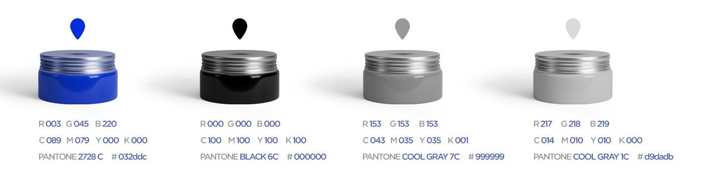
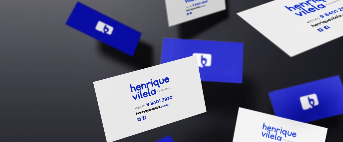
Proprietary Color: We bet on a vibrant, digital Electric Blue. Unlike the traditional black and white of photographers, this blue conveys modernity, technology, and youthful energy.
Typography: The combination of Somatic Rounded (friendly and modern) with Gotham Book (geometric and technical) creates a balance between the professional’s approachability and the precision of his work.
Result
A contemporary visual identity that works both as a discreet watermark and as a highlight element on mobile interfaces and business cards, differentiating Henrique Vilela in the photography market.